

It's not a leak or a spoiler, Shueisha shows it in a official Live Stream 
ONE PIECE 7TH Popularity Poll!!
-


Twitter: https://twitter.com/Mugiwara_23
-
Nice, in the third poster, Oda put Carrot in Sulong form rather than in her normal form. I also like how Yamato is on the left side of the poster, Luffy is in the middle, and Carrot is on the far right.
-
Absolutely incredible.
I would love to know how long the actual drawing and coloring process took him and how he scheduled it. -
The full poster looks awesome! Can't wait to have the full thing in hd!
Very interested to see how they handle it in volume 101 though. Three separate parts, at least 6 pages in width all up, and one of the parts isn't released as part of a chapter. Will they keep the six pages in separate blocks of two with a chapter between them, or push them together like they did for the chapter 1000 spread, robbing at least one chapter of its cover and ballooning the length of another to 23 pages? A fold-out would be cool, but would translate poorly to digital releases. Hmm…
-
I can't really tell what's going on above Kuzan. Could anyone enlighten me?^^

-
I can't really tell what's going on above Kuzan. Could anyone enlighten me?^^
There's Lucci fighting Marco.
-
Carrot’s position is so weird, as there’s no characters familiar to her around. I’d expect her near the SHs due to that.
It really feels like it was intentionally making Carrot opposite to Yamato for reasons. Does that mean “and”, “or” or “neither”?Wano predictions: There will be 5 acts; All Straw Hats will get fights, some in Act 4; Big Mom Pirates will arrive; Carrot will have her moment, but won't join; Yamato will be a Kouzuki samurai and Wano's Guardian; Shanks will visit Luffy in Act 5; Next arc is Mary Geoise.
-
Robin got kinda done dirty in this poster. All the characters that were really high in the poll are big and in the forefront in some way or another, yet she's way in the back even though she was 6th.
-
Carrot’s position is so weird, as there’s no characters familiar to her around. I’d expect her near the SHs due to that.
It really feels like it was intentionally making Carrot opposite to Yamato for reasons. Does that mean “and”, “or” or “neither”?There was probably nowhere else she could fit, really.
-

 Like the Avatar? / Like the Miis?
Dragalia Lost ID: 97617932505
-
If I had 3 computer screens, this would definitely be my new wallpaper.
-
Here's the rip of the poster for the digital edition of Jump, for anyone looking for it:
Do you have the second part? :ninja:
-
I have it:
Thanks!
Vivi being grouped with the crew nice.
-
The only thing I don't like in that poster is Jinbe. He's not in an attacking position, he's just there doing nothing flashy.
-
Do you have the second part? :ninja:
Though you seem to have gotten what you needed from Deicide, he's definitely replied with a physical scan, not a digital rip. You can tell by looking at the different colour grading and the amount of noise from the scanner in that version if you put them side by side. I'll post the digital version as soon as I find it.
Unfortunately, I'm at the mercy of Japanese rippers for that point. While I'd gladly buy some issues myself for things like this, the website for the digital version of Jump doesn't like foreign credit cards, so waiting on pirates is the only recourse. Some weeks the rips are out already by now, sometimes it takes til Wednesday, so some patience may be required.
-
Though you seem to have gotten what you needed from Deicide, he's definitely replied with a physical scan, not a digital rip. You can tell by looking at the different colour grading and the amount of noise from the scanner in that version if you put them side by side. I'll post the digital version as soon as I find it.
Unfortunately, I'm at the mercy of Japanese rippers for that point. While I'd gladly buy some issues myself for things like this, the website for the digital version of Jump doesn't like foreign credit cards, so waiting on pirates is the only recourse. Some weeks the rips are out already by now, sometimes it takes til Wednesday, so some patience may be required.
Wish Viz included the three parts of the poster in their digital release :/
-
Wish Viz included the three parts of the poster in their digital release :/
Yeah, would be nice.
I get the feeling this one's on Shueisha though. Just like the Where's Wally poster from a bit back, they don't seem to be allowing Viz to use anything from the magazine that's not the actual chapter. So if the official stance is that the WT100 poster isn't part of the chapter…
-
Robin has one of the coolest poses in that poster. And being positioned between the Pirate King and the Future Pirate King means that even with the perspective on her being smaller than other Straw Hat Pirates, focus is naturally drawn to her.
-
My analysis of the 2nd piece of the poster:

-
This is the 2nd part of a 3-part poster. This is the mid portion of the image, but it also doubles as Chapter 1,024's color spread. And, just like regular color spread, it's about the crew doing stuff. In this case, the crew is defending its treasure, under the legacy of Gold Roger.
-
What's more interesting is that this seems to be the full, including honorary crewmates **Vivi **and Karoo, and the never officially crewmate but certainly a would-be one if he had the chance, Bentham/Mr. 2 Bon Kurei! We also have our lost ship Going Merry, with the surprising cameo of Woop Slap.
-
Boa Hancock, who also appeared in the 1st piece, is notable for being the only other ally joining the Straw Hat formation. As I've commented in part 1, it's surprising that she's also defending the treasure, side-by-side with them. Plus, she got a new color scheme that matches Salome's, and is the only character that is using an outfit that was never featured in the story. Are these hints of a storyline waiting to happen? I make no secret that I think Hancock will be the last crewmate, and that she will be a center character in the arc following Wano, so this got me really excited.
-
As predicted in the last piece, Crocodile is here, doing his barchan attack. Enel is also here, as I expected, but I predicted that based on lightning that was actually Nami's. Lucky guess, uh?
-
I was expecting an area of the image dedicated to the marines to the right, in opposition to the Warlord on the left. I was wrong, it's actually dedicated for the Worst Generation! This includes Apoo, X-Drake, Kid, Killer, Urouge and Bonney. This leaves out Capone Bege (whom we can see a hint of to the right of the image) Hawkins (who's probably near Bege), who will probably be in the 3rd piece of the poster. Obviously, Law, as an ally, was on the 1st piece, so he's absent here. It's also interesting that many of these characters were not in the Top 50. Oda considered them important enough to be included.
-
I'm surprised that Kid and Killer are featured as enemies. I expected them to be allies in the 3rd piece, opposite to Law and Rosinante. This may be a hint of their future purpose in the story. Unlike Law, they'll likely continue to be rivals to the Straw Hats.
-
To the right we can also see a hint of Sabo.
–--------------------
Predictions for 3rd part? Well, predicting it is kind of cheating, since Shueisha already showed the full picture in promotional material. But I'll make a notes about which characters from Top 50 must be in it: Shirahoshi, Izou, Blackbeard, Garp, Lucci, Koby, Tashigi, Aokiji, Buggy, Rayleigh, Whitebeard, Smoker, Marco, Shanks, Carrot.****
-
-
Digital rip of the second part:

And here's the first two parts combined:

Weird how Jinbe's kimono has gone back to being orange after being yellow on the volume 99 cover and edited from orange to yellow in the anime opening. I think it's just going to be one of those things where Oda gives himself the freedom to flip-flop on the exact colour choice, like Law's Hair.
-
Weird how Jinbe's kimono has gone back to being orange after being yellow on the volume 99 cover and edited from orange to yellow in the anime opening. I think it's just going to be one of those things where Oda gives himself the freedom to flip-flop on the exact colour choice, like Law's Hair.
Lighting will affect things pretty drastically in soem cases. But with Oda's usual watercolor style, he doesn't take extreme lighting into account.
This is just a case where its a BUSY spread, so he put a color there that made him stand out better. Not much else orange on there aside from Oden and Luffy's shorts, but quite a bit of yellow.
-
Lighting will affect things pretty drastically in soem cases. But with Oda's usual watercolor style, he doesn't take extreme lighting into account.
This is just a case where its a BUSY spread, so he put a color there that made him stand out better. Not much else orange on there aside from Oden and Luffy's shorts, but quite a bit of yellow.
I still think it's interesting to note. Oda's consistent with colours far more often than he's not, so it does stick out in the cases he flip-flops. It's even the second time it's happened to Jinbe, with his Fishman Island outfit going from white to green across two volume covers.
I wonder, if it's just a colour balance thing, why all the red across so many of the Strawhats' outfits was left intact, or why Zoro and Brook's black outfits were allowed to overlap with Luffy's coat and haki-clad fist.
It's not a huge deal either way, just something I noticed.
-
I wonder, if it's just a colour balance thing, why all the red across so many of the Strawhats' outfits was left intact, or why Zoro and Brook's black outfits were allowed to overlap with Luffy's coat and haki-clad fist.
Because Oda doesn't think about the color spreads when he puts black into the outfits, he just fills it with black, and black doesn't lend itself to color very well outside of doing blue highlights. Sometimes he'll just translate that into a color, like Jinbe's kimono is black right now. Or color spreads where he'll dye Brook's afro a fruity color so its not just a solid ink blob. It happens.
Unless there's a very specific inspiration like "I'm going to do cherry blossoms" or "I'm going to do a winter scene" its VERY RARE that an artist thinks about the color composition before they do the drawing, especially in a big character splash like this. Usually thats something you figure out afterward and juggle on the fly. If two characters with similar colors are close together, you deal with it by trying to shift the tones a little bit.
I have colored SO many montage group shots where the artist didn't think about that at all, and the only way to deal with it is to just use heavy shadows between characters, or make the backgroudn kind of monochrome, or do a complicated atmosphere grad to push back half the cast.
Also, red for all it pops out, visually reads fairly close to the brown Oda has in the background so its not super overwhelming, compared to the really stark popping yellow.
Here's a spread I colored about a year ago.
[hide]

Complete chaos in black and white, because the artist wasn't thinking about it!
So, I made the top and bottom panels bathed in red energy, to help seperate it. And I made the background characters more blue to help push them back and let the foreground characters pop.
But that still wasn't enough because… the art hadn't really thought about the color part. So I then had to add edgelights to everything, and add a gradiant to push things back even more.
(Please note that I knew I was going to be edgelights from very early on, that middle phase was never going to be the final version, its just for demonstration here.)
Things like this are tough for composition. Sometimes some characters are just going to be wearing similar colors, or black, because that's what they wear, and you have to work with it.[/hide]
-
Because Oda doesn't think about the color spreads when he puts black into the outfits, he just fills it with black, and black doesn't lend itself to color very well outside of doing blue highlights. Sometimes he'll just translate that into a color, like Jinbe's kimono is black right now. Or color spreads where he'll dye Brook's afro a fruity color so its not just a solid ink blob. It happens.
Unless there's a very specific inspiration like "I'm going to do cherry blossoms" or "I'm going to do a winter scene" its VERY RARE that an artist thinks about the color composition before they do the drawing, especially in a big character splash like this. Usually thats something you figure out afterward and juggle on the fly. If two characters with similar colors are close together, you deal with it by trying to shift the tones a little bit.
I have colored SO many montage group shots where the artist didn't think about that at all, and the only way to deal with it is to just use heavy shadows between characters, or make the backgroudn kind of monochrome, or do a complicated atmosphere grad to push back half the cast.
Also, red for all it pops out, visually reads fairly close to the brown Oda has in the background so its not super overwhelming, compared to the really stark popping yellow.
Here's a spread I colored about a year ago.
[hide]
https://i.ibb.co/s68FXb6/VHelsing-50versions.jpgComplete chaos in black and white, because the artist wasn't thinking about it!
So, I made the top and bottom panels bathed in red energy, to help seperate it. And I made the background characters more blue to help push them back and let the foreground characters pop.
But that still wasn't enough because… the art hadn't really thought about the color part. So I then had to add edgelights to everything, and add a gradiant to push things back even more.
(Please note that I knew I was going to be edgelights from very early on, that middle phase was never going to be the final version, its just for demonstration here.)
Things like this are tough for composition. Sometimes some characters are just going to be wearing similar colors, or black, because that's what they wear, and you have to work with it.[/hide]
It's really cool to have a professional colourist's input on the topic!
I get that this would absolutely be a thing for all mangaka to varying degrees. All I'm saying is that Oda doesn't tend to do the Araki thing where outfits and hair will be a different colour each time they show up in a colour page or cover - he usually does canon outfits the same way every time, with non-canon colour spread costumes being a free for all, which is why it stands out to me when one of them changes. You're definitely right about colour choices not being planned for a piece like this though. Oda couldn't possibly have planned having to draw some of these characters together when he first made them, which is, I suppose, as good a reason as any to tweak one or two of them. Weird that it seems to have only been Jinbe to go from a different tone to an actual other colour so far, but it is what it is.
I've always appreciated the contrast between Oda's inking and colouring. You can tell the fully inked in segments of any outfit are chosen to make distinct silhouettes rather than reflect actual light or dark tones. It's clear and deliberate that in a given arc each major character is going to have a different amount of black space in a different shape across their clothes and hair, and that inking stays consistent across basically every panel unless the character gets fully silhouetted for dramatic effect or they get softened into a screentone to emphasise depth of field. This makes every important character that much easier to pick out of the chaos, and that was the foremost consideration in Oda's inking. Unlike the artist in your reference pic, who presumably knew his work would be coloured over, Oda's art still feels like a finished product in black and white, even after seeing coloured versions. (Though I also love and often prefer the colour version as well; they're two different complete products.)
And of course Oda's designs can make for fun spots where light and dark literally invert when you compare the linework with covers/colour spreads/the full-colour release. Even just staying on Jinbe, the segment of his cape that's black here is uninked in the manga, presumably because it would have overwhelmed his black/white balance to fill it in on top of his whole kimono being black too. That's probably a fairly mundane fact of the job to you, but readers don't get to compare inks to colours that often, so I enjoy spotting that kind of that.
-
Weird that it seems to have only been Jinbe to go from a different tone to an actual other colour so far, but it is what it is.
There's actually a ton of that. Oda's just good at what he does, and he did plan for some of it while drawing, so you don't notice.
Law and Kidd's coats were much darker colors on volume 97, they're much lighter here. Hancock is wearing a dress style like she has before but never those colors. Pudding was never in color outside of a wedding dress so she's thrown into random pink outfit. Kuma is put so far in the back that he's being effected by the atmosphere, turning his otherwise all black outfit into a blue grey. Drake is in his dinosaur form specifically so that he's green and pops against Apoo rather than being a big black spot. (Oda was definitely thinking about color there.) Woop Slap is made basically the same color as Merry so you don't notice the meme. Crocodile is back in his green Alabasta coat instead of his black Marineford one even though he hasn't had that coat in 20 years. Bart is making a barrier to push the background away. Robin has wings explicitly so Jinbe doesn't blend in with the background. Carrot is in Sulong form and her Cake outfit instead of her Wano outfit. All the emperors are color wash giant heads. Nami and Enel are both throwing lightning at the same spot, and Ace Sabo fire, so that its a unified visual instead of being confusing from being in several spots. And so on.
There's a bunch of concessions like that, they're just subtle and you don't notice because Oda is good. Like they're colors they've worn before, but specific outfits were chosen to accomplish that, not just whatever they had most recently.
-
There's actually a ton of that. Oda's just good at what he does, and he did plan for some of it while drawing, so you don't notice.
Law and Kidd's coats were much darker colors on volume 97, they're much lighter here. Hancock is wearing a dress style like she has before but never those colors. Pudding was never in color outside of a wedding dress so she's thrown into random pink outfit. Kuma is put so far in the back that he's being effected by the atmosphere, turning his otherwise all black outfit into a blue grey. Drake is in his dinosaur form specifically so that he's green and pops against Apoo rather than being a big black spot. (Oda was definitely thinking about color there.) Woop Slap is made basically the same color as Merry so you don't notice the meme. Crocodile is back in his green Alabasta coat instead of his black Marineford one even though he hasn't had that coat in 20 years. Bart is making a barrier to push the background away. Robin has wings explicitly so Jinbe doesn't blend in with the background. All the emperors are color wash giant heads. Nami and Enel are both throwing lightning at the same spot so that its a unified visual instead of being confusing fromm being in several spots. And so on.
There's a bunch of concessions like that, they're just subtle and you don't notice because Oda is good. Like they're colors they've worn before, but specific versions of those colors were picked to work in this image.
That's a ton of good observations. I thought I was paying pretty close attention to the details, but it's hard to match the practiced eye of a pro.
-
I actually noticed a few more things when I looked at what we have for the full spread. Carrot is a major cheat. She's in her Sulong Cake outfit instead of her Wano look. Ace and Sabo are making all their fire together and that's belending right into blackbeard so you have all that color in one spot instead of it being jarring and all over the place. Etc.
I haven't given the third part a good look yet, the skewed angle from the livestream background isn't good for picking out details. But I'm looking forward to having a decent go through it when it and seeing what I can find when it comes out properly.
-
awesome input, Robby, thanks for that! I'm in awe of how well everything blends together and getting to notice how it's done is always interesting!
-
awesome input, Robby, thanks for that! I'm in awe of how well everything blends together and getting to notice how it's done is always interesting!
Yeah indeed .
-
if Oda has one tiny weakness here, it's that I wish he was more willing to go in and do a little bit of digital cleanup afterward.
I fully respect the fact that he wants to do it all traditional media, and just uses photoshop for doing layouts. That's perfectly respectable and awesome!
But even a little soft glow on things like energy and treasure and armor, plus pushing back those knocked back background details could just make everything pop and sing that tiny bit more.

I get why he doesn't. It's 100% cool that what he has on the paper is what we get. But I wish he did. His colored lightning always looks sickly and off to me. Maybe if he just didn't ink it with hard outlines and left white space instead?
-
OK, so that's definitely a burn on Killer's arm, right? Now just being veiny?
-
if Oda has one tiny weakness here, it's that I wish he was more willing to go in and do a little bit of digital cleanup afterward.
I fully respect the fact that he wants to do it all traditional media, and just uses photoshop for doing layouts. That's perfectly respectable and awesome!
But even a little soft glow on things like energy and treasure and armor, plus pushing back those knocked back background details could just make everything pop and sing that tiny bit more.
https://i.ibb.co/5TGvFm0/compare.jpg
I get why he doesn't. It's 100% cool that what he has on the paper is what we get. But I wish he did. His colored lightning always looks sickly and off to me. Maybe if he just didn't ink it with hard outlines and left white space instead?
I usually like how Oda handles fire at least when he's got enough space to give the flames a bright-looking mostly-white core, but the lightning here is a massive and undeniable improvement . A lot of fan colourings (especially the ones at the end of recent scanlated chapters) lean way too hard on bloom and glow effects but that's absolutely the right place and amount of it. Great work!
Since it was the point that got the colouring discussion rolling in the first place, I wanted to try and quick and nasty edit for Jinbe's kimono, since he was the only Strawhat not matching the volume 99 - 101 covers (barring some massive unforeseen changes to Brook, Nami and Franky on volume 101) and that still bugged me, all colour theory aside. I honestly can't decide if it changes his level of visibility for better or worse at all. The piece is so chaotic on the whole that I'm having a hard time judging the impact of such a small change.

-
It Matches Merry a bit which is right there but overall its not a big deal.
I think being surrounded by Vivi's cape and Sanji's outfit and Luffy's shirt, the orange blends in a little better, in the yellow your eye goes straight to him. So less about standing out, and more about not standing out.
Make's Law's yellow pop more if he's the only ones in yellow though.
Alternatively, Oda didn't think about it at all and just colored Jinbe on autopilot while he was doing Oden and had the oranges out, and we're putting more thought into it that he did.
Yeah, all good points. Including the autopilot thing. With the orange basically being his pre-timeskip design and Oda seemingly having a history of inking over things by habit that should have been left open for colouring (Law's hair, Franky's outfit on the volume 92 cover, Enma's hilt in that one colour spread) it remains a strong possibility.
Hey, while we're on the topic, what do you think of the digital colour version of the manga (or Shueisha's digital colouring in general) compared to the American comics styles and methods of colouring you work with? I'd be curious to hear a pro's commentary if you've read enough of that version to have any.
-
Hey, while we're on the topic, what do you think of the digital colour version of the manga (or Shueisha's digital colouring in general) compared to the American comics styles and methods of colouring you work with? I'd be curious to hear a pro's commentary if you've read enough of that version to have any.
I haven't looked at it too much (mostly the vivre cards) but what I have seen looks very solid and mimics Oda's marker color style very well. It overall looks nice though they run into problems with screen tone that they don't seem to know how to work around. And the white outlines are handled very poorly. If the series wasn't so freaking long I wouldn't mind getting color versions of some of it.
It edoes run into the same problem as the anime that some of the color choices Oda makes that look fine for a single image lok kind of bad on a character for dozens of pages, particularly some hair colors, but that is what it is.
Meanwhile I think the colorized Dragonball generally looks like complete novice garbage and I want it nowhere near me. Ick.
Part of that is just that the anime had a huge budget and really upped the standard on how things should look, especially when it comes to stuff like power ups underlighting characters and changing the colors of things, and the manga just doesn't really do that outside of kaioken. The shadows are all just sort of done with a base dark color rather than actually selecting two colors that work together, or ever being affected by the lighting around them, and the rendering is always unobtrusive… they pout color there just to put color there, but they never add any depth or dimension to it with the color. Compare almost any colorized manga screenshot to the anime screenshot, and the anime will look better.
[hide]


The anime version adds so much more rendering and depth to it, the color choices are better. Especially on Namek, the anime's green sky is WAY more pleasing than the manga's sickly neon green. The Recoom screenshot is kind of bad for how they usually did skies so…

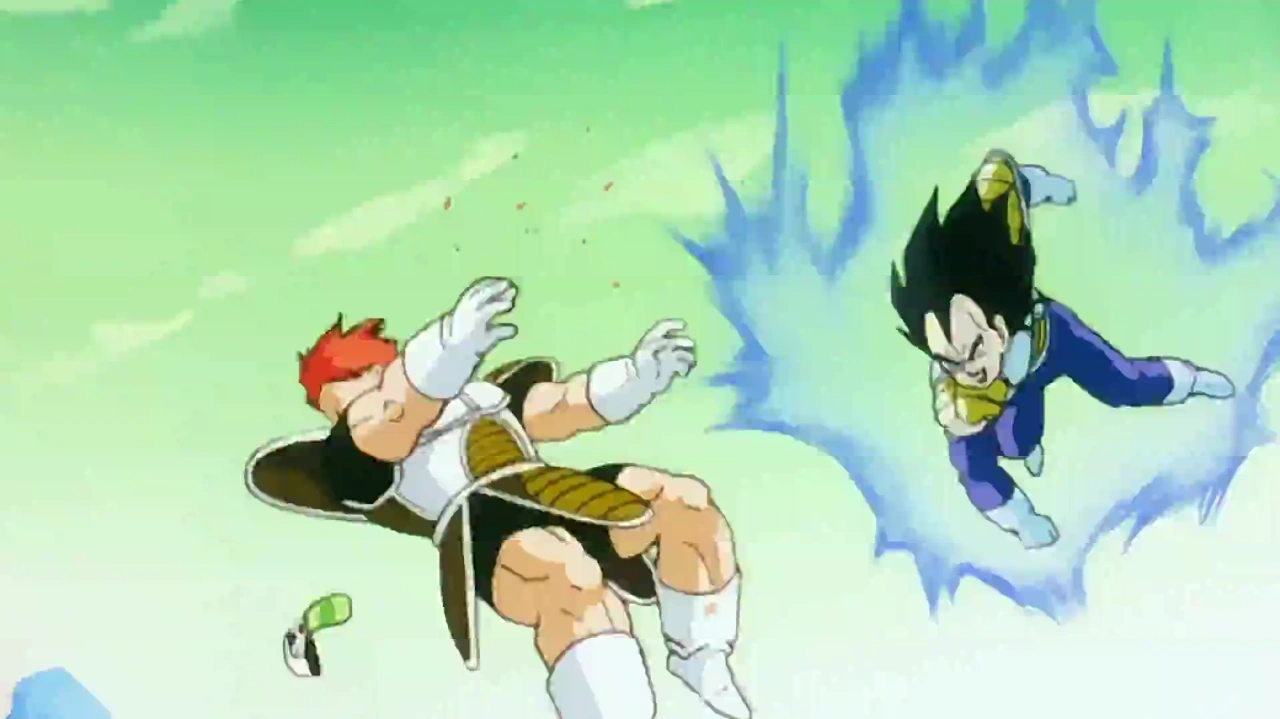
Use THOSE sky colors as a base grad instead of the sick green, you guys had the resources RIGHT there. The work was already done once, just copy it!
I'm not saying I expect the colorized manga to go in and paint every background or anything but color choices and definition matter and it just looks bad. It's servicable but its not so good I'm motivated to get it over the black and white original.[/hide]
-
I haven't looked at it too much (mostly the vivre cards) but what I have seen looks very solid and mimics Oda's marker color style very well. It overall looks nice though they run into problems with screen tone that they don't seem to know how to work around. If the series wasn't so freaking long I wouldn't mind getting color versions of some of it.
It edoes run into the same problem as the anime that some of the color choices Oda makes that look fine for a single image lok kind of bad on a character for dozens of pages, particularly some hair colors, but that is what it is.
Meanwhile I think the colorized Dragonball generally looks like complete novice garbage and I want it nowhere near me. Ick.
Part of that is just that the anime had a huge budget and really upped the standard on how things should look, especially when it comes to stuff like power ups underlighting characters and changing the colors of things, and the manga just doesn't really do that outside of kaioken. The shadows are all just sort of done with a base dark color rather than actually selecting two colors that work together, or ever being affected by the lighting around them, and the rendering is always unobtrusive… they pout color there just to put color there, but they never add any depth or dimension to it with the color. Compare almost any colorized manga screenshot to the anime screenshot, and the anime will look better.
[hide]
https://pbs.twimg.com/media/ER3X8WlW4AAuqsO.jpgThe anime version adds so much more rendering and depth to it, the color choices are better. Especially on Namek, the anime's green sky is WAY more pleasing than the manga's sickly neon green. The Recoom screenshot is kind of bad for how they usually did skies so…
https://comicvine1.cbsistatic.com/uploads/original/11134/111344940/6301565-1004738787-61e06.jpg
https://static.wikia.nocookie.net/dragonball/images/a/a2/Vegeta_strikes_first.png/revision/latest?cb=20180413171634Use THOSE sky colors as a base grad instead of the sick green, you guys had the resources RIGHT there. The work was already done once, just copy it!
I'm not saying I expect the colorized manga to go in and paint every background or anything but color choices and definition matter and it just looks bad. It's servicable but its not so good I'm motivated to get it over the black and white original.[/hide]
Yeah fair enough. I think Dragon Ball was one of their earliest releases in the style, so it tracks that it looks amateurish. The first few One Piece volumes are pretty flat as well, but you can see them finding their feet as they go. They still don't always know how to handle Oda's white halos between the moving parts and the backgrounds in some panels, but it's not a huge issue.
From what I've seen, Shueisha's colourists seem to be extremely beholden to the mangaka's linework, both for better and for worse. Outside of redrawing things like creases on sections that had been inked-in for the black and white, they don't often add any kind of texturing or glowing or gradient that isn't suggested in the inks, and keep their shadows and highlights understated. For artists who draw a lot of detail and render in textures themselves, that's fine, but for the simple, clean art of a Toriyama type, it ends up really flat-looking with big blocks of plain solid colour.
-
Yeah I get not wanting to obscure or overtake the artwork and that's fine… but basically just dropping flat colors and calling it a day is so basic there's really no point and it just kind of looks garish and bad.
-
[Twitter
-
Embedded for everyone's convenience:
Marco in this last part is a good show of some of the stuff Robby was talking about - with the colours in his wings blurring together too much into something murky rather than fiery, and his blue birdfeet blending in badly with the sea.
It also shows what I love about Oda's fire a lot better than the flames around Sanji's legs. There's something really satisfying in the rounded, rolling way he forms the tongues of flame, and it manages to look a lot brighter than a lot of the other energy effects in the piece because of the choice to use big, obvious white cores rather than fill the whole thing with colour. I can't think of many artists whose fire looks quite the same, so it always stands out.
-
3rd and final cover for ONE PIECE 7TH Popularity Poll
Embedded for everyone's convenience:
Not to be THAT guy, but have you consulted Shift about spoilers in this case?
Since that last time with the 1st piece, I think we need to be extra careful about showing here anything that is not officially released. The Shueisha video with the full picture was an "official release", but this is a leak. I'd be careful about that and check out before posting.Wano predictions: There will be 5 acts; All Straw Hats will get fights, some in Act 4; Big Mom Pirates will arrive; Carrot will have her moment, but won't join; Yamato will be a Kouzuki samurai and Wano's Guardian; Shanks will visit Luffy in Act 5; Next arc is Mary Geoise.
-
Not to be THAT guy, but have you consulted Shift about spoilers in this case?
They already put out the whole thing through official channels last week, albeit at an angle. It's not a spoiler anymore.
We only came down hard on not putting the images up before because we didn't want to set any precedent for people posting whatever they wanted from a new chapter just because they felt like it wasn't a spoiler, or we'd run into problems every time there was a color spread. And to respect the official release as is forum policy.
But this is already fully released publicly now so it's fine.
-
Am I wrong or this is the first time we see old Garp using black busoushoku?
-
They already put out the whole thing through official channels last week, albeit at an angle. It's not a spoiler anymore.
We only came down hard on not putting the images up before because we didn't want to set any precedent for people posting whatever they wanted from a new chapter just because they felt like it wasn't a spoiler, or we'd run into problems every time there was a color spread. And to respect the official release as is forum policy.
But this is already fully released publicly now so it's fine.
Oh, ok. All settled, then.
–-----------------------
Since this is not considered spoilker, I'll discuss it here.
This is my least favorite piece of the poster.
Sabo and Ace look cool, and they form, with Carrot, the "heroes" of this piece.
But almost everyone is oddly placed, IMO. Unlike the previous pieces, characters are not grouped by affinity. Buggy is off by himself, same as Carrot. Carrot's color scheme and positioning almost makes it feel like she's part of the marines and rushing with Garp, Koby and Kuzan to attack the others. Capone being focused outward, like most allies, makes sense, but Hawkins is also facing outward, instead of attacking the Straw Hats like the other Supernovas, which gives him an "ally" vibe. The Whitebeard pirates and marines are all over place and not neatly packed.
Not saying that it's bad, just that it feels a lot more chaotic than the previous 2 pieces.
--- Update From New Post Merge ---
Am I wrong or this is the first time we see old Garp using black busoushoku?
Well, we never saw him fighting post-timeskip, and haki was portrayed as invisible back then, so…
-
I think its interesting the only characters on this spread whom we have not yet seen in Post TimeSkip, are Crocodile, Eneru, and Mr2 (if you don't count the one cover page). So they are all in their Pre TimeSkip designs
-
Pretty sure we saw Crocodile in silhouette back during one of the early Reverie chapters, where everyone was reacting to Luffy's new bounty, and he's also in Stampede, if that counts. His coat in Stampede is more in line with the one he wore during Impel Down/Marineford, though, whereas the one he has on in the colorspread is definitely more in line with his Alabasta-arc coat.
No reason he can't have a selection to choose from, though…

Without love, it cannot be seen.
-
Pretty sure we saw Crocodile in silhouette back during one of the early Reverie chapters, where everyone was reacting to Luffy's new bounty, and he's also in Stampede, if that counts. His coat in Stampede is more in line with the one he wore during Impel Down/Marineford, though, whereas the one he has on in the colorspread is definitely more in line with his Alabasta-arc coat.
No reason he can't have a selection to choose from, though…
It's not even silhouette, he's clearly shown in one panel in chapter 903, reading the news about Luffy.
-
[Twitter


 ](
](