This is why I’m so on the fence about Carrot joining she just seems to fit in so well with the group
Volume 97 Predictions/Discussion
-
-
"He went the full length to draw Wanda but hey moved the panel a few mm to the side, rabbit is IN"
Say it out loud and realize how ridiculous this argument is
-
"He went the full length to draw Wanda but hey moved the panel a few mm to the side, rabbit is IN"
Say it out loud and realize how ridiculous this argument is
Wait wait, I have a better one, look;
Already existing printing limitations(since like the 80's) are clearly conspiring to make her a crewmate.
-
Prettymuch every page of One Piece is cropped. I'm pretty sure it's been literally decades since we had one without art running off at least one edge of the page.
But sometimes there's a milimetre or two of difference in how the magazine and volume versions are cropped (and apparently between the English and Spanish official releases too) so it was worth checking if there was any change, given how much debate that one page sparked back when it came out.
–- Update From New Post Merge ---
Oop, there it is. Imagine the stir the closer cropping would have caused if we hadn't already got the real whole crew at once panel.
That is totally true. Every page of One Piece is cropped, and in every version!
The only exception is the Spanish official version, which is the least cropped from all these versions. I once asked Redon if he had a backup of these Spanish chapters, but sadly I never got a reply. If anyone has it that would be awesome!!
An author does know what the margins are, so anything they want to be sure won't be cropped, like word balloons and such, goes well inside that margin.
Of course margins do exist..but, if you saw the raw art of each chapter, you'd notice that each frame is closed.
Take a look at this :
!
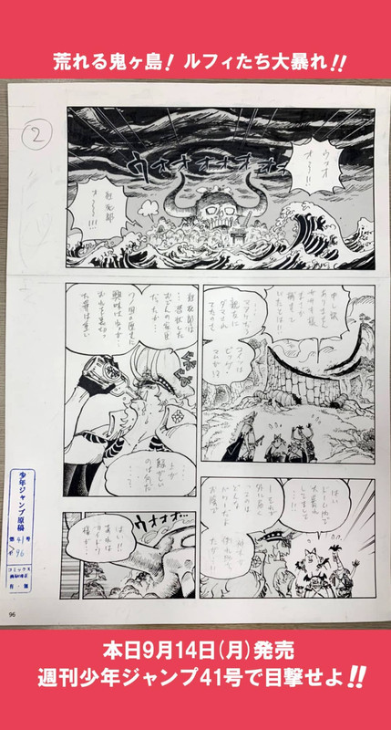
If they wanted it, they could release a full panel version…
Unfortunately, we have to accept the situation as it is....
-
That is totally true. Every page of One Piece is cropped, and in every version!
The only exception is the Spanish official version, which is the least cropped from all these versions. I once asked Redon if he had a backup of these Spanish chapters, but sadly I never got a reply. If anyone has it that would be awesome!!
Of course margins do exist..but, if you saw the raw art of each chapter, you'd notice that each frame is closed.
Take a look at this :
If they wanted it, they could release a full panel version…
Unfortunately, we have to accept the situation as it is....
But is that unfortunate? The art is designed to look the way it's displayed. Having the art run off the page means all the page is used (and given how busy the art is, means it can be displayed as large as possible) and gives the story an impression of being too big to be contained by the book. Look at all the awkward empty space beyond the speech bubbles on the top, right and bottom edges of the page, compared to how the ones on the inner panels and the left edge (which faces into the spine of a physical book in this case) are snug up against their panel boarders. There's not much we would stand to actually gain from having a "full panel" release. Oda's been doing this long enough to know not to put anything he considers important outside the edges.
-
But is that unfortunate? The art is designed to look the way it's displayed. Having the art run off the page means all the page is used (and given how busy the art is, means it can be displayed as large as possible) and gives the story an impression of being too big to be contained by the book. Look at all the awkward empty space beyond the speech bubbles on the top, right and bottom edges of the page, compared to how the ones on the inner panels and the left edge (which faces into the spine of a physical book in this case) are snug up against their panel boarders. There's not much we would stand to actually gain from having a "full panel" release. Oda's been doing this long enough to know not to put anything he considers important outside the edges.
You are right, we don't miss anything really important.
But, I have to disagree because I think it would be better if we had a full version, or at least, one like the Spanish official one (which is cropped but not as much as the English and Japanese ones).
I understand your argument though. When we face something like this, there are always two options. We either choose to complain about it, or see the good side and try to justify it to reassure ourselves. That's human. I noticed this problem long ago and I used to have the same reasoning.
Obviously I won't try to find any justifications for this anymore, because the Spanish version shows that if they wanted to give us a near full page (with minimum cropping) that would be possible (particularly digitally). It's just a convenient choice they made. I still hope we'll get a "full" version (and when I say "full", I mean like the Spanish one) someday though. Somehow.
-
You are right, we don't miss anything really important.
But, I have to disagree because I think it would be better if we had a full version, or at least, one like the Spanish official one (which is cropped but not as much as the English and Japanese ones).
I understand your argument though. When we face something like this, there are always two options. We either choose to complain about it, or see the good side and try to justify it to reassure ourselves. That's human. I noticed this problem long ago and I used to have the same reasoning.
Obviously I won't try to find any justifications for this anymore, because the Spanish version shows that if they wanted to give us a near full page (with minimum cropping) that would be possible (particularly digitally). It's just a convenient choice they made. I still hope we'll get a "full" version (and when I say "full", I mean like the Spanish one) someday though. Somehow.
Agree to disagree I guess. I think it's always a fun novelty to see the little bit extra when it comes up when they show the manuscripts or when a page is misprinted, but as an actual aesthetic/readability thing, the empty space and awkward speech bubble placement aren't worth it for a full release. You don't have to characterise it like I'm justifying something unacceptable to myself because I feel I've got no choice, it's just a fact that we're already seeing the manga as it was intended to be read and there are good reasons it's done the way it is.
-
Agree to disagree I guess. I think it's always a fun novelty to see the little bit extra when it comes up when they show the manuscripts or when a page is misprinted, but as an actual aesthetic/readability thing, the empty space and awkward speech bubble placement aren't worth it for a full release. You don't have to characterise it like I'm justifying something unacceptable to myself because I feel I've got no choice, it's just a fact that we're already seeing the manga as it was intended to be read and there are good reasons it's done the way it is.
Agree to disagree yeah completely. But courteously!
You have your opinion. It may be a fact for you, for me it's an opinion and vice versa, what is a fact for me is an opinion for you.
I won't try to win this debate by stating "facts", this is pointless. In the end, nobody can't deny that there's a difference between the Spanish, Japanese, and English versions. That's all.
I'll stop here for my part, this debate is pointless because it won't change anything to the situation itself. It's just that one will feel like he won and the other like he lost. Let's say that I lost and you won

Have a good day!
-
Agree to disagree yeah completely. But courteously!
You have your opinion. It may be a fact for you, for me it's an opinion and vice versa, what is a fact for me is an opinion for you.
I won't try to win this debate by stating "facts", this is pointless. In the end, nobody can't deny that there's a difference between the Spanish, Japanese, and English versions. That's all.
I'll stop here for my part, this debate is pointless because it won't change anything to the situation itself. It's just that one will feel like he won and the other like he lost. Let's say that I lost and you won

Have a good day!
Yeah, I've seen the potential back and forth before. We could talk about how the difference between the English and Japanese cropping could be measured in pixels in most cases while the Spanish release is a clear outlier and debate what, if anything, that means, but we're not going to change each other's minds about what we want to see of think is worth seeing. And there isn't anything wrong with that.
Hope you enjoy the rest of your evening!
-
the empty space and awkward speech bubble placement aren't worth it for a full release.
Well, the awkward speech bubble placement certainly wouldn't happen if the authors knew the page wouldn't be cropped. In a world where the entire page is always fully printed, the speech bubbles would be adequately placed.
And I actually like the empty spaces with the frames closed. And it gives more creative opportunity to the author, more room to deliberately play with the margins.
–- Update From New Post Merge ---
Wait… where are these pages published? This is from chapter 990.
-
Well, the awkward speech bubble placement certainly wouldn't happen if the authors knew the page wouldn't be cropped. In a world where the entire page is always fully printed, the speech bubbles would be adequately placed.
I mean, yeah, if printing and publishing standards were different, authors would work differently within them. That goes without saying. But even in the current system it still seems to be an aesthetic choice the author has the freedom to make. Oda has basically every panel that aligns with an edge run off the page but other authors deliberately have panels that end both inside and outside the page to varying extents depending on the series. Some use small, fully contained panels for downtime and exposition and blow things up to run off the page when the action starts. Hell, One Piece itself had this in the early years, even if Oda's definitely outgrown it. Or you could look at Assassination Classroom for a great example of a relatively recent manga that existed almost entirely within the confines of the page.
Boichi, for contrast, has stuff run off the edges all the time and into the spine as well for some godforsaken reason. Why he was allowed to do that when he wasn't making a double page spread I'll never understand.
-
Of course margins do exist..but, if you saw the raw art of each chapter, you'd notice that each frame is closed.
Oda draws to the edge of the borders, he wants it to be full bleed. He INTENDS for some of that art to be lost.
And even after all this time he still doesn't consider his two page spreads very well. Especially when he does that 2/3 thing, he often has important stuff falling into the spine crease. He's good about not putting words there, but art? Not so much.
I've worked with a lot of artists in my 20 years in the comic industry, and every single artist that does full bleeds completely fails to grasp where the actual cutoff is and always does more art that goes off the page, rather than stopping at the actual printing edge. Every single time.
-
And even after all this time he still doesn't consider his two page spreads very well. Especially when he does that 2/3 thing, he often has important stuff falling into the spine crease. He's good about not putting words there, but art? Not so much.
I think he knows exactly where the spine crease is, but doesn't care to avoid drawing meaningful stuff in it.
I say this because when he draws these 2/3 panels sometimes there are multiple small panels below the big one, and he makes a bigger space in-between them exactly where the cutoff is, but the big one suffers the blow in that very same vertical line.
I don't like it very much, especially now that Oda does "panels at the centre of the page" like the one Franky hits Big Mom with the bike.
-
To back up what Captain M and Robby are saying, there was actually a misprint for the first printing of volume 58 in Japan. They printed with the margins and it's definitely a very different visual experience; far less immersive than the artwork running off the page.
They fixed it for later printings, but the US edition is also misprinted. It only affects the double page spreads, but it's still very noticeable and in my opinion, is far less visually appealing.
The other factor that should be considered here is page / book size. To include the margins would be to shrink the image. You'd see more of the artwork, but everything would be smaller and less readable.
Maybe it might look okay in a larger format. But even then, the artwork is designed to run off the page, particularly in an action heavy series like One Piece. It makes the panel layout more dynamic and expressive and helps convey a sense of motion to the reader, which is really important.
You could compare to a series like Monster or Death Note, which are much more dialogue heavy. In those stories, panel layout is important, but not really intended in most scenes to convey a kinetic sense to the reader. Accordingly, it's fine if the panels are simple blocks with clearly visible borders / margins.
–- Update From New Post Merge ---
I think he knows exactly where the spine crease is, but doesn't care to avoid drawing meaningful stuff in it.
I say this because when he draws these 2/3 panels sometimes there are multiple small panels below the big one, and he makes a bigger space in-between them exactly where the cutoff is, but the big one suffers the blow in that very same vertical line.
I don't like it very much, especially now that Oda does "panels at the centre of the page" like the one Franky hits Big Mom with the bike.
This is honestly my biggest issue with the simple tankoban / US Volumes. I know the English edition is even a larger format with better paper quality than the Japanese volumes. But in both cases, it's difficult to read double page spreads without bending the cover / spine.
It's not a problem for the digital edition, for which double page spreads look great. It also works pretty well in the printed magazine if US Shonen Jump is any indication. But certainly in the smaller formats, it's a problem.
Yet another reason, I'd love to see a deluxe / larger size reprint of the series someday.
-
Speaking of that^^^
I always felt like Marine Ford had these cropping way more noticable than any other arc.
At least that's actually my experience with Viz Media's volumes.
-
Thanks to T.D.A (Worstgen Forums) to note that some changes between Vol. version & magazine of the Jump version :
-
Speaking of that^^^
I always felt like Marine Ford had these cropping way more noticable than any other arc.
At least that's actually my experience with Viz Media's volumes.
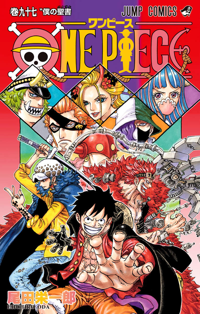
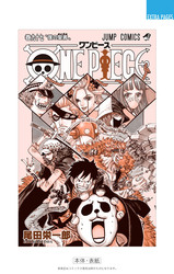
Hell yeah they even cropped a cover lol
-
Thanks to ONE_PIECE 2000 : differences between chapters in WSJ & the Vol. 97 :
-
@Raydjahs:
Wow, Oda went out of his way to make Usopp more obnoxious in that scene. Don't know if I'm more annoyed or impressed.
-
How is he being obnoxious lol?
-
I liked the original better as well. I thought it was cool that Usopp took his job as sniper / cannoneer really serious, despite the entire tank being filled with ladies.
It's not a big deal, just something I considered pleasantly unusual.
-
@Raydjahs:
Thanks to ONE_PIECE 2000 : differences between chapters in WSJ & the Vol. 97 :
https://pbs.twimg.com/media/Eja-f9kXYAE-eVf?format=jpg&name=large
https://pbs.twimg.com/media/Eja-mj7XYAEt8JA?format=jpg&name=mediumLots of little changes and corrections in this one. Can anyone comment on the dialogue tweaks? Just visually, it doesn't look like anything's changed in the first one besides its punctuation and placement in the speech bubble, but the second one actually seems to use some different characters.
-
Lots of little changes and corrections in this one. Can anyone comment on the dialogue tweaks? Just visually, it doesn't look like anything's changed in the first one besides its punctuation and placement in the speech bubble, but the second one actually seems to use some different characters.
My wife (we'll call her Onka) tells me it's the same meaning, a ship's shadow. The original, "senei", used what's called the on'yomi, basically the original Chinese pronunciation for the two kanji. The revision, "funakage", uses the kun'yomi, the Japanese equivalents.
Here's an example: 水 means water, and it can be read as the on'yomi "sui", like in Suicune the Pokemon, or the kun'yomi "mizu".
-
My wife (we'll call her Onka) tells me it's the same meaning, a ship's shadow. The original, "senei", used what's called the on'yomi, basically the original Chinese pronunciation for the two kanji. The revision, "funakage", uses the kun'yomi, the Japanese equivalents.
Here's an example: 水 means water, and it can be read as the on'yomi "sui", like in Suicune the Pokemon, or the kun'yomi "mizu".
That's great, cheers to you and your wife!
-
Does anyone know where I can find RAW Volume 97?
-
Does anyone know where I can find RAW Volume 97?
Give it a week for the digital version to come out, then it should be easy to find. Redon will probably share a download link like usual.
-
Give it a week for the digital version to come out, then it should be easy to find. Redon will probably share a download link like usual.
Okay, good to know, thankss!
-
-
Any news about vol 98's date? I thought of december but can't find any thread yet, so 2021?
-
Any news about vol 98's date? I thought of december but can't find any thread yet, so 2021?
Yeah, they hinted on a promo for the box sets it was planned for December, but there's still nothing on Shueisha's website. Presumably the unexpected two week break messed up the schedule.
It's definitely not coming with the other new Jump releases on the 4th. I don't think it's impossible for it to come out alongside the box sets on the 28th, but every day it's not officially announced makes that feel more and more unlikely. Mid to late January would be the safest guess, imo
-
If is late January vol 98 would be released with a buffer of 8 chapters, assuming ch.994 is really its conclusion.
-
Haha, that's a great find!
How would you bring it up in a possible Franky fight though? Why would any of them randomly talk about Kokoro?
But I guess it's better than the racist Jinbe / Sasaki pairing.
"Oh noes, who's going to fight the scary enemy fishman??!!"Everyone looks at Jinbe
They're together now. Lets see if anything comes up
-
English version covers got revealed a few days ago while the forum was down:


