Favorite designs:
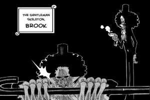
Brook
All CP9 members
Wanze
T-bone
Vivi
Carue
Eneru
Mr.1
Mr.2
Mr.3
Mr.5
Ms.Goldenweek
Gedatsu
Norla the snake
Mashira
Sarquiss
Jango
Van Auger
Moria
Doflamingo
Absalom
Perona
Dalton
Wapol
Ace
New Koby
New Helmeppo
Smoker
Franky
Usopp
Chopper
Dr.Hogback
Jigoro
Dogpen
Talaran
Ryuuma
Oz
Hachi
Buggy
Pell
Pandaman
Lulu
Arlong
Lucky Roux
Butchi
Foxy
Hina
Porche
Pearl
Nami
Lasso
Hildon
Aokiji
Whitebeard
Patty
Baskerville
Iceberg
Least favorites
Chimney and Kokoro-Too ugly
Sham-I like the green hair but dislike the outfit
Robin-I like her eyes and her hats but dislike her nose
Mr.4-He looks lame
Favourite Character Design
-
-
Ace
Zoro
Zeff
mihawk
rob lucci
whitebeard
shanks
smoker
aokiji
eneland lots more
-
heatxz wouldnt it have been easier to list the ones you dont like?
im going to list the ones i dont like: the swordshop mangager in loungetown. just because hes hounded by his wife…
there done!
-
My list for bad desighns.
.
.
.
Sames as Gorloms list. -
copycat ….. =(
-
No dont call me copy cat My mind is not working that well after those Naruto vs One piece war.
-
-
Speaking of Brooke, despite him being a favorite of mine, I find his design half awesome and half decent. The part about him being a skeleton is pretty groovy, but the suit has been done before. Oh well, I can live with it.
Higuma gets an honorable mention from me. His clothes seemed like an unique mishmash of foreign clothing. Maybe that's why I always imagined him with an Arabian dialect.
@Aldrich:etc etc etc
They're generic. If you have a problem with me saying that, get some sense into your head and move on.
And I predicted you were going to say scareface had the best design.
-
I already did that
a sorry missed that line near the end that wasnt a name =P (or i just interperated it funny as the ones you liked least amongst your favourites)
-
Blackbeard. He's a schemer, he's set to be a big player in the series, he's colossally powerful, etc…and Oda just has to go and make him a big fat guy with gappy teeth in a grubby shirt and a bandana. He's like...the anti-bishie.
Usopp. He's...ugly. In a weirdly feminine way. And refuses to wear a shirt, despite his lack of muscle tone. It just say it all about him, really- pathetic, but keen to show off all he's got all the same. It gets even better when he puts the mask and cape on...
Buggy. He dresses like a clown- even though, to my knowledge, he never tells any jokes, or does any clowning whatsoever. I guess he just...likes the clothes.
But yeah, the makeup, the scarf, the pointy shoes...if I ever cosplayed, it would be as this guy.Oh, and Kaku, in all forms. I love his high-necked tracksuit in Water 7, and I love giraffe's, so he can't lose.
Any I don't like? Um, Iceberg. It's that little curl, somehow it annoys me every time.
-
I had no idea so many people like Brooks design….he's a nicely designed character, but he ain't that great.
Meh, probably cause he's the current attraction of the new arc. Probably change eventually.
-
@Mizu:
Blackbeard. He's a schemer, he's set to be a big player in the series, he's colossally powerful, etc…and Oda just has to go and make him a big fat guy with gappy teeth in a grubby shirt and a bandana. He's like...the anti-bishie.
So very, very true. Part of the reason I like Blackbeard so much is because he has a look that most people wouldn't equate with powerful in the world of shounen manga. Hell, that whole crew looks great; I'm particularly fond of Van Auger's design. I just like the hat and monocle he has, obviously fits well with his theme. That and Jesus Burgess has me excited about the potential of professional wrestling maneuvers when he fights.
-
I liked that each of them had a sort of Western nation theme, German, French, Spanish, and Scandinavian.
-
@Mr.:
I liked that each of them had a sort of Western nation theme, German, French, Spanish, and Scandinavian.
Damn I totally didn't pick up on that. Great observation. Reading these last few posts have made me like Blackbeard's crew even more. I can't wait to see Blackbeard's role increase as time goes on.
-
I love Mr. Prince so much.
-
Seeing Mr. 9 always gives me warm fuzzies inside… I think I'm gonna have to go with his design as my favorite.
Sarquiss comes in second, just because he dressed like a pimp, and we all know pimps kicks ass...
-
Mr. 9 did indeed have an exceptionally snazzy suit. Ms. Friday on the other hand. :/
-
Anybody mention Bellemere yet? If she was real I'd probably court her, Sanji-style. I like my women like I like my coffee.. pink and with a semi mohawk.
-
Well my favourite CP9 is Blueno,seems a lot of people dont like him,its just his lack of emotions that got me.That and the door thing.
Next up is Kuma.We reaaaaaallly need another apearance of his.
Sengoku ,Akainu (Sakazuki design for now) Doberman ,Garp,John Giant (i really hope oda wont make him just a panel filling guy and that well see him in real time,sometime.After all hes the only marine that wears a gold-red uniform so hes gotta be something special) Onigumo and Aokiji for the marines
Whitebeard clearly
Laffite and Doc Q for the Kurohige Kaizokudan
Wapol and Don Krieg for one use villains
Moria fits in there too,its just that id really like him to be an actual giant, rathen then simply a big guy.
-
I think the only design that I didn't like so far was of… Hotori and Kotori =P
They were just a lazy, ugly copy of Satori. Okay, I know they and Satori are triplets, but Oda could make those two more original.
-
@Mr.:
I liked that each of them had a sort of Western nation theme, German, French, Spanish, and Scandinavian.
which one is which? (i can only spot the german… and burgess is mexican for me) and is there only 4 themes for 5 members? in which does Lafiette fit in?
-
Its funny how Luffy havent even been mentioned.
I like how some characters is huge (Ao Kiji, Whitebeard), without anyone saying anything about it.
-
which one is which? (i can only spot the german… and burgess is mexican for me) and is there only 4 themes for 5 members? in which does Lafiette fit in?
Lafiette is France.
I don't know the others. -
@El:
Its funny how Luffy havent even been mentioned.
I like how some characters is huge (Ao Kiji, Whitebeard), without anyone saying anything about it.
we dont like his design. its too generic hero type…

-
Arlong was cool.
-
@El:
Its funny how Luffy havent even been mentioned.
Actually, I liked his clothes for Unlimited Adventure and I love the pajama thing he wore after fighting Crocodile (not that I think his design is the absolute greatest).
I think he was designed to be plain looking though - which isn't so shabby of an idea.
-
Well I wouldn't say I dislike Luffy's design really since somehow Oda's style manages to make all the characters look interesting, but it's certainly not as complex and doesn't require as much thought. Personally I think it's simple but effective. The only real requirement for the design of the main character is that they are recognizable and that the readers can easily relate to them (thus, young male with dark hair). I think Luffy is a very successful design in that respect but it certainly wouldn't be anyone's favorite.
-
I think the only design that I didn't like so far was of… Hotori and Kotori =P
They were just a lazy, ugly copy of Satori. Okay, I know they and Satori are triplets, but Oda could make those two more original.
Awww, that's not very fair now is it?
-
They were triplets and fodder to get their ass handed to them by an awesome, crazy old guy with a lance.
They need not be designed well.
-
Let's see…
Franky
Braham
Perona
Hogback
Moria
Doflamingo
Kuma
Blackbeard
Gan Fall
Fukuro
Wanze
Ryuuma
Crocodile
Enel
Shura
BrookAnd that's all I have for now...
-
uh…...........Braham?
-
thats one of the raiders isnt it? think it was the one Zoro fought…
but i can be "completly out riding my bicycle" on this one
(native saying that has been translated into english just for fun.. the meaning should be somewhat obvious in the context) -
thats one of the raiders isnt it? think it was the one Zoro fought…
but i can be "completly out riding my bicycle" on this one
(native saying that has been translated into english just for fun.. the meaning should be somewhat obvious in the context)Yeah, that's him. The good old basket head.
-
That's kind of the point of a shounen hero- their character designs have to be fairly simple and normal-looking, so the reader can identify with them. Naruto and Ichigo are ordinary teenagers too.
You ever notice how normal Superman and Batman look out of their costumes? It's like that. -
@Mizu:
That's kind of the point of a shounen hero- their character designs have to be fairly simple and normal-looking, so the reader can identify with them. Naruto and Ichigo are ordinary teenagers too.
You ever notice how normal Superman and Batman look out of their costumes? It's like that.It could also be because a creater wouldnt want the main character to be too complicated, seeing as he is going to draw him the most.
-
1.) Mohji – my favorite character, his design is 50% of why I like him. He's just ADORABLE, his hairstyle shaped like various animals (bear, bunny, lion... what's next?), and his li'l furry halter top is too cute for words. My favorite hairstyle was the original, but I also love his li'l bunny ears sprouting out of the pink helmet. He's proper classic, deffo.
2.) Franky -- I don't know what it is about him, he's just HILARIOUSLY designed. His li'l speedos on his muscular bod... it's sexy yet the entire rest of his body cancel that all out, it's fantastic. I love his chin, also.
3.) Doflamingo -- possibly the gayest design I've ever seen, I love it. And I love that despite his extremely effeminate appearance, he's one of the most powerful OP characters.
4.) Miss Merrychristmas -- I love that Oda put in an older woman as a mercenary, it's completely off-the-wall and unique. And she's a GOOD fighter at that! I love her poofy hair and her christmas-themed outfit, it's hilarious.
oh hey you're back
-
Gecko Moria: Even when we saw the vague shadow of him back in the beginning of Thriller Bark, I liked his design. His body is weird, yet great. To me, he's like a mix between Him (Powerpuff Girls), and Ursula (The Little Mermaid). Seriously, a fat body and a long, slender neck looks awkward, yet Oda's touch makes him one of the best Shichibukai.
Foxy: The small touches like his long, red nose and fox-ear hair.
T-Bone: It's funny how early in the Puffing Tom ride, he looked normal since only his eyes were shown. But when he was revealed to be ugly, it made me laugh. I think that was Oda's intention.
Enel: If not for the freakishly long ear lobes and lines on his nose, he wouldn't be one of the best designs.
-
Crocodile, Eneru, Braham, Sanji, Franky, Usopp, Mr. 9(gotta love the crown :D), Wiper, Bonny Boy.. Who can really pick just one favorite character design? Oda-sensei is the master in making unique and rememorable character designs.
-
I think the Ace Ventura look made me love Franky.
I also like alot of the oddly proportioned characters as well, which I guess Franky falls under (Popeye arms, FTW!)
-
I like Smoker's new design a lot better than his old. He looks way tougher now. And Hot Damn! Same for Kuina, I mean Tashigi. She looks so much better with longer hair. And I've always loved Hina's design! There's something about women in suits that are just….wow
-
I don't know why I always loved Sanji's classic design… But Smoker, Zoro, Ace and Lucci were bad-ass too... Especially Zoro's Sky-Pia design
-
Brook definitely. A mix between the skeleton from Nightmare before Christmas and Slash from Guns n Roses lol.
Franky is hilarious too, a mix of Popeye and Elvis Presley in panties.
-
-
-
@Senshi:
Gecko Moria: Even when we saw the vague shadow of him back in the beginning of Thriller Bark, I liked his design. His body is weird, yet great. To me, he's like a mix between Him (Powerpuff Girls), and Ursula (The Little Mermaid). Seriously, a fat body and a long, slender neck looks awkward, yet Oda's touch makes him one of the best Shichibukai.
For me he is the love-child between Snorlax and Frank N. Furter.
But indeed, he is the Shichibukai of best look who appeared so far, being Mihawk the second one.
-
For some strange reason looking back over the chapters recently, I decided I really liked Arlong's design… Don't quite know why. O.o'
-
i dont know why but my favourite is grown up coby! But i also like usopp a lot!
-
Can't belive nobody said Judge Baskerville yet. One can not function without the othes. Like most others Brook also tops my list. I mean come on a skeleton with an afro can't be beat. Others include Doflamingo, Kuma, Enel, and the entire Blackbeard crew.
Worst character design is probably Pearl. Pearl wearing two shields as his shirt looked totally weird. The other bad character design that comes to mind is Jozu(Whitebeard's 3rd division leader). He looks so unoriginal to me. He reminds me of an oversize version of Cricket.
-
After watching the Fukurou fight, I have to put him as probably Numero Uno.
He's horribly fat and has stubble, but he's bizarrely cute. Chapa chapa chapa…


 ♪♫♪♫♪
♪♫♪♫♪


