Vol. 46 Discussion Thread
-
-
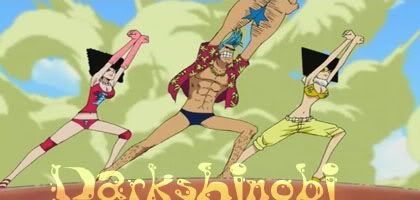
Most of the cover is obviously lazy (rerun of the zombie run), but Brooke makes up for it. Its like he's just yelling out "BONE!" with his position.
-
The cover's probably the laziest one yet, but it's pretty much perfect for this volume. Plus, Brooke makes it.

the bigot who thinks being an asshole is actually worth shit
-
Lovin' it!
But I'm afraid Carlsen will mess up the german version of Vol. 46 with the famous blue Cover >> (at least I think the fullmoon will optical disappear).
Ah, nevermind XD Brooke's on the cover with a pretty nice pose, so I can't complain x3 -
I'm quite disappointed they he simply reused a coverspread. Tho I forgive him if it was making it and Jump decided they'd use it….tho I don't think that's the case.
It's a great cover, no doubt, just...has Oda ever done this before?
-
It's pretty lazy, but I don't mind. That Jump cover kicked ass so it's fine. Plus, Brook looks awesome!! And I guess Luffy is really wearing orange and red then.
-
Funny, Brook's colors are exactly how I pictured them, minus the purple cane/sword.
-
Never has there been a more colorful horror based thing.
-
Thanks to Heiji Sama:
http://img184.imagevenue.com/loc512/th_08212_978-4-08-874382-0_123_512lo.jpg
Brook's clothes look good with Orange and Black but i wish that Brook's Afro were in a different color like purple or blue

Kamen Rider OOOs
-
Yuck. Thats basically the same thing as the cover from a Jump issue with Brook basically copy and pasted on. A bit lazy imo… Theres also a lot of blank orange space right above the zombies and SH. Wow, I really hope that the next volume is better.
-
Pretty lazy, sadly. That's not even a very well resized version of the Jump cover. Brook looks nice, though.
-
You guys never know how to appreciate, don't you? My father and friends who went to USA were right after all about Americans not being able to appreciate anything…
-
This post is deleted!
-
Oh no.
Oh God no, they're back again.
Opinions, those bastards_._
-
It's a bit unexpected but it's still the sort of image I imagined the cover would have with Brook possibly being featured on it. Anyway I can't wait to see the interior shots of the Thousand Sunny.
-
LOL! Gimme 5, Hitotsumami!!
-
This post is deleted!
-
Eeek, where did you find this?
I don't believe that that's the real cover (But that's just me)
It looks like it was Photoshopped or something.
It's just too damn lazy.
And something else is off about it….
Like the edges, there's no, outer rim like there is on every other cover, if you get what i mean.
O wait, there is, but, it's the same as the backround and.....it's odd. -
@Kitsune::
Eeek, where did you find this?
I don't believe that that's the real cover (But that's just me)
It looks like it was Photoshopped or something.
It's just too damn lazy.
And something else is off about it….
Like the edges, there's no, outer rim like there is on every other cover, if you get what i mean.
O wait, there is, but, it's the same as the backround and.....it's odd.It's from the Shueisha's site, the publisher of WSJ & One Piece. They upload every single volume cover on their site a few days before release.
It's very real, deal with it.
-
I like it, then again I really liked the Jump Cover plus Brook's there which is always fun. Despite the laziness it's a decent cover.
-
@Battle:
It's from the Shueisha's site, the publisher of WSJ & One Piece. They upload every single volume cover on their site a few days before release.
It's very real, deal with it.
can you give me a link?
It still just seems a bit too shoddy. -
Its real: also saw the ES21 and Bo-bobo covers for the month too.
http://books.shueisha.co.jp/search/book_image/978-4-08-874382-0.jpg
-
Which chapters are listed? The usual ten??
She/Her
-
sry
but can someone post cover46 bigger? -
Pfft, they got lazy. The second I saw that issue of WJ, I knew that they just should have saved it for 46. Oh well, at least Brooke is there.

Believe is song ripped from a dance craze that involves women in as little clothing as possible and crazy sex. The only thing happy-go-lucky about it is my cock.
-
I don't like Brook's colors. They look ugly :X
-
Yuck. Thats basically the same thing as the cover from a Jump issue with Brook basically copy and pasted on. A bit lazy imo… Theres also a lot of blank orange space right above the zombies and SH. Wow, I really hope that the next volume is better.
The blank orange space looks like the moon to me.
I like the cover, even though it is the same thing we saw on the Jump cover. My hope would be that Oda was making this, and Jump was like "let's use it for a cover too!" But the image is still a good one, and seeing Brook on the cover is great. His color scheme is brighter than I thought, but it still looks good.
-
been waiting for this one. a bit disappointed that it's just the jump cover (especially since i went to all the trouble to buy the magazine in japan town because i liked it so much–and now it's on the volume too), but brooke looks great, and i LOVE his colors. i kind of figured him to be almost entirely black and white, and his clothes and purple cane reveal a lot of his fun personality.
-
@Yuugi's:
Which chapters are listed? The usual ten??
Chapter listings won't be up until the 3rd (which will be the 4th in Japan…about 10 or 11 in the morning in this country).
-
yeah right gogoedward
brook's color is not bad
i haven't seen the jump cover jet
lol
but it's the same -
@Battle:
It's very real, deal with it.
Thanks to your avatar I can only read this in Ben's voice.
Cover's alright. It does seem like they had to scramble for a picture though.

-
Yeah, that does sound like something Ben would say. "Do you really think you have the right to tell me about this tankoban?"
I personally see nothing wrong with the cover. Sure, they used artwork that's already been seen, but at least we see Brooke's official color scheme. Maybe next tanko, we'll see ones for the Thriller Bark Four.
-
Brook's clothes look good with Orange and Black but i wish that Brook's Afro were in a different color like purple or blue
yeah that'd be awesome if you were a retard
the bigot who thinks being an asshole is actually worth shit
-
@Cap'n:
yeah that'd be awesome if you were a retard
Yea HEATXZ, and while you're at it, paint Brook's afro red and give him a bannana nose.
Geese Cap'n Carter, the nerve of kids these days… :getlost:
-
Don't you talk to me
-
Cool cover, lazy on Oda's part, but Brooke looks very cool. He's got a little color on him, but not so much to make him look like a clown.
-
@Lobster:
Yea HEATXZ, and while you're at it, paint Brook's afro red and give him a bannana nose.
Geese Cap'n Carter, the nerve of kids these days… :getlost:
Come on now, I'm sure he was only joking about the neon afro. No need to be so mean about it, brotha'.
-
You guys never know how to appreciate, don't you? My father and friends who went to USA were right after all about Americans not being able to appreciate anything…
So do you come from the Republic of Chickenshit Discussion or what? Seriously. Stop turning into a whiny faboy everytime you see people betraying WON PEESE. Let alone bringing up some stupid prejudice crap that your family came up with.
As for the cover had I already seen and poured over the jump cover I'd be pissed, since I didn't I'm fine with it, mostly because of the creamsicle background, nice color that..
Maybe he was putting so much extra effort into making Sunny Go cross sections? -
That or A.) he's just lazy or B.) he already had this cover designed and had to use it for the JUMP cover due to a sudden deadline. Probably the Sunny thing though.
-
@seventyseven:
yeah right gogoedward
brook's color is not bad
i haven't seen the jump cover jet
lol
but it's the sameWait…what did I say?
-
@Cap'n:
The cover's probably the laziest one yet, but it's pretty much perfect for this volume. Plus, Brooke makes it.
Possibly, but I still don't think it beats the laziness of volume 6. At least the cover makes sense for this volume.
-
You have the greatest signature ever sir. Tis a shame its creator is unknown.

Jump Ultimate Stars FC: 4596 6023 4615
-
Well, I understand people's points of view but I also think Oda has been pretty busy these last few weeks, what with the 10 anniversary of One Piece coming up, plus Summer holidays and spending time with his wife and friends.
The man has a private life too y'know?
-
Y'know…I actually forgot about Volume 6 being a chapter cover, not to mention being non-contextual...
But I always loved it anyway, since Oda's color scheme choices for the rest of the cover really kicked ass.
In the light of that theres nothing the matter with this for me. -
You have the greatest signature ever sir. Tis a shame its creator is unknown.
If you are referring to warp, Taboo drew that pic.
http://www.deviantart.com/deviation/36213036/ -
No, it's the "Light gives swimming lessons" signature. The file was wayyyyyyy too huge for this forum though.
Go to the death note animation thread if you want to see it.

_ Originally Posted by mr.allsunday
Nice job jumping on the bandwagon there Aethos, I can only wish I was as cool as you_
-
Volume 6 was never a favorite of mine, but it isn't terrible.
-
No, it's the "Light gives swimming lessons" signature. The file was wayyyyyyy too huge for this forum though.
Go to the death note animation thread if you want to see it.
Oh, that one. I saved it as soon as I saw it. Looks like it was a good idea.
-
I was about to condemn it for being lazy but when you consider the massive number of OP projects Oda is juggling at the moment, it makes sense.
There's the Kamakura event and then the Universal Studios Japan event which he's both involved in, then the 10th Anniversary Celebration releases culminating in 10th Treasures.
He's been a busy beaver so I think we should cut him a little slack in that respect.
457 is still a sin against humanity though no matter how busy he's been.