@Joy:
I hope Luffy and Katakuri are the centerpiece
Really, it's either that or the cake. Or both.


@Joy:
I hope Luffy and Katakuri are the centerpiece
Really, it's either that or the cake. Or both.
Or Flambe all over it.
That would be absolutely glorious. I would immediately change my avatar for a coloured version of the best fangirl of all time.
That would be absolutely glorious. I would immediately change my avatar for a coloured version of the best fangirl of all time.
Shes isnt really a fangirl…


Twitter: https://twitter.com/Mugiwara_23
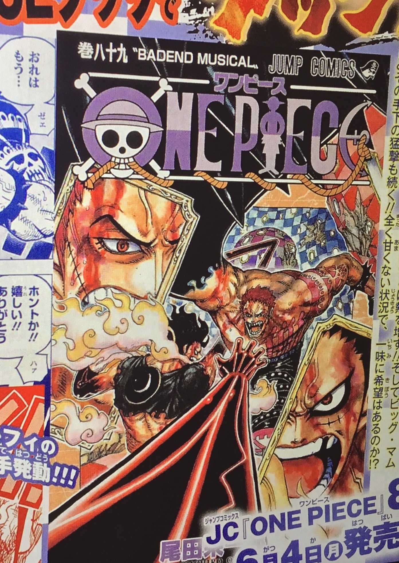
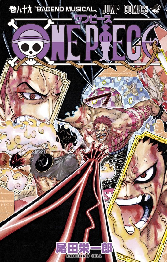
The cover looks great!
But sadly I instantly noticed Katakuri got normal teeth on the closeup shot…
Yeah! Thanks redon- really nice it‘s centred only around those two.
Edit: Thing with his teeth is indeed strange.
That's a damn good looking cover, and the weird teeth inconsistency mat be due to it being partially covered.
Sent from my iPhone using Tapatalk

So, Red Gear fourth is now canon, also the smoke looks fire-ish.
Appreciate it whenever the volumes are focused and aren't a jumbled mess.
The title is very well picked, but the decision to end the volume on that cliffhanger doesn't sit well with me.
That's a damn good looking cover, and the weird teeth inconsistency mat be due to it being partially covered.
Sent from my iPhone using Tapatalk
Nah, he definitely got regular human teeth:
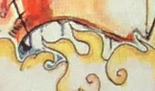
But I wonder if they can fix it in time. It's still 20 days until it goes into sale, so maybe the volumes are not printed yet…
That's one good cover, I appreciate focused ones like this.
I didn't get what I expected, but I got exactly what I needed. This is gorgeous, I can't wait to see it in full, without the magazine text in the way.
Interesting look at the colours of Mirroworld. Toei's had it totally pink and purple and made it look very dark. I had figured it was pale green and yellow, like the backdrop to vol 85's cover, but apparently the wall colours vary a bit in Oda's mind. Interested to see what they do with it in the digital colour manga.
THis is actually the first volume since 48 to depict only 2 characters. And I must say it’s gorgeous.
@Lao:
THis is cruelly the first volume since 48 to depict only 2 characters. And I must say it’s gorgeous.
Not to mention the fourth ever to be so minimalist.
How about this ?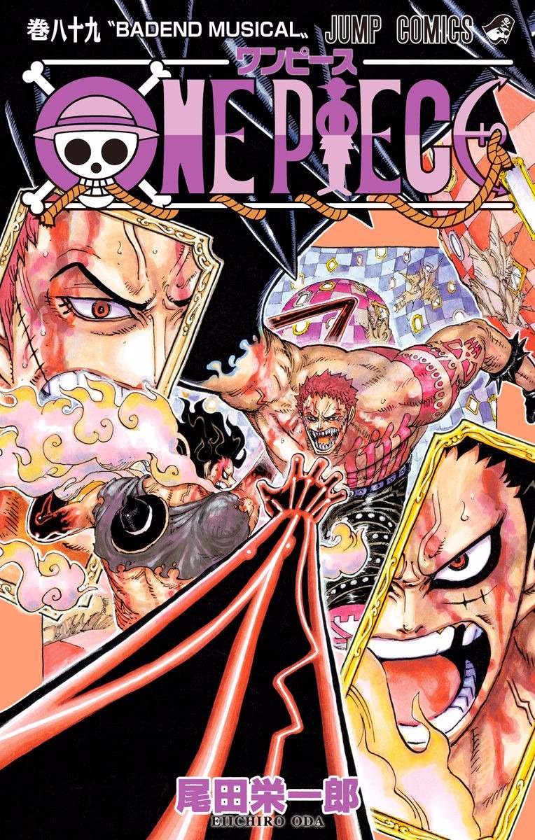
Yes! That's exactly the cover I wanted! Loved It!
Another thought: all the letters in the title have a checker thing going on except the O at the start. Kinda feels like an oversight to me. Maybe it'll be fixed for the actual release. If not that, then the digital release. I mean, it could be deliberate, but I don't see what the logic behind the choice is.
I haven't seen a cover like that in a really long time, and it looks great. Not only the character minimalism, but that angle! Looking forward to seeing it in HD.
So, Red Gear fourth is now canon,
Was it ever not? I always figured it was gear 2 + haki given all the steam.
Also lol, the teeth.
–- Update From New Post Merge ---
Another thought: all the letters in the title have a checker thing going on except the O at the start. Kinda feels like an oversight to me. Maybe it'll be fixed for the actual release. If not that, then the digital release. I mean, it could be deliberate, but I don't see what the logic behind the choice is.
The straw hat is the lighter colour in the O.
In the manga Gear 4th was black and blue instead of red but that was changed in the anime. I suppose Oda decided to go with the anime colors now (or maybe the anime used those because Oda had already changed his mind).
In this cover you can see Katakuri's has a blue shade, though. I wonder if BM's will have a different color (pink?) and we'll have each character with their own.
@.access:
In the manga Gear 4th was black and blue instead of red but that was changed in the anime. I suppose Oda decided to go with the anime colors now (or maybe the anime used those because Oda had already changed his mind).
In this cover you can see Katakuri's has a blue shade, though. I wonder if BM's will have a different color (pink?) and we'll have each character with their own.
I reckon we'll find that the Gear Four forms are colour coded. The blue-grey we've already seen for Boundman on vol 79's cover. Red for Snakeman here. I'd guess Tankman will have its own colour as well, if it ever gets on a cover, or just when the colour version reaches it.
I reckon we'll find that the Gear Four forms are colour coded. The blue-grey we've already seen for Boundman on vol 79's cover. Red for Snakeman here. I'd guess Tankman will have its own colour as well, if it ever gets on a cover, or just when the colour version reaches it.
If Oda was going for a color for each "-man" I suppose he would have warned the anime team to not change Boundman's, specially to one he planned to use for another form (and the anime wouldn't have used the same color as Boundman for Tankman). Or, if things got to this point, he wouldn't use the same color the anime used for Boundman for Snakeman.
He probably just decided to use red instead of blue for G4.
@.access:
In this cover you can see Katakuri's has a blue shade, though. I wonder if BM's will have a different color (pink?) and we'll have each character with their own.
The anime has flirted with this idea a bit. Aside from Gear Fourth's red highlights, I recall Vergo's Armament Haki having purple highlights, Doflamingo's being light blue, and Burndy World's from that special being green.
@.access:
If Oda was going for a color for each "-man" I suppose he would have warned the anime team to not change Boundman's, specially to one he planned to use for another form (and the anime wouldn't have used the same color as Boundman for Tankman). Or, if things got to this point, he wouldn't use the same color the anime used for Boundman for Snakeman.
He probably just decided to use red instead of blue for G4.
He may have decided on colour coding only recently, after the anime made its choice. It may have always been intended, but miscommunicated, or the anime decided red would look better with their art style and rolled with it, because adaptations make changes like that sometimes. Remember bright pink Gear Two? These things happen. Either way I don't think Boundman's colours are going to be retconned. They've been shown too blatantly on the volume cover to take back and change.
We won't really know for sure what Oda's thinking until we get another colour Gear Four illustration I suppose, though I'd be willing to call the colour manga's version a confirmation if that comes out first. (or if someone like Greg can offer insight, but I don't think it'd be right to @ him about it before the cover goes up officially on the website.)
The cover's amazing. Now to ruin it.
! Katakuri's just a normal dude with normal teeth in the top left section yelling "AHHHHH"
Nevermind, access saw it too. The perspective and angle of the cover is by far my favorite part. Very unique.
 Croc or Enel would never.
Wanna see the "ancient civilization destroyed" thing done really well? FFXIV did a great take on it. The bar's high for One Piece to beat.
The cover's amazing. Now to ruin it.
! Katakuri's just a normal dude with normal teeth in the top left section yelling "AHHHHH"
Nevermind, access saw it too. The perspective and angle of the cover is by far my favorite part. Very unique.
The mirror shows the version of himself his family knows, a distorted reflection of the real thing. Deep, deep mochi symbolism.
Or Oda just understated the fangs so bady it gets lost if you can't see the tips of them under Luffy's steam. That's fine too.
He may have decided on colour coding only recently, after the anime made its choice. It may have always been intended, but miscommunicated, or the anime decided red would look better with their art style and rolled with it, because adaptations make changes like that sometimes. Remember bright pink Gear Two? These things happen. Either way I don't think Boundman's colours are going to be retconned. They've been shown too blatantly on the volume cover to take back and change.
We won't really know for sure what Oda's thinking until we get another colour Gear Four illustration I suppose, though I'd be willing to call the colour manga's version a confirmation if that comes out first. (or if someone like Greg can offer insight, but I don't think it'd be right to @ him about it before the cover goes up officially on the website.)
According to Naotoshi Shida, the anime made G4 highlights red because the animation team was in talks with Oda so it's very possible that Oda changed his mind & retconned the color.
According to Naotoshi Shida, the anime made G4 highlights red because the animation team was in talks with Oda so it's very possible that Oda changed his mind & retconned the color.
Now that is interesting. But I can't help feeling it doesn't line up with timeframes and the like. If the manga colour for G4 was only decided when it was put on the vol 79 cover - volume released October '15, so the illustration was probably completed sometime that September, and the anime colours were revealed in an episode that aired January '16… A 4 month gap between anime and manga colours sounds like a lot, but considering how long in advance anime episodes would have to start production (hey what is the exact timeframe for that?) the decisions can't have been made too far apart. Seems odd Oda would change his mind of G4's look so quickly.
The mirror shows the version of himself his family knows, a distorted reflection of the real thing. Deep, deep mochi symbolism.
Or Oda just understated the fangs so bady it gets lost if you can't see the tips of them under Luffy's steam. That's fine too.
What if… It's the way he imagines himself fighting Luffy. "I'm going to fight my senpai with perfect teeth, just like his!"
Croc or Enel would never.
Wanna see the "ancient civilization destroyed" thing done really well? FFXIV did a great take on it. The bar's high for One Piece to beat.
I don't think coloring would be that big of an issue for anime production. There've been occasions where an episode preview video or image will show a character colored one way, then when the episode actually airs that week it's something else. This has happened to at least Cracker and Sugar from what I recall.
And it could always be a case of the anime team coming up with the idea first and Oda deciding that he liked it enough to keep.
It's an okay cover. Luffy and Katakuri being on it was a given. I like the touch withthe mirrors and the dymamic angling. I just… I dislike gear 4 Luffy so much. It's like the epitome of shonen power up aesthetics and that turns me off lol. And I too instantly noticed the weird teeth thing. Can't unsee it. Wish it was just the two of them eating donuts on the cover.
Im so glad Kuma didnt stay orange
It's an okay cover. Luffy and Katakuri being on it was a given. I like the touch withthe mirrors and the dymamic angling. I just… I dislike gear 4 Luffy so much. It's like the epitome of shonen power up aesthetics and that turns me off lol. And I too instantly noticed the weird teeth thing. Can't unsee it. Wish it was just the two of them eating donuts on the cover.
I already disagree regarding Snakeman, but are you including Boundman as well?
@.access:
Nah, he definitely got regular human teeth:
[qimg]https://s7.postimg.cc/k5wbnusi3/katakurodonto.png[/qimg]But I wonder if they can fix it in time. It's still 20 days until it goes into sale, so maybe the volumes are not printed yet…
Maybe he had some good ol' milk with his donuts and it fixed his teeth. Never underestimate the power of calcium.
Sent from my iPhone using Tapatalk
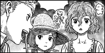
This one may be nitpicking, but why Luffy's reflection on the mirror has the scar and the missing tooth on the left side? That's not how mirrors work. I suppose we can explain that by saying we are seeing them through the mirrors, not reflected on them, but I doubt that was the intention…
And now that I said this, I realized that it would be a nice addition if Oda made the characters be "flipped" inside the Mirro-world.
@.access:
This one may be nitpicking, but why Luffy's reflection on the mirror has the scar and the missing tooth on the left side? That's not how mirrors work. I suppose we can explain that by saying we are seeing them through the mirrors, not reflected on them, but I doubt that was the intention…
And now that I said this, I realized that it would be a nice addition if Oda made the characters be "flipped" inside the Mirro-world.
But then we shouldnt see any of Katas face in the mirror.
Amazing cover! In my top 5 covers ever! Let's see if anime does justice to that epic fight!
while I do like the cover, personally, since it is the last volume of whole cake before she eats the cake, I would have preferred starving monster mama with burning hair destroying the sunny as a cover image
We'll get witch Linlin when she and Kaido clash at Wano :ninja:
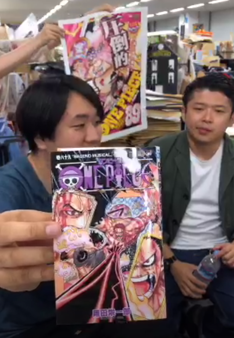
Cropped version, just in case it doesn't show up on the website in a couple hours.
!
Cropped version, just in case it doesn't show up on the website in a couple hours.
I just now realized the the cover is actually orange. There's so much stuff in the way that I couldn't tell.
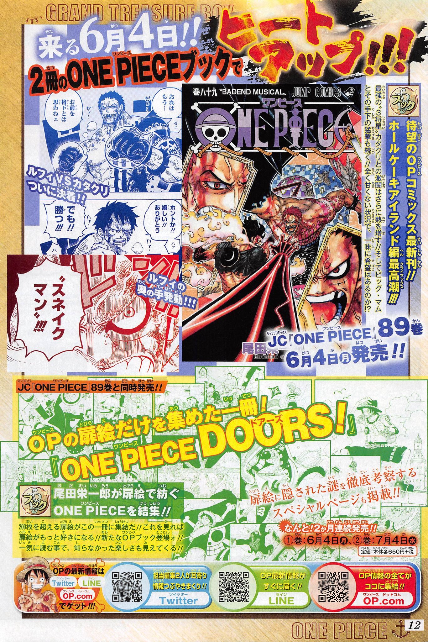
One Piece Volume 89 HQ cover from official website.

Twitter: https://twitter.com/Mugiwara_23
Twitter: https://twitter.com/Mugiwara_23
When can we expect the sbs?
They're holding it just right so we can't see who's on the spine, the teasing bastards! I'm curious to see it this time, since Luffy's at a bad angle to be cropped down and Katakuri got one all to himself just recently.
@'T€:
@$;3894423']When can we expect the sbs?
In about two weeks when the volume is actually released.
Luffy got his tooth back.. Did he lose it again during the fight?
Check out my podcast for conversations about Greatness in anime, sports, music, and whatever else we can think of.