@Yuugi's:
Because, JUMP is a Shueisha comic magazine so you should only use Shueisha comics.
Just because you think that doesn't mean they absolutely HAVE to run it that way.


@Yuugi's:
Because, JUMP is a Shueisha comic magazine so you should only use Shueisha comics.
Just because you think that doesn't mean they absolutely HAVE to run it that way.
I'm sure Shueisha wouldn't like their brand being used as a platform for rival comics.
@Yuugi's:
I'm sure Shueisha wouldn't like their brand being used as a platform for rival comics.
[sarcasm]Yeah I'm sure they'd REALLY care about what Viz does.[/sarcasm]
[sarcasm]Yeah I'm sure they'd REALLY care about what Viz does.[/sarcasm]
Yeah, they do. Kids swarm to JUMP, if a rival companies comic was in it and it boosted sales of rival comics and their Anime counterparts that'd piss them off, I'm willing to bet.
In short, non-Shueisha comics won't, and shouldn't, be in Shônen JUMP.
They could always do another Shônen magizine, like Shônen Sunday, but don't get your hopes up.
Idly wondering– what's the deal with Viz and representing money?
I've been reading Ouran High Host Club, and they refer to the initial portion where Haruhi breaks a vase costing '$80,000'. Come on! It's a series set in Japan-- did they mean '10 million yen' or did the original actually say 80,000? Meanwhile, at appropriate junctures in Eyeshield 21, they just annotate prices with dollar counterparts; it's amusing to see the exchange-rate-as-of-press-time rise and fall.

[sarcasm]Yeah I'm sure they'd REALLY care about what Viz does.[/sarcasm]
Since the company itself owns a portion of Viz Media I would think they do care.
Good thing is, by 2008 Crocodile will be introduced, and the cliffhanger will be Ace's intro. So, atleast with this 3 chaps a month were getting somewhere. I just hope they don't go back to 2 chapters a month. That was horrible.
Got my Issue yesterday. I noticed one thing none of you pointed out;
according to page 360, they're going to release Cowa! next year.
I saw that, but I have no idea what it is, so I didn't mention it here.
Idly wondering– what's the deal with Viz and representing money?
I've been reading Ouran High Host Club, and they refer to the initial portion where Haruhi breaks a vase costing '$80,000'. Come on! It's a series set in Japan-- did they mean '10 million yen' or did the original actually say 80,000? Meanwhile, at appropriate junctures in Eyeshield 21, they just annotate prices with dollar counterparts; it's amusing to see the exchange-rate-as-of-press-time rise and fall.
They sometimes do that, in the older volumes of Shaman King and JoJo they put down a footnote that says how much it is IN AMERICA.
They sometimes do that, in the older volumes of Shaman King and JoJo they put down a footnote that says how much it is IN AMERICA.
That's in Hikago too [at least by my vols], 1-6 all put the Yen in and have a footnote translating how much it is in USD.
Actually I never saw a company NOT doing that. What's wrong about it?
Or did I get you all wrong?

Good thing is, by 2008 Crocodile will be introduced, and the cliffhanger will be Ace's intro. So, atleast with this 3 chaps a month were getting somewhere. I just hope they don't go back to 2 chapters a month. That was horrible.
Considering that next issue will begin the ten chapter long volume seventeen's serialization, they might just have to do two chapters, unless they're willing to do 3-3-4, it might be 2-2-3-3 (or any configuration of this set up).
I'd say the whole dollar/yen thing depends on the editor, really.
Quick question.
In Hikaru no Go…
well, at what chapter does it end (or around which chapter)
The series gets like 1-2 chapters a month, I just want to know when its going to end, because its about to hit its climax.
And at Yuugi's Black Magician
10 chapter long serialization of what? One Piece?
I don't understand what your saying. Theres no Naruto next month, so why would there be less OP. Bleach is coming in, but it cant take up that much of the mag....
They sometimes do that, in the older volumes of Shaman King and JoJo they put down a footnote that says how much it is IN AMERICA.
Yeah; as I said, they do it in ES21, so I wondered why the inconsistency.
It's very bizarre how inconsistent their offerings can be… even matters like fonts. OP uses fonts heavily to differentiate characters and emotions, but other series really don't as much.
Quick question.
In Hikaru no Go…
well, at what chapter does it end (or around which chapter)
The series gets like 1-2 chapters a month, I just want to know when its going to end, because its about to hit its climax.And at Yuugi's Black Magician
10 chapter long serialization of what? One Piece?
I don't understand what your saying. Theres no Naruto next month, so why would there be less OP. Bleach is coming in, but it cant take up that much of the mag....
What I'm sayin' is, issue 59 will begin serializing the seventeenth volume, which has ten chapters. Because Viz likes to serialize a volume so that chapters from another volume aren't in the same issue as chapters from another, we can expect the next three or four issues to have either:
This was pretty random but while I was flipping through the channels yesterday I came across an episode of Grounded for Life where the Dad pulls out an issue of Shonen Jump from a bag.
I checked the original air date and it was from 2003 and in the next scene he goes up to his older son's room to talk to him and you can clearly see a Shonen Jump poster on the wall with Luffy and other SJ characters. This would be the second time I see Donal Logue and Luffy in the same scene.
Well, since this is Viz Manga discussion
I just picked up Hunter X Hunter volume 16.
Translation is very good.
This was pretty random but while I was flipping through the channels yesterday I came across an episode of Grounded for Life where the Dad pulls out an issue of Shonen Jump from a bag.
I checked the original air date and it was from 2003 and in the next scene he goes up to his older son's room to talk to him and you can clearly see a Shonen Jump poster on the wall with Luffy and other SJ characters. This would be the second time I see Donal Logue and Luffy in the same scene.
He could be a fan and gets this stuff added into scenes/sets.
This was pretty random but while I was flipping through the channels yesterday I came across an episode of Grounded for Life where the Dad pulls out an issue of Shonen Jump from a bag.
I checked the original air date and it was from 2003 and in the next scene he goes up to his older son's room to talk to him and you can clearly see a Shonen Jump poster on the wall with Luffy and other SJ characters. This would be the second time I see Donal Logue and Luffy in the same scene.
I think they just show it in the boys room because Its a prop for the boys.I saw some pokemon blanket in 7th heaven:ninja:
As said they're probably just appealing to kids trends. They know that anime is popular in the US.
Well obviously but I just wanted to point out the weird coincidence that Donal Logue had been in a movie a year or two prior where he's in a comic book shop and a poster of One Piece can be seen.
Got the latest issue at my store last night. Tho I was dead tired so only got through one chapter of One Piece.
But someone is gonna have to answer something for me. This being the largest issue yet…..it has more pages, but it is half the width as my September 2004 issue, which is the fattest Shonen Jump I own. Is the paper a hella lot thiner or something?
I noticed the older volumes were alot thicker as well.
I think they did change papers, as the older ones seemed to be more sturdy paper.
I was just about to say. Were they use to be normal paper, and now they are tissue or something? Cause I notice I can easily see through to the next page in the newer issues. Tho I can see through the paper in the older ones too.
Yeah, they have been using thinner paper for the past two or three years now. Honestly, I miss the old paper when the magazine would wind up being really sturdy.
Is there anyway to get One Piece the original, perfect translation, no changes at all. You know… what we read online? Can you order it offline? because One thing is really ticking me off about the American version. The fact that they change the letter colors to every issue, and make the image smaller (on the cover). That REALY upsets me. When I look at my volumes, they all say "One Piece" in gold. No color variations. This angers me. Naruto and Bleach don't get this. I'm so angry... So very angry...
@Lobster:
The fact that they change the letter colors to every issue, and make the image smaller (on the cover).
Make the image smaller? Eh, all the japanese covers (Except the most recent ones) are like that too… And is the gold-logo really that bad? But for the record, as Viz's manga is the only legal english release available, no. There is no legal way to get a better translation. But trust me, it could have been a lot worse.
@Lobster:
Is there anyway to get One Piece the original, perfect translation, no changes at all. You know… what we read online? Can you order it offline? because One thing is really ticking me off about the American version. The fact that they change the letter colors to every issue, and make the image smaller (on the cover). That REALY upsets me. When I look at my volumes, they all say "One Piece" in gold. No color variations. This angers me. Naruto and Bleach don't get this. I'm so angry... So very angry...
Letter colours?
You mean the volume number colour on the spine?
Well the Japanese Tankōbon do that too with the skull and crossbones being a different colour each volume. The main gripe I have with Viz is that each spine’s background is a different colour
The Japanese version has different colour backgrounds for the cover but was smart enough to leave the spine white, everything just looks in uniform whereas Viz's looks like a trigger for an epileptic seizure.
The logo in gold doesn’t bother me in the slightest.
@Vegard:
Make the image smaller? Eh, all the japanese covers (Except the most recent ones) are like that too… And is the gold-logo really that bad? But for the record, as Viz's manga is the only legal english release available, no. There is no legal way to get a better translation. But trust me, it could have been a lot worse.
UK got their versions translated by Viz as well? thought they had a different company do it.
Sonsaiy: im not sure but i think LPS is complaining about viz changeing the original (differently coloured for each volume) logo to gold. think he just wants evertythging to be as close to the japaneese design as possible except with an english translation.
UK got their versions translated by Viz as well? thought they had a different company do it.
The UK version is the Viz version, it's just published by a different company or by Viz under a different name, I'm not really sure which it is though.
so is the cover the same?
so is the cover the same?
Yes, apart from the Viz logo which was swapped with the UK publisher logo.
I can also comfirm that note. Its exactly the same… I think there may be a few further censorships in it, sometimes there is in manga because (in some areas of media publishing) we have tougher rules and regulation here. However without the orginal I can't confirm that much.
Is there anyway to get One Piece the original, perfect translation, no changes at all. You know… what we read online?
I think you put too much faith in the scanlations groups.
It's not just the letters, it's also the image size on the cover. They shirnk/crop the image slightly. =(
:sick: Lameness= 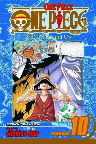
:w00t: Original= 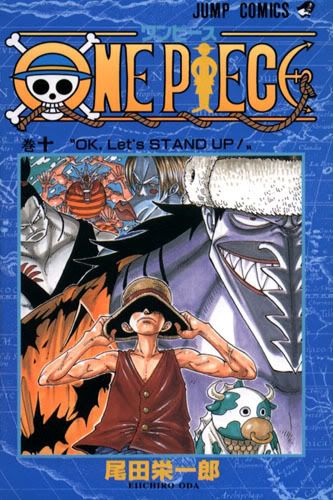
See. (cries) =(
All I want them to do is keep the original cover, that's my only gripe with the english version, which I still buy. A couple other things bother me, to a lesser degree though. They should leave the "doom" untranslated. Because sometimes it looks wierd, like in the latest volume, where Sanji had two "dooms" on either sde of his head, and the font just looked unnatural. Another thing was that they call Whaphol "Capitan of the Evil Tin Pirates". Instead of "Capitan of the Tin Plate Pirates".
But I'll excuse all of that. Because I guess they HAVE to make those changes. They are obligated, and it makes the feel good inside. But the cover massacre is one thing that I cannot excuse. >:(
Well, I opted to enter the contest they are having, to win the season 3 DBZ boxset. Here's my entry letter.
!
I drew One Piece spoilers at the bottom as I'd think when they see it it'll be amusing.
You could always go with the typical way of sucking up to somebody
Say your like eight years old and put a whole lot of typing errors.
They might believe you.
Lmao
I have no purpose of doing that, my drawings look like they're from a eight year old. Not to mention my inability to write straight.
Those are some pretty good pics, imo.
Is the mother thing true? That's pretty sweet if it is.
Oh yeah, she has plenty of health problems. Aneurysm on her heart, clogged arteries, she's died twice but luckily came back and since had to get a machine implanted in her chest, and of course she has arthritis. But it isn't that sweet when you consider I put One Piece getting big in the US before her. XD
lmao, amazing picture Buuhan.
I am curious what the reaction of whoever sees it will be.
A) Who the fuck are they?
B) Haha…this guy is up to speed on Japan like me.
C) Wtf! Only way he's that far in the US is pirating! SUE, SUE!
Tho, C) is stupid cause I could have imported Jumps and volumes from Japan for all they know.
@Lobster:
It's not just the letters, it's also the image size on the cover. They shirnk/crop the image slightly. =(
:sick: Lameness= http://i88.photobucket.com/albums/k190/KrushedIcee/61XKVG046KL.SS500.jpg?t=1188658226
:w00t: Original= http://i88.photobucket.com/albums/k190/KrushedIcee/10.jpg?t=1188658224
See. (cries) =(
…They're the same. The main difference is the logo. If I hadn't seen both of those images right after each other, I wouldn't even have NOTICED the size-difference. Seriously, the difference is REALLY small. Compare it to the german/danish(presumably)/norwegian cover for example: The logo is different, (It keeps the Skull-O, but the rest of the letters is just some Comic Sans-like letters.) and they use the same background-color for every volume. THAT is significant enough to actually care about, as it's easily noticeable to anyone.
@Vegard:
…They're the same. The main difference is the logo. If I hadn't seen both of those images right after each other, I wouldn't even have NOTICED the size-difference. Seriously, the difference is REALLY small. Compare it to the german/danish(presumably)/norwegian cover for example: The logo is different, (It keeps the Skull-O, but the rest of the letters is just some Comic Sans-like letters.) and they use the same background-color for every volume. THAT is significant enough to actually care about, as it's easily noticeable to anyone.
Um? Are you bind? It's a very noticable difference. The "10" logo covers up most of Momo. And you can tell that the second section to Kerobi's pony tail is cut, because you only see ONE point on the english version. Plus his right eye is barley visible in the english version, yet you see have of it in the original. Also the letter colors, not just the shape. It looks very unprofessional compaired to the original. Also the lightening of the backround colors. It doesn't have the same sharp contrast with the sickly yellow letters.
Original: dark blue backround and sickly yellow letters
American: sky blue, and gold letters
a MAJOR reduction of contrast, which lessens the menecing appearence of Arlongs crew; in that dark waters cause the feeling of fear, yet the yellow frightenly contrasts to give you that "fishy" after taste. This is unforgivable in my opinion. However, this is done to all the volumes. Like the little garden one. 1/8th of Vivi's leg is cut off on the cover, and the volume number covers up nearly half of Carue, in addition to the purple title AGAIN being turned to gold. This takes out the purple contrast with the jungle, making the series seem 30x less adventurous, and 40x more stagnant, boring, and all around childish. This my friends is the definition of unforgivable. This my friends is downright distasteful.
Lobster, if you don't like the covers, don't buy the American Volumes. Tho only thing that really bothers me is the extra "One Piece" above the logo where the Japanese kana was (they should have just removed it and completed the line), and the volume number overlapping the cover art.
But that isn't gonna stop me from buying the volumes.
I don't see what's so bad about the volume number. It just barely touches the artwork and it lets you know which volume you're buying.
@Lobster:
Is there anyway to get One Piece the original, perfect translation, no changes at all. You know… what we read online?
Doesn't this line contradict itself?
[…]make the image smaller (on the cover). That REALY upsets me.
You mean how they make it so that none of the original cover art gets cut off during reformatting for the North American printing? Funny, I thought that was a good thing.
When I look at my volumes, they all say "One Piece" in gold. No color variations. This angers me.
…Waaaait a minute, lets look at this again...
@Lobster:
because One thing is really ticking me off about the American version. The fact that they change the letter colors to every issue, and make the image smaller (on the cover). That REALY upsets me. When I look at my volumes, they all say "One Piece" in gold. No color variations.
…...
TakinawaTonfa: there is minimal cropping of the art that only someone as picky as LPS would notice.
He is saying the japaneese logo has different colour on every volume while the american one is allways in gold. (incase you didnt understand his wording)
What the…? Holy smurf am I slow! Until this statement of yours I never even realized that an octopus is actually serving octopusballs. Talk about not seeing the forest because of too many trees. facepalm
TakinawaTonfa: there is minimal cropping of the art that only someone as picky as LPS would notice.
Heeeey. As a fellow artist (well, aspiring), I hate to see something so amazing reduced to a mear pudding puddle of its former self.
He is saying the japaneese logo has different colour on every volume while the american one is allways in gold. (incase you didnt understand his wording)
Yep. Arlong has yellow letters. Little Garden has light purple. Enis Lobby dark purple. Triller Bark red, etc… All beautifully shaded. I wouldn't mind the shiny, if they kept it the same color. But nope... all gold...