Ok, so I'm taking webscripting (again =__=;) this quarter and I'm designing my own website… I'm not really very good at this sort of thing, so I'd like some feedback/constructive criticism on what I've got so far.
Drawovers and suggestions are also welcome! n.n
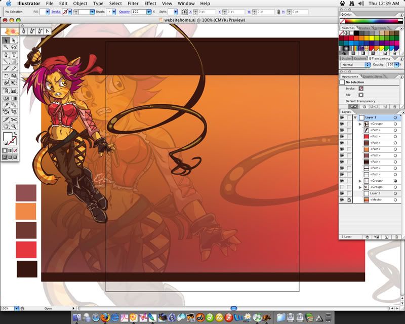
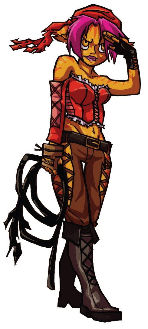
This is what my home page looks like so far... I know I've told people in the past that gradients are cheesy, but here I am using them, hehe... There's a difference between just slapping them on there and actually knowing how to use them... not that I'm any better but yeah...

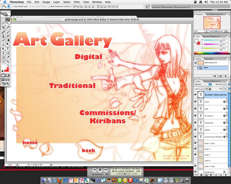
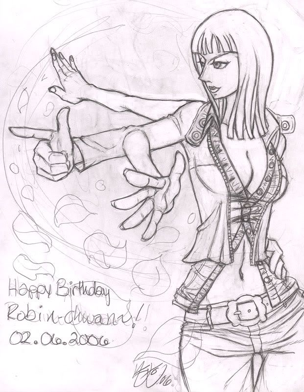
This is the page for my artwork, the main gallery page… i really wanted to use that Robin fanart, and this is for a class, so why not, eh? I'm sorta happy with this one, but I'm sure it could still use some work...

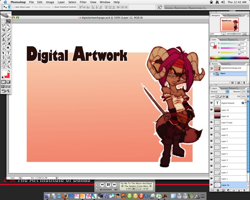
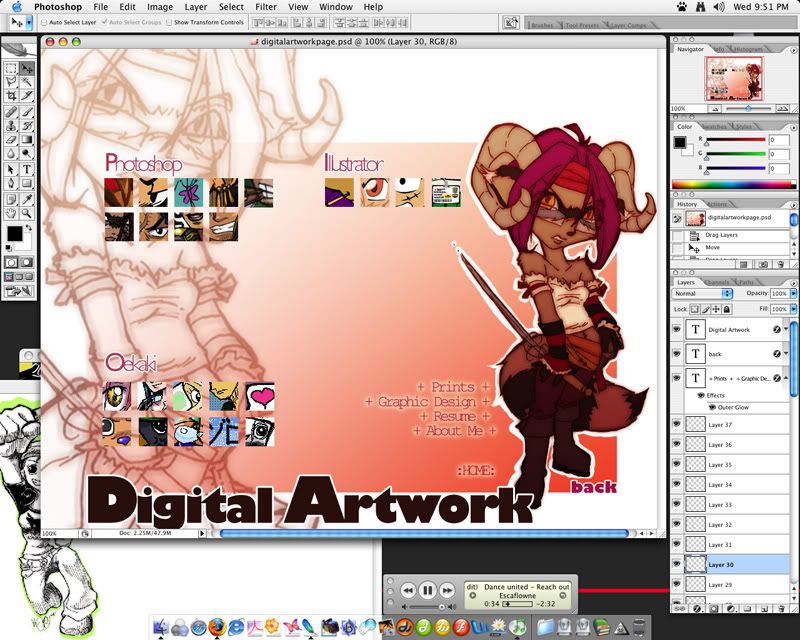
page for digital art (photoshop, illustrator, etc.)….

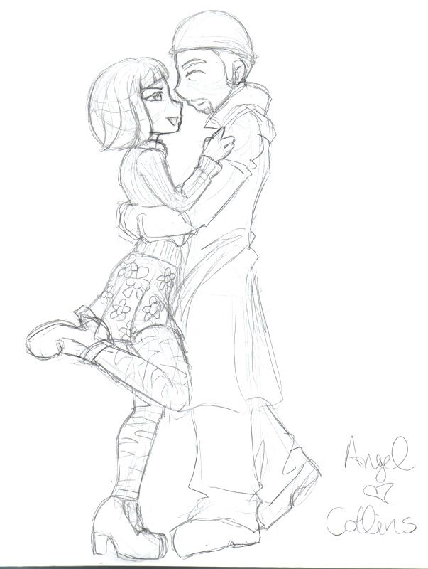
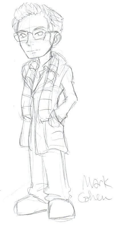
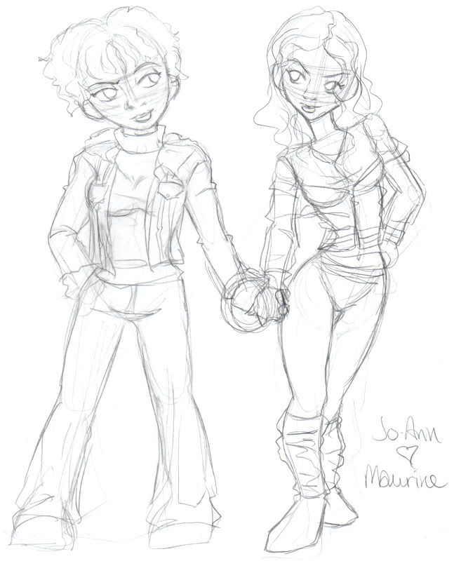
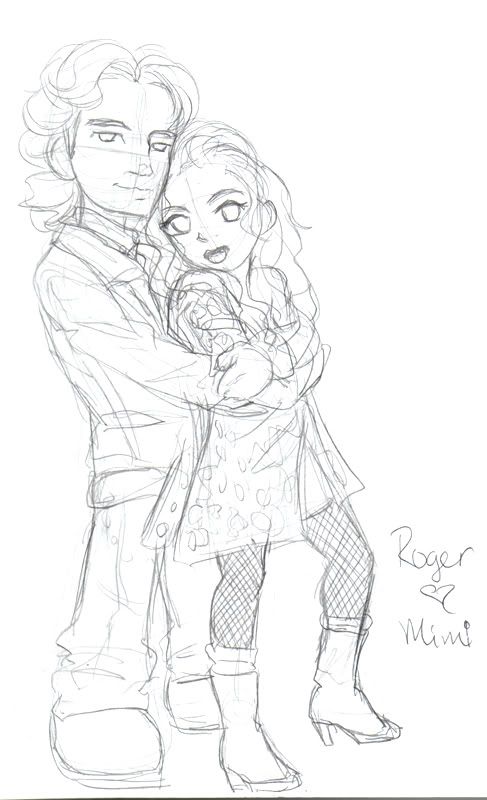
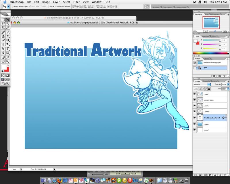
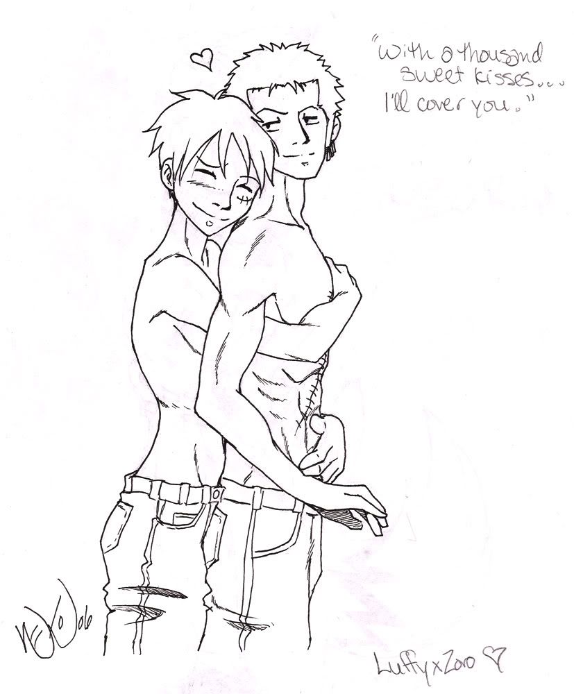
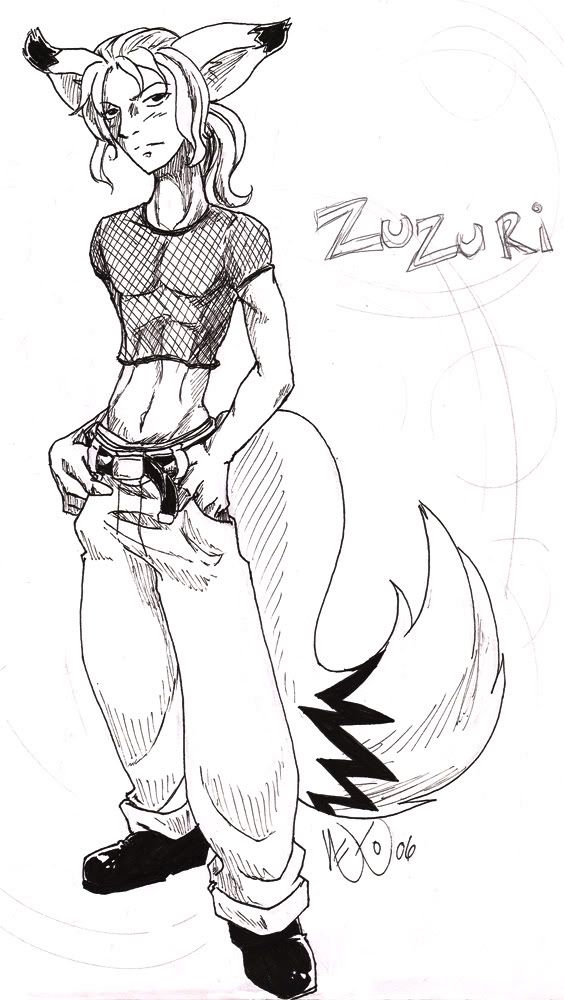
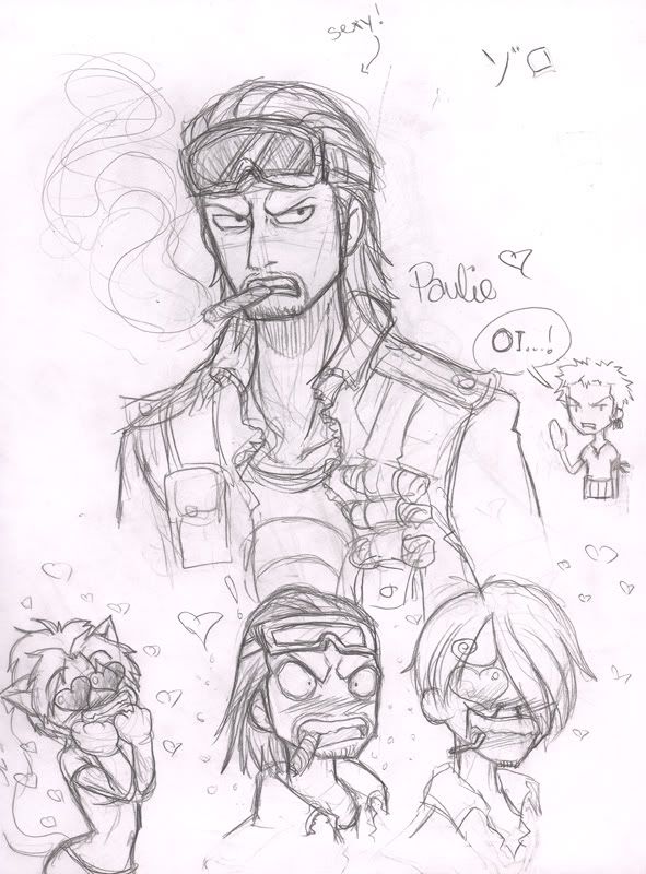
page for traditional art (pencil, ink, etc..)

hm.. actually, now that i look at it, i have a better idea for this page… but i would still love to know what you guys think! n.n
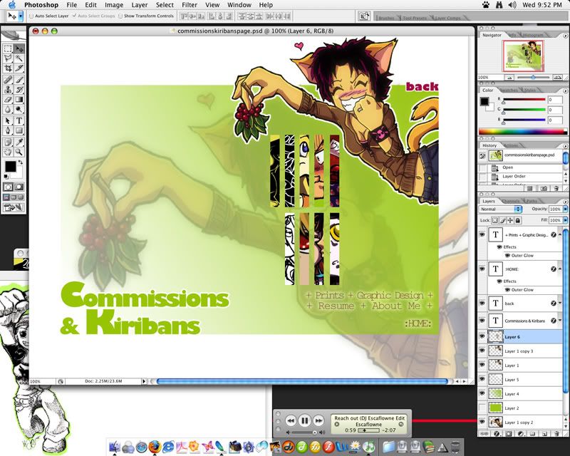
I don't have a set color scheme, i just do whatever comes to mind and i don't want to have the exact same colors for all the pages. similar layouts maybe, but yeah....




 So far, you're off to a good start.^^

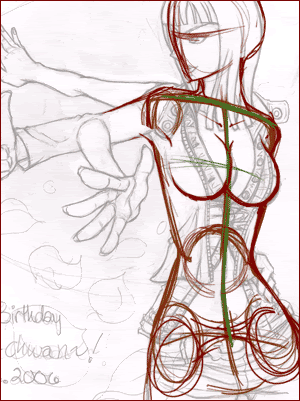
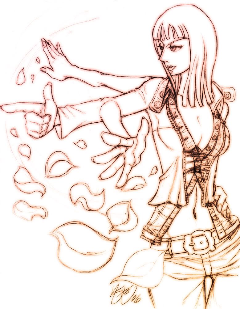


 i'm feelin the outfit too :biggrin: much props!!!