

Yeah A-la-deen seems to be how the Arabic reads, at least according to some quick googling. It's prettymuch how the Japanese for his name comes out phonetically as well. So really the "correctness" of Aladine (which is entirely a subjective thing, ultimately) all depends on whether Oda intended an English or French pronouciation. All we can do is speculate.
The Viz Media Thread
-
-
There are great news for people from Singapor,e Philippines and India : Sasaki made a huge announcement:
In addition to the free chapters, we expand our distribution of SHONENJUMP to India, Philippines, and Singapore.pretty cool news!didn't think they'd cover india when even europe's not covered lol

but maybe it's because there's no presence of one piece here,and no regional localisation options to consider.
well anyway this is pretty good and really i'm just going to subscribe now,after saving a bit.
i checked viz's site and yeah,i'm able to browse it freely without any vpn -
I ve contacted comixology and asked about why WSJ is not released in HQ like the volumes and I received the following reply:"Double checked with our team on the WSJ releases and it seems that the publisher has stated that this is the best file quality that they can currently provide for the WSJ releases."I know for a fact that viz could provided WSJ in a better quality and I could even prove it (there is a test issue in 300dpi). I really wonder what the reason is why we not get WSJ in HQ. Platinum End for example is released in HQ on comixology (on vizmanga it only has 1200px)By the way, digital One Piece volumes are 2$ off until 7/7/2016 on all platforms:
-
This post is deleted!
-
I ve contacted comixology and asked about why WSJ is not released in HQ like the volumes and I received the following reply:"Double checked with our team on the WSJ releases and it seems that the publisher has stated that this is the best file quality that they can currently provide for the WSJ releases."I know for a fact that viz could provided WSJ in a better quality and I could even prove it (there is a test issue in 300dpi). I really wonder what the reason is why we not get WSJ in HQ. Platinum End for example is released in HQ on comixology (on vizmanga it only has 1200px)By the way, digital One Piece volumes are 2$ off until 7/7/2016 on all platforms:
Are you sure their price reduction isn't because you complained about the quality?

-
Are you sure their price reduction isn't because you complained about the quality?
We are in the age of HD, so why the hell do we still get Jump in awful 1145px, respectively uspcales on kindle and cmx. Even Crunchyroll offers a better image quality. Kodansha release their simulpup stuff in HQ as well. I m complaining about the quality issue for over 2 years. Just look at how long it took viz to replace the upscaled volumes on itunes. They just started last month. Normally there is a holiday sale for the digital releases around this time every year. But viz is getting stingy and it seems they do now these flash sales just for one series a time.
-
We are in the age of HD, so why the hell do we still get Jump in awful 1145px, respectively uspcales on kindle and cmx. Even Crunchyroll offers a better image quality. Kodansha release their simulpup stuff in HQ as well. I m complaining about the quality issue for over 2 years. Just look at how long it took viz to replace the upscaled volumes on itunes. They just started last month. Normally there is a holiday sale for the digital releases around this time every year. But viz is getting stingy and it seems they do now these flash sales just for one series a time.
Which volume are you currently buying?
-
Which volume are you currently buying?
From viz I would say I ve bought digitally so far most of the Shonen Jump, Shonen sunday and Shonen Advanced Imprint (300+ volumes I guess are only viz). Most of the One Piece volumes I bought twice: on viz and itunes
-
From viz I would say I ve bought digitally so far most of the Shonen Jump, Shonen sunday and Shonen Advanced Imprint (300+ volumes I guess are only viz). Most of the One Piece volumes I bought twice: on viz and itunes
Oh ok. So up to One Piece 76?
-
-
- Can VIZ release the digital volumes of Slam Dunk? 2) Can VIZ release more manga of Osamu Tezuka? I'd really appreciate if someone were to contact VIZ and ask them these questions. Thanks in advance.
-
- Can VIZ release the digital volumes of Slam Dunk? 2) Can VIZ release more manga of Osamu Tezuka? I'd really appreciate if someone were to contact VIZ and ask them these questions. Thanks in advance.
You can contact them yourself if you want sjsupport@viz.com However I know this for sure: Slam Dunk won't be released digitally any time soon because Inoue once said he does not want his titles that he had drawn for print to be published digitally. Therefore Slam Dunk is also not available in a digital format in japanese. He believes that print and digital are two different things for him and if he wants to release digitally he would use drawing techniques that are suited for a digital manga. A lot of Tezuka's mangas are already released in english, most of them by independent publishers/kickstarters. Just use the "Tezuka in English" web site to figure out which titles are officially released in english
-
Already sent them a message. However, I don't believe that they will ever consider my request. So I'll ask here instead. Could anyone please convince VIZ to release the digital volumes of Slam Dunk and more manga of Osamu Tezuka?
-


-
Seems like "New World" is here to stay :(

Spoiler:


-
Maybe this will be the last New World volume. It does have significantly more Dressrosa than Zou, that would cut the New World off at a nice round 20 volumes, and we can move easily into the Emperors or Totland or whatever saga from 81 onwards.
Unlikely, I know, but hey, it could happen.
-
@Kaido:
Seems like "New World" is here to stay :(
Captain M is right, nothing about this volume suggests this.
-
Currently skimming through volume 79. Anyone have a clue what "Mamoru" is reffering to
or what is written on the back of that shirt:
-
Mamoru means "protect".
-
Mamoru means "protect".
Thanks a bunch.
Is anyone interested in helping creating a petition that viz would consider publishing English Shonen Jump at least on Comixology in high quality. On Comixology english Shonen Jump is the only "manga release" that has a very poor quality and there is no technical reasion that viz could not do that (For the record: Platinum End and Boys over flower, both simul pup releases are having LQ on viz.com but are available in HQ on comixology).
For people who do not know what I m reffering to:
Viz WSJ quality ever since the beginning on viz.com: http://www.imagebam.com/image/9c94ae500638670
What viz could probably provide (at least on cmx because cmx is able to host HQ images): http://www.imagebam.com/image/a4a860500638682 -
Could someone please convince Viz Media to release the digital volumes of Slam Dunk? Thanks.
-
which one of these is correct…"harder than anything I’ve come across" or "too hard"?

-
It's hard …!! His Color of Armament!!!
Is the most direct translation, so Stephen's.
-
@abu:
which one of these is correct…"harder than anything I’ve come across" or "too hard"?
for sure you should trust stephen's TL over Mangastream any day
-
Ghetto-stream, your trusted source for hip translations.
-
It has come to my attention that Viz was releasing OP volumes in the UK too. That means that I'm finally able to buy the volumes (from Amazon UK) without having to pay custom charges and the volumes arrive in just a few days. 78 and 79 arrived yesterday and now 71-77 are on the way
 The next step is getting the box sets. And the great news is that box set 3 (vol. 47 - 70) release date is October 4 (October 20 in the UK)
!

-
It has come to my attention that Viz was releasing OP volumes in the UK too. That means that I'm finally able to buy the volumes (from Amazon UK) without having to pay custom charges and the volumes arrive in just a few days. 78 and 79 arrived yesterday and now 71-77 are on the way
The next step is getting the box sets. And the great news is that box set 3 (vol. 47 - 70) release date is October 4 (October 20 in the UK) There is also bookdepository which offers freee shipping worldwide (owned by amazon) and I am pretty sure amazon uk sells the One Piece volumes for quite a while
-
There is also bookdepository which offers freee shipping worldwide (owned by amazon) and I am pretty sure amazon uk sells the One Piece volumes for quite a while
Thank you for the suggestion, a friend of mine also recommended Wordery. They have free worldwide shipping too.
Sent from my LG-D855 using Tapatalk
-
I wanted to ask you how you think about the current state of viz in regards to digital: Is anyone here happy that viz changed its website and swiched to a mobile version only? Or does anyone feel betrayed by those akward digital sale offers that only feature single titles during the summer holidays?: Until 2 or 3 years ago we got a holiday sale for the whole digital catalouge, then they switched to imprint sales and now we only get sales for certain titles.
-
Cover for Cross Epoch/Toriko crossover mini comic that comes with box set 3.

-
Finally, viz adressed a request I was making for months: According to this week's SJ podcast viz will soon (not next week but soon) release Shonen Jump in high quality on comixlogy.
-
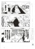
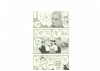
Sort of a weird thing I've just noticed and was curious to see if anyone knew about…
Why do the spread pages in Viz's volume 58 not run off the page?
On the wiki's chapters and volumes page, in the trivia section, it mentions there being two versions of volume 58 (presumably but not specifically talking about the Japanese volumes). One where all the spread pages are shown to their borders, and another where they run off the page as intended. Supposedly the first one was a mistake, and the second one is the correct one, released shortly after. The wiki, in all its glory, doesn't give a source for this information, but the magazine scans from that era and the digital colour volume 58 both have the art run off the page, which supports what's being said there.
So what's the deal here? Did the wiki writer mean it was the English version that had two versions, and I'm just lucky enough to have the incorrect first printing? Or was the error with the Japanese version, and even though the English one came more than a year later they still got the incorrect files or cropping instructions from the Japanese publishing team?
Pictures to show what I mean:
! My volume 58, with the full art, showing the outermost borders of the panels:

! The digital colour volume 58, with the art running right to the edge of the page and being cropped off:

-
The first printing of the volume in Japan had that mistake. From what I recall, they fixed it quickly, though. It seems like they gave out the messed up versions for the international releases. Germany has the same problem.
-
Weird they wouldn't bother to fix that up. And I guess also that none of the international teams requested the corrected files, assuming they'd even be aware of such things.
I suppose the Japan team just send off the files/info for the volume internationally when the volume is done, or at release, so all the other teams get whichever ones come first. They probably would have been more concerned with fixing the local printed version than sending corrections to people in other countries where the thing wasn't even going to be out for like a year. And then it just got forgotten entirely.
That's me speculating, anyway.
-
I kinda like it that way, sort of.
I dunno.
Reminds me of Dragonball. -
Lol, I d actually prefer if the pages would not be cropped as it is the case for the double spreads of volume 58. I m glad that the digital version also has this fortunate mistake.
I guess you know that magazine chapters usually are more cropped in the height and the volumes more cropped in the width and unless you do have access to the original manuscripts you will never see the whole drawing of most of the pages even if you compare the volume and the magazine version. Just look at chapter 1: In the Romance Dawn manuscript box you can spot a guy of Shanks crew that you never saw in the magazine, in the logs or the volumes. As an artist I would be pissed when my drawings would be cropped just to fit in the magazine. In the age of digital releases you could avoid that but then viz/Shueisha would have to create two files one for the printer and one for the digital release -
I'm kinda surprised at the support this is getting. Would you guys want the same thing done with the single pages too? Just, not have anything run off the page?
From a book design perspective, having the art go right to the edge makes the pages more dynamic, and using the whole page lets Oda's art be shown in more detail (which given its busyness, is kinda important). The pages (literally all of them) are obviously drawn with the chance of losing a centimeter or so on the edges in mind to create this effect. The art running off the page is a deliberate choice to create the series' atmosphere. It makes the shots feel more open, and emphasises the feeling of chaotic action, the feeling that things just keep going off camera. Plus it means we get to see the important parts of each page closer up. In the comparison I posted above, for example, I'm fine with sacrificing, say, Marco's collar and most of Sakazuki's left hand for that. Those are not the important parts.
I can understand from a fandom perspective why people are clamoring for just a little more of Oda's art, or a rare opportunity to see the pages as they were drawn (the only other way you really can see pages like this is via a series of prints of key spreads, only available in Japan, as far as I know). And as a writer and as someone actually trying to break into the publishing industry I understand why the cropping has been done.
If there was an edition with larger page sizes, like something closer to the magazine version, I'd be more for showing the full art with gutters on the edges and everything. But when our releases are only like 19 x 12.5 centimeters as it is, and Japan's are even smaller, I'd rather the option that makes each spread larger by about a whole centimeter on each edge.
-
I'm kinda surprised at the support this is getting. Would you guys want the same thing done with the single pages too? Just, not have anything run off the page?
From a book design perspective, having the art go right to the edge makes the pages more dynamic, and using the whole page lets Oda's art be shown in more detail (which given its busyness, is kinda important). The pages (literally all of them) are obviously drawn with the chance of losing a centimeter or so on the edges in mind to create this effect. The art running off the page is a deliberate choice to create the series' atmosphere. It makes the shots feel more open, and emphasises the feeling of chaotic action, the feeling that things just keep going off camera. Plus it means we get to see the important parts of each page closer up. In the comparison I posted above, for example, I'm fine with sacrificing, say, Marco's collar and most of Sakazuki's left hand for that. Those are not the important parts.
I can understand from a fandom perspective why people are clamoring for just a little more of Oda's art, or a rare opportunity to see the pages as they were drawn (the only other way you really can see pages like this is via a series of prints of key spreads, only available in Japan, as far as I know). And as a writer and as someone actually trying to break into the publishing industry I understand why the cropping has been done.
If there was an edition with larger page sizes, like something closer to the magazine version, I'd be more for showing the full art with gutters on the edges and everything. But when our releases are only like 19 x 12.5 centimeters as it is, and Japan's are even smaller, I'd rather the option that makes each spread larger by about a whole centimeter on each edge.
Magazine and volume pages are both equally cropped in terms of missing areas: It just happens that one is "more" cropped in the width and the other more in the height. However both are cropped in the height and width. It has nothing to that magazine pages are larger (B5=50% of B4, the manuscript size) than volume pages (B6 50% of the magazine pages) but with the "ratio of the dimension".
Design is a lousy argument. They just need to do a more subtle job. In the age of digital you could bypass this issue but the publisher don't do that. -
Magazine and volume pages are both equally cropped in terms of missing areas: It just happens that one is "more" cropped in the width and the other more in the height. However both are cropped in the height and width. It has nothing to that magazine pages are larger (B5=50% of B4, the manuscript size) than volume pages (B6 50% of the magazine pages) but with the "ratio of the dimension".
Design is a lousy argument. They just need to do a more subtle job. In the age of digital you could bypass this issue but the publisher don't do that.I never said they weren't cropped equally. What I'm saying is that with the art running off the edge of the page we get a more zoomed in view of it. It makes it larger, which is important for Oda's busy, detail oriented way of drawing. The volume releases are, as you said, a fraction of the size of Oda's manuscripts, hence why either he or his publishers decided it was in their best interests to use every bit of the page space.
I think if there was a volume release closer to the size of the magazine chapters, it would be more acceptable to leave a gutter, because it would be twice the size and shrinking the art another centimeter or so wouldn't be as much of a loss. As it is, nothing of value has been lost (unless you mean it was an actual named and relevant member of Shanks' crew who was cut off) by the cropping and I think it creates an atmospheric effect to have them run off as opposed to how they look completely confined by panel borders. Oda knows how his work is going to be printed. He knows there's going to be cropping, and he's smart enough not to put anything important where it might be cut. It's the same principal as laying out a spread and making sure nothing important gets lost in the gutter between the two pages when it's put into a book.
"Design is a lousy argument. They just need to do a more subtle job." I have no idea what you mean by this. What would be the subtle way to handle this? How can design possibly be a lousy thing to consider when putting together a book? We are talking about the design choices of the book, design is the only argument. I think the publishers are more invested in what makes the book look as good as possible and what makes the art as clear as possible than they are in letting people see every last drop of ink Oda put on the page.
"In the age of digital you could bypass this issue." You're right on this one. It needn't necessarily be an issue with digital releases being a thing. They aren't restricted by the cost of printing in larger sizes, and even if you argue that fitting on the screens of ebook readers and in the windows of ebook apps is a thing that could influence cropping (which it is) there's always zoom functions.
BUT making a different version that takes advantage of this would likely require creating a whole different set of files for the digital versions. For every single page of the comic, since even the singles almost always run off the page as well, and I assume you'd want to see all of them as well. Most companies prefer the ease of using the same files for the physical and digital edition, just uploading basically the same version you'd send to the printers. It's especially preferred when making an uncropped digital version would mean altering more than 16,000 pages. And this is after they've already taken the initiative to go back and colour like 14,000 of those pages already. It's simply not going to happen. The digital versions are driven by the physical ones, and the physical ones are done the way they are for what I can only guess are clarity and atmosphere reasons (I can't say for sure, of course, but I do know that there's no chance any part of these books' design is accidental). And even if it was the norm anywhere to prioritise digital or give those editions special treatment, it's unlikely a Japanese publisher is going to be quick to follow the example set. Simultaneous digital and physical releases are pretty common for most books in the west, and definitely happens with the English versions of these comics, but in Japan the digital version is always about a month behind. This industry is not completely digital-friendly yet.
A digital friendly Japanese publisher might, for example, put the colour back into the spreads for the digital release, because using colour here doesn't cost any extra
Example:!

And some manga publishers do actually do this, don't get me wrong. Just not this one.Or get rid of unsightly gaps in the text of speech bubbles like the middle one on the spread below, since there's no chance of words getting lost in the book's gutter with a digital release
!

But absolutely no one does that.Basically there are reasons the books are designed the way they are, and to criticize them over such a minute difference in the amount shown seems nonsensically petty. And the idea of a special uncropped release, even as a digital exclusive is just aggressively not going to happen.
-
I can't believe I missed those double pages…
You can even tell they messed up the placement because of the speech bubbles creating a rectangular bleed line..
Like Shady, I like to see the whole page because you never get a chance like this, but then again it kinda sucks that such a big mistake happened.
One reason I bought the Marineford arc was because I thought Oda did this deliberately and it looks so cool. I thought he left this giant white board for impact. Too bad it's just a mistake.
-
Do you reckon the impact varies at least a little from page to page? Like with the battle scenes running off it feels like we're getting a snapshot of the action, and there's more happening just offscreen, to show the size and chaos of the battle. But for simpler, more focused pages like Whitebeard hugging Squard the uncropped version feels somewhat more fitting than it does elsewhere. Good job spotting the speech bubbles giving away the bleed lines, also. I didn't even pick up on that before, but it's a pretty telling sign that Oda is working with the presentation of the books.
-
I never said they weren't cropped equally. What I'm saying is that with the art running off the edge of the page we get a more zoomed in view of it. It makes it larger, which is important for Oda's busy, detail oriented way of drawing. The volume releases are, as you said, a fraction of the size of Oda's manuscripts, hence why either he or his publishers decided it was in their best interests to use every bit of the page space.
I think if there was a volume release closer to the size of the magazine chapters, it would be more acceptable to leave a gutter, because it would be twice the size and shrinking the art another centimeter or so wouldn't be as much of a loss.
Point taken. I misread your post in the rush and shouldn't have replied while sitting at work in my office. What happened in volume 58 is a slight mistake but it would not be the way I would like to see the spreads. The margin around the spread is too large
As it is, nothing of value has been lost (unless you mean it was an actual named and relevant member of Shanks' crew who was cut off) by the cropping and I think it creates an atmospheric effect to have them run off as opposed to how they look completely confined by panel borders. Oda knows how his work is going to be printed. He knows there's going to be cropping, and he's smart enough not to put anything important where it might be cut. It's the same principal as laying out a spread and making sure nothing important gets lost in the gutter between the two pages when it's put into a book.
For the record, I m speaking about every single page and not just spreads. Unfortunately we can't verify what is missing in every case.
If you look at chapter 1 e.g I would say Shueisha over-cropped some pages and I fear that happens more often than we think.! Manuscript
1stLog
viz volume 1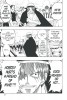
Unless we have full access to all manuscript pages you ll never know what is missing."Design is a lousy argument. They just need to do a more subtle job." I have no idea what you mean by this. What would be the subtle way to handle this? How can design possibly be a lousy thing to consider when putting together a book? We are talking about the design choices of the book, design is the only argument. I think the publishers are more invested in what makes the book look as good as possible and what makes the art as clear as possible than they are in letting people see every last drop of ink Oda put on the page.
I just wanted to point out that I don't think the publisher can justify the cropping of pages in the light of the small size of the tankobons for the sake of utilizing the whole page. However I could imagine that some spreads have a better "artistic impact" if the whole page is used. But certainly not all pages. Like I said, you do not have to leave such a thick margin.
"In the age of digital you could bypass this issue." You're right on this one. It needn't necessarily be an issue with digital releases being a thing. They aren't restricted by the cost of printing in larger sizes, and even if you argue that fitting on the screens of ebook readers and in the windows of ebook apps is a thing that could influence cropping (which it is) there's always zoom functions.
BUT making a different version that takes advantage of this would likely require creating a whole different set of files for the digital versions. For every single page of the comic, since even the singles almost always run off the page as well, and I assume you'd want to see all of them as well. Most companies prefer the ease of using the same files for the physical and digital edition, just uploading basically the same version you'd send to the printers. It's especially preferred when making an uncropped digital version would mean altering more than 16,000 pages. And this is after they've already taken the initiative to go back and colour like 14,000 of those pages already. It's simply not going to happen. The digital versions are driven by the physical ones, and the physical ones are done the way they are for what I can only guess are clarity and atmosphere reasons (I can't say for sure, of course, but I do know that there's no chance any part of these books' design is accidental). And even if it was the norm anywhere to prioritise digital or give those editions special treatment, it's unlikely a Japanese publisher is going to be quick to follow the example set. Simultaneous digital and physical releases are pretty common for most books in the west, and definitely happens with the English versions of these comics, but in Japan the digital version is always about a month behind. This industry is not completely digital-friendly yet.
A digital friendly Japanese publisher might, for example, put the colour back into the spreads for the digital release, because using colour here doesn't cost any extra
Example:! http://i.imgur.com/E5KMv9v.jpg
And some manga publishers do actually do this, don't get me wrong. Just not this one.Or get rid of unsightly gaps in the text of speech bubbles like the middle one on the spread below, since there's no chance of words getting lost in the book's gutter with a digital release
! http://i.imgur.com/aI4Mniw.jpg
But absolutely no one does that.Actually publishers do all of that even SHueisha. Some Jump SQ volumes (e.g. 7th Garden) got color pages and I could imagine Shueisha will one day follow Square Enix example and will include all color pages in the (digital) tankobons. And if you compare english SJ and the volume release you can often spot corrections how the text in the bubbles was re-aranged by viz.
Basically there are reasons the books are designed the way they are, and to criticize them over such a minute difference in the amount shown seems nonsensically petty. And the idea of a special uncropped release, even as a digital exclusive is just aggressively not going to happen.
So you would say a publisher does not need to improve/re-invent/change their processes and standards? But other consumer goods have to improve like the processor of your smartphone with each release?
-
Point taken. I misread your post in the rush and shouldn't have replied while sitting at work in my office. What happened in volume 58 is a slight mistake but it would not be the way I would like to see the spreads. The margin around the spread is too large
Fair enough, and again, fair enough; if they're going to use the full art at all it should definitely go a little closer to the edges. There's little enough room to work with as it is.
For the record, I m speaking about every single page and not just spreads. Unfortunately we can't verify what is missing in every case.
If you look at chapter 1 e.g I would say Shueisha over-cropped some pages and I fear that happens more often than we think.! Manuscripthttp://thumbnails116.imagebam.com/50914/437aa5509136379.jpg
1stLoghttp://thumbnails116.imagebam.com/50914/c29815509136389.jpg
viz volume 1http://thumbnails115.imagebam.com/50914/9ba169509136395.jpg
Unless we have full access to all manuscript pages you ll never know what is missing.I see your point (and I hadn't seen that manuscript/log/viz release comparison before, so that's pretty cool), but also I think it's an exaggeration to say there's anything so important on the edges of the panels. Shueisha and Oda aren't working against each other with the art's presentation. As discussed with Snir above, the placement of the speech bubbles gives a pretty clear indication of where the pages are going to be cropped to. Nothing important is going to be placed beyond them because there are such small odds it would ever be seen. It's pretty likely the art beyond them only exists at all as bleed, to maintain good presentation should a page's cut be a little off in the printing process.
I don't think we're being robbed of art here, the pages are designed for this.
I just wanted to point out that I don't think the publisher can justify the cropping of pages in the light of the small size of the tankobons for the sake of utilizing the whole page. However I could imagine that some spreads have a better "artistic impact" if the whole page is used. But certainly not all pages. Like I said, you do not have to leave such a thick margin.
I concede a point here as well. Even arguing it as an atmospheric choice, that would clearly have to depend on the atmosphere of the page. Some are more suited than others, and of course which ones those are is a matter of opinion.
Actually publishers do all of that even SHueisha. Some Jump SQ volumes (e.g. 7th Garden) got color pages and I could imagine Shueisha will one day follow Square Enix example and will include all color pages in the (digital) tankobons.
Is it just the Weekly Jump releases that aren't getting the colour treatment or what? I knew Square Enix did it for everything of their's I've followed, but I've never seen it done in a Shueisha-owned comic. Guess I'm not following the right series.
And if you compare english SJ and the volume release you can often spot corrections how the text in the bubbles was re-aranged by viz.
Sorry, I don't see what this is relevant to?
So you would say a publisher does not need to improve/re-invent/change their processes and standards? But other consumer goods have to improve like the processor of your smartphone with each release?
I'm not saying publishers shouldn't embrace the possibilities of digital media. Hell, I love works that take advantage of a format like that. There are tons of great webcomics that implement things that only digital work allows, like animated gifs for certain panels, or infinite scrolling, or even more complex interactive elements. Some ebooks are embracing in-text hyperlinks to link to glossaries or endnotes, simplifying navigation. There's a new "Enhanced Edition" of A Game of Thrones that's come out recently that's packed with digital-only stuff like interactive maps at the start of each chapter, showing the characters' journeys, annotations to help keep the cast and world in line. I am all about the possibilities of new media when it comes to storytelling.
Buuuuuuut I don't have high expectations at all for Shueisha doing much like this in the near future. At least, not with their flagship series anyway. Again, these guys aren't even willing to do same day physical/digital releases yet. They're pushing for physical sales as hard as they can.
Who ever mentioned smartphones? Kind of a low blow to go after a guy's phone when you have no idea what it even is
-
I don't think we're being robbed of art here, the pages are designed for this.
I don't dare to coin that on my preferences - I would go furter and would argue the publisher do not appreciate the work of the artist to the fullest. Which artist would like to see and hear, "we found a frame that suits your painting perfectly but it will cover certain areas of your paninting and also your signature". There is a reason that manga artists draw their manga on JIS B4 and that the manga is printed on JIS B size paper instead of JIS or DIN A size paper. I could imagine publisher could avoid this problem with handing out proper guidlines which areas of a B4 should not be used due to the binding process of the print issues.
There are also rumours that certain easter eggs in One Piece are only seen in the magazine or the volume due to that issue. I could also imagine that there are some easter eggs we do not know of, because you would only see them on the manuscript pages
Is it just the Weekly Jump releases that aren't getting the colour treatment or what? I knew Square Enix did it for everything of their's I've followed, but I've never seen it done in a Shueisha-owned comic. Guess I'm not following the right series.
It depends on the title. But so far no WSJ title got color pages in the volumes. I know only of other Jump titles
Sorry, I don't see what this is relevant to?
Why not? Didn't you bring up the gaps in your previous post?
-
From a book design perspective, having the art go right to the edge makes the pages more dynamic,
I dunno. It also looks more messy to an extent. Oda has had issues with cluttered drawings in the last decade, and steady frames might help. Maybe not though.
It does seem to match other mangas better than One Piece, to have lots of white gutter space. One Piece has such a animated look. -
I don't dare to coin that on my preferences - I would go furter and would argue the publisher do not appreciate the work of the artist to the fullest. Which artist would like to see and hear, "we found a frame that suits your painting perfectly but it will cover certain areas of your paninting and also your signature". There is a reason that manga artists draw their manga on JIS B4 and that the manga is printed on JIS B size paper instead of JIS or DIN A size paper. I could imagine publisher could avoid this problem with handing out proper guidlines which areas of a B4 should not be used due to the binding process of the print issues.
Oda clearly draws with this kind of thing in mind though. From the speech bubble placement, we can tell he knows or even advises his editors on where to cut it off. Obviously there would be guidelines, obviously he knows them, and draws with them in mind. The same way he would draw spreads in such a way that no important information gets lost in the gutter. There is basically a zero percent chance this is being done against Oda's will. It's a deliberate aesthetic choice from him and his publishers. Suggesting otherwise in nonsense.
Most manga have the majority of their panels completely inside the page, with occasional exceptions that run off it. Even Dragon Ball, presented by Monkey King as something the complete art reminded him off, has a handful of panels per chapter that run off at least one edge. A more recent example that I've been reading, Assassination Classroom does it about as often as Dragon Ball, if not more. Would you rather the offending pages of those series be redone so we don't miss any art there either, or can you accept it's being done for the aesthetic.
Oda just kinda does the opposite. It's rare for him not to have a panel run off, and obviously that too is an artistic choice. It kinda reflects his whole larger than life, bombastic style, doesn't it?
There are tons and tons of western comics with art that runs off every side of the page (300 and The Sandman are great examples) and no one's calling for them to come clean and show their full, unedited manuscripts for. Logically, we all know there's more that was created for those pages, but we know it's not much, we know it was cut for a reason, and we know that putting a white frame around the whole book would be damaging to its presentation.
There are also rumours that certain easter eggs in One Piece are only seen in the magazine or the volume due to that issue. I could also imagine that there are some easter eggs we do not know of, because you would only see them on the manuscript pages
I would love actual examples of things only visible in the magazine. Or only visible in the books. I would love it.
And will happily eat my words (or at least admit that the page shown was a bad one to crop) if you can do it.
It depends on the title. But so far no WSJ title got color pages in the volumes. I know only of other Jump titles
Fair enough. I wonder if they're trying to make all releases with the WSJ branding uniform regardless of format or something. Seems so odd that only those lack colour.
Why not? Didn't you bring up the gaps in your previous post?
Only to demonstrate my point that the spreads are designed with the print version being considered, even in the typesetting. I'll be more clear, here's a comparison:
!

Our focus is the speech bubble in the middle, at the top. The first two images are the official digital edition and the English WSJ version, while the last one is a scanlation. The gap in the typesetting in the Japanese version, and the squashed, right side alignment on the Viz one would be awful typesetting in a pure digital release, or if presented as a full, landscape image. The scanlation on the other hand, while it has many other issues, will never be printed, and treats the spread as one wide page instead of two joined ones.
It's one of those tiny little things that could be adjusted for a priority digital release, or if the files were altered for the digital one, but will almost definitely never happen. That's all I was trying to demonstrate with that, sorry if I was unclear.
-
There is basically a zero percent chance this is being done against Oda's will. It's a deliberate aesthetic choice from him and his publishers. Suggesting otherwise in nonsense.
On what do you base this assumption? I will admit in 99,9% of the cases no important information is missing but it is definetely not a "deliberate aesthetic choice". (And for the record I m not referring to spreads alone but to each single page.) Your example of the spread proves that. That spread is drawn on B3 (and not on two B4 pages) and Oda might not have calculated very well that the speach bubble is overlapping in the middle. For the printer the publisher had to arrange the text. In the same way the publisher might also cut off the page that it suits the printer.
I would love actual examples of things only visible in the magazine. Or only visible in the books. I would love it.
And will happily eat my words (or at least admit that the page shown was a bad one to crop) if you can do it.
Recently I checked chapter 0: In the deep Blue version of chapter 0 you won't see that Shakky is holding the hand of Hachi. The other example shows a situational shirtt. In the magazine version you can't know for sure it is the number 39 (homonym on "Thank you") but in the volume version you can definetly see the number 39 (and I dare to say on the manuscript even better). For the enjoyment of One Piece I consider that a detail that Oda certainly wanted to show the reader
!
-
On what do you base this assumption? I will admit in 99,9% of the cases no important information is missing but it is definetely not a "deliberate aesthetic choice". (And for the record I m not referring to spreads alone but to each single page.) Your example of the spread proves that. That spread is drawn on B3 (and not on two B4 pages) and Oda might not have calculated very well that the speach bubble is overlapping in the middle. For the printer the publisher had to arrange the text. In the same way the publisher might also cut off the page that it suits the printer.
Recently I checked chapter 0: In the deep Blue version of chapter 0 you won't see that Shakky is holding the hand of Hachi. The other example shows a situational shirtt. In the magazine version you can't know for sure it is the number 39 (homonym on "Thank you") but in the volume version you can definetly see the number 39 (and I dare to say on the manuscript even better). For the enjoyment of One Piece I consider that a detail that Oda certainly wanted to show the reader
! http://thumbnails116.imagebam.com/51054/e977c7510530338.jpg http://thumbnails116.imagebam.com/51054/41b0c9510530339.jpg http://thumbnails116.imagebam.com/51054/56fe06510530344.jpg http://thumbnails115.imagebam.com/51054/7d4fe0510530345.jpg
I'm just picturing Oda slaving over his desk week after week, thinking to himself "these damn editors, they don't appreciate my work at all! I give them their flagship, best selling of all time series, but they won't listen to my one, small request that they stop cropping my work off the page! Why won't they listen?"
Meanwhile, at Shueisha his editor throws his head back and cackles, "nothing important happens near the margins anyway, I can just cut them all off! The people will never know they're missing a small fraction of the art on each page! Maybe I can even… sell the margins back at an inflated cost later! AHAHAHAHAHA!"
Alternative theory: Oda is literally chained to his desk. He writes pleas for help in the edges of his panels, but they keep getting cut off in the printing process. He wonders why no one has answered.
As you can see, this is utter fucking nonsense. Oda gets to see the printed version. If it was an issue, he'd say "stop doing this shit." The man knows he's illustrating a book. He couldn't not. He wouldn't have made it this far if he didn't. He draws speech bubbles in from the edges of outer panels to account for cropping. You can literally see it everywhere. He doesn't just forget that when drawing a spread page either. It's not a goddamn coincidence that the focal points of panels, characters' faces and sound effects never fall into the gutter on spread pages, and when speech bubbles cross into it, they're always wide enough that the text can be placed somewhere visible. On all eight hundred something spread pages and colour spreads, it's never once been an issue. But that just accidentally happened, didn't it? These are professionals creating a product they want to sell. None of these things are accidents. Why is this so hard for you to believe? There's no conspiracy happening where to rob you of the art you're paying to see, and the secret to One Piece definitely wasn't lost in a margin dozens or hundreds of chapters ago.
As for your examples there, wow I had no idea the Dressrosa citizens were grateful to Luffy until I saw the 39 on the shirt there, that was sold it, that's the big detail. Not even the Lucy text on it, still visible in the magazine gave that away. No wait, that is a ridiculously minor thing to cut, and as you have pointed out, even then it has been corrected in the volume release, as other issues in the magazine one have before. Maybe even at Oda's request. We just don't know.
The chapter 0 one I will give you though. That's a nice little detail that it would be a shame to lose. But also, as you have an example, it's been corrected for a later release, or at least for the files Viz was sent. (it's also a movie tie in comic, and technically canon or not, doesn't go in any of the actual volumes, so may have been a lower priority than the main series).
So basically shit has happened, but it all seems to have been corrected in later releases, shockingly. And in the one case where shit happened in a volume release (in which case it wasn't cropped enough, as opposed to too much, a new edition came out the next day, (according to the slightly dubious wiki, at least). They are on it. They are professionals.
Can I just ask, what the hell do you think has happened with the cropping here, for nearly twenty years, through more than eighty books, if it is not a deliberate aesthetic choice? Has it just been an accident, on every single one of One Piece's sixteen thousand pages? All that time, all those pages, and no one said a thing. And the one time they apparently got it "right" in volume 58, they changed it back right away. How do you think this has happened if Oda and Shueisha didn't want it to happen?
-
I'm just picturing Oda slaving over his desk week after week, thinking to himself "these damn editors, they don't appreciate my work at all! I give them their flagship, best selling of all time series, but they won't listen to my one, small request that they stop cropping my work off the page! Why won't they listen?"
Meanwhile, at Shueisha his editor throws his head back and cackles, "nothing important happens near the margins anyway, I can just cut them all off! The people will never know they're missing a small fraction of the art on each page! Maybe I can even… sell the margins back at an inflated cost later! AHAHAHAHAHA!"
Alternative theory: Oda is literally chained to his desk. He writes pleas for help in the edges of his panels, but they keep getting cut off in the printing process. He wonders why no one has answered.
As you can see, this is utter fucking nonsense. Oda gets to see the printed version. If it was an issue, he'd say "stop doing this shit." The man knows he's illustrating a book. He couldn't not. He wouldn't have made it this far if he didn't. He draws speech bubbles in from the edges of outer panels to account for cropping. You can literally see it everywhere. He doesn't just forget that when drawing a spread page either. It's not a goddamn coincidence that the focal points of panels, characters' faces and sound effects never fall into the gutter on spread pages, and when speech bubbles cross into it, they're always wide enough that the text can be placed somewhere visible. On all eight hundred something spread pages and colour spreads, it's never once been an issue. But that just accidentally happened, didn't it? These are professionals creating a product they want to sell. None of these things are accidents. Why is this so hard for you to believe? There's no conspiracy happening where to rob you of the art you're paying to see, and the secret to One Piece definitely wasn't lost in a margin dozens or hundreds of chapters ago.
As for your examples there, wow I had no idea the Dressrosa citizens were grateful to Luffy until I saw the 39 on the shirt there, that was sold it, that's the big detail. Not even the Lucy text on it, still visible in the magazine gave that away. No wait, that is a ridiculously minor thing to cut, and as you have pointed out, even then it has been corrected in the volume release, as other issues in the magazine one have before. Maybe even at Oda's request. We just don't know.
The chapter 0 one I will give you though. That's a nice little detail that it would be a shame to lose. But also, as you have an example, it's been corrected for a later release, or at least for the files Viz was sent. (it's also a movie tie in comic, and technically canon or not, doesn't go in any of the actual volumes, so may have been a lower priority than the main series).
So basically shit has happened, but it all seems to have been corrected in later releases, shockingly. And in the one case where shit happened in a volume release (in which case it wasn't cropped enough, as opposed to too much, a new edition came out the next day, (according to the slightly dubious wiki, at least). They are on it. They are professionals.
Can I just ask, what the hell do you think has happened with the cropping here, for nearly twenty years, through more than eighty books, if it is not a deliberate aesthetic choice? Has it just been an accident, on every single one of One Piece's sixteen thousand pages? All that time, all those pages, and no one said a thing. And the one time they apparently got it "right" in volume 58, they changed it back right away. How do you think this has happened if Oda and Shueisha didn't want it to happen?
Thanks for the condescending lecture. I ll just stop here
-
Box Set 3 is up for 109.96 USD (41% off) on Amazon… https://www.amazon.com/dp/1421590522


