I did something interesting today and used the Human Development Index to make a comparison of 2007 to 1980.
The Human Development Index is a way of rating countries in how the standard of living is. Which takes into account all sorts of things, infrastructure, infant mortality, clean water access, poverty etc etc etc. The scores of today range from Niger's 0.340, to Norway's 0.971 for instance. Aside from countries that data could not be gathered on (North Korea, Iraq, Somalia, Zimbabwe) it provides a simplified glimpse at the state of prosperity worldwide.
What I did was go to their site and look up past calculations of HDI, which go back to as early 1980 for most countries and took a blank map of google and color it in using the same (roughly) color scheme used on the modern world HDI maps. A comparison of about 30 years in progress.
It showed some interesting contrasts.
(Disclaimer: The data for 1980 is missing from some countries, including most of Africa and the former communist Europe. With some they had data from not so long later, for others they didn't. I made educated guesses based on trends and local history for those. Take much of Africa with a grain of salt. As well as North Korea and Iraq.)
Colors are on a dark red to dark green scale.
Dark red/black: the worst
Red/orange: low third world
light orange/yellows: developing third world
light greens: "second" world if you will.
greens/dark greens: first world or rich rich generous monarchies
Here is the 1980 map (sorry about Poland, mistakes were made, it's the right color but looks like it belongs in the USSR)
![]()
Here is the 2007 map.
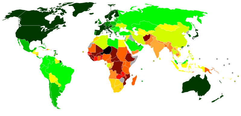
Personally I can't believe how much South Korea jumped. They started out in the higher end of the third world, and are now strongly embedded in the first world. In about 25 years they managed that!
Just found this interesting personally and thought I'd share.
Any questions you have ask away.