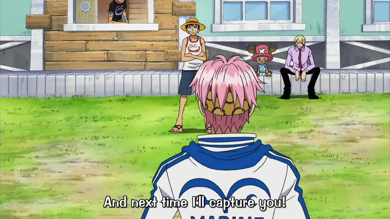
I wanna know who the hell drew this scene! Not only are Chopper's eyes weird, but he looks like a cat!
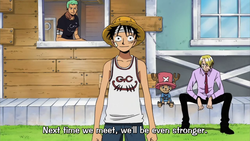

I wanna know who the hell drew this scene! Not only are Chopper's eyes weird, but he looks like a cat!

http://img259.imageshack.us/img259/6108/untitled1copysw1.jpg
I've never seen Nami's boobs so small. …Well compared the the watermelons that she has now.
That one reminded me of Dub Piece :|
http://img255.imageshack.us/img255/6382/plauw0.png
Robin, you don't look too cool today. Look her eyes. And nose.
robin looks normal,IMO
I noticed ep. 319 uses the movie 6 style- which is okay, but:

Is it just me or does this look…off?
I noticed ep. 319 uses the movie 6 style- which is okay, but:
http://img480.imageshack.us/img480/777/poorlydrawnhz6.jpg
Is it just me or does this look…off?
Robin looks like that someone decided to transform her into a teenager and nami looks like her chin has a lump in it
@Crocodile15:
This is a weird one, Spandam's been drinking
[qimg]http://i139.photobucket.com/albums/q297/Acebecool/091.jpg[/qimg]
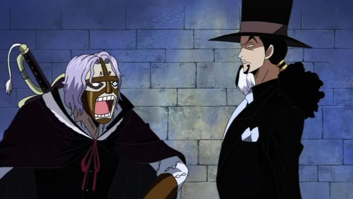
It doesn't show up….
@Crocodile15:
http://i139.photobucket.com/albums/q297/Acebecool/094.jpg
Man, there is soooo much wrong with this one
Spandam took a bite out of Gum-Gum. Hohoho.
@The:
http://i4.photobucket.com/albums/y131/Lorenor/Brogy.jpg
http://i4.photobucket.com/albums/y131/Lorenor/Namivivi.jpg
Nami and Vivi…
Nami's body looks really bad, and Vivi's face.....
http://i4.photobucket.com/albums/y131/Lorenor/Skinnysanji.jpg
Damn Sanji, you lost weight!http://i4.photobucket.com/albums/y131/Lorenor/Zosanfault.jpg
face faults I know, but…Man.
Holy crap he's ugly!
http://i139.photobucket.com/albums/q297/Acebecool/091.jpg
It doesn't show up….
That's strange, it used to show up. Oh well, here it is again

@Crocodile15:
Not a very attractive sight.
Oh, and, is it just me, or does Lucci's hat look off in that picture too?
Not to take the fun out of this or anything, but I find people in this thread are often using shots with characters quite far in the background and therefore with simplified facial features etc. While I'm not gonna argue that those scenes look good, I will say that there is a limit to how small the animators can draw before they lose a fair amount of detail and accuracy, unless you want them to like whip out their microscope or something.
If the point is to simply get a laugh out of the zany facial expressions then that's all fine and dandy, but I note that some use these as a basis for criticism of the way the series is animated which I don't find valid. In any case I just think it's good to remember that One Piece is a cartoon and what may look very good in motion may not look so good frame by frame. I mean, really, there is plenty of blaringly obvious artistic failure within One Piece in terms of styling and proportions so I don't find pointing out these very minute errors (for example, a dot for an eye) is necessary.
Anyway, sorry for thrusting my artsy-fartsy thoughts into an otherwise lighthearted topic. This is my first post here and it seems like a weird way to start things off. Carry on!
Oh, and for the record, I really like the simplified style used for episodes like 311 because I find it more fluid and expressive like the Oda's drawings in the manga. The 312 style on the other hand was just bleh… More detail but lacking in taste.
I actually do agree with a lot of that, I just do it for fun, not to critisize of the anime, but I have noticed some people critisizing the anime for these scenes, most of these are only on screen for a second, so I don't notice them when watching the anime, but when I look at a collection of random screenshots, I do
Not to take the fun out of this or anything, but I find people in this thread are often using shots with characters quite far in the background and therefore with simplified facial features etc. While I'm not gonna argue that those scenes look good, I will say that there is a limit to how small the animators can draw before they lose a fair amount of detail and accuracy, unless you want them to like whip out their microscope or something.
If the point is to simply get a laugh out of the zany facial expressions then that's all fine and dandy, but I note that some use these as a basis for criticism of the way the series is animated which I don't find valid. In any case I just think it's good to remember that One Piece is a cartoon and what may look very good in motion may not look so good frame by frame. I mean, really, there is plenty of blaringly obvious artistic failure within One Piece in terms of styling and proportions so I don't find pointing out these very minute errors (for example, a dot for an eye) is necessary.
Anyway, sorry for thrusting my artsy-fartsy thoughts into an otherwise lighthearted topic. This is my first post here and it seems like a weird way to start things off. Carry on!
Oh, and for the record, I really like the simplified style used for episodes like 311 because I find it more fluid and expressive like the Oda's drawings in the manga. The 312 style on the other hand was just bleh… More detail but lacking in taste.
You're preaching to the choir. This is for fun, and if people really do judge the basis of the anime off these screens….then well, they're idiots.
Villains lookin' weird
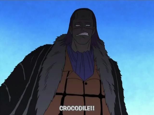
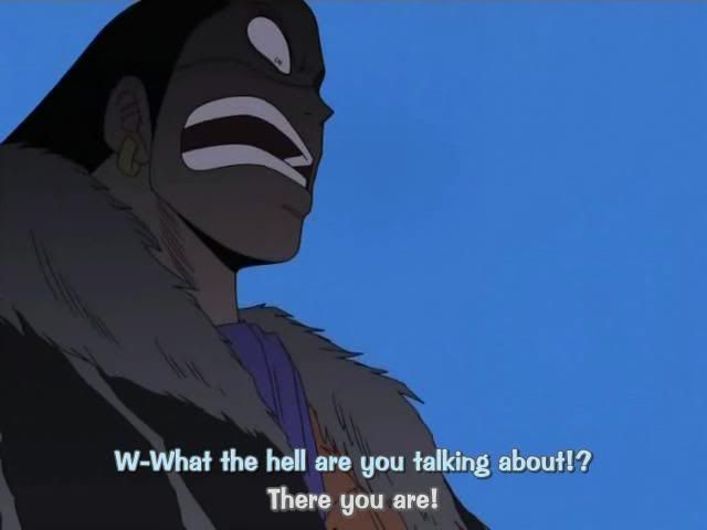
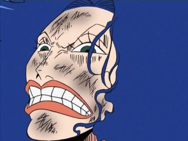
Not to take the fun out of this or anything, but I find people in this thread are often using shots with characters quite far in the background and therefore with simplified facial features etc. While I'm not gonna argue that those scenes look good, I will say that there is a limit to how small the animators can draw before they lose a fair amount of detail and accuracy, unless you want them to like whip out their microscope or something.
To be totally honest, this thread is really only for lulz. It's not an anime critique thread, but just something light hearted.
Which I have to say, the last few ROBINES pictures have been damn hilarious XD
ALSO shinpanman, I watch you on DA and I love your One Piece/DBZ stuff
@Crocodile15:
Villains lookin' weird
http://i139.photobucket.com/albums/q297/Acebecool/031.jpg
pics dont show up
You're preaching to the choir. This is for fun, and if people really do judge the basis of the anime off these screens….then well, they're idiots.
That's right
pics dont show up
Hmm, they show up perfectly for me, are other people seeing those?
@Crocodile15:
Hmm, they show up perfectly for me, are other people seeing those?
No. And when I try to click the links for the images, I'm informed that they no longer exist.
Oh, I wonder if that's because I uploaded these on Photobucket, then after uploading them here, I deleted them off my photobucket album, let me try again here


Do they show up now?
@Crocodile15:
Oh, I wonder if that's because I uploaded these on Photobucket, then after uploading them here, I deleted them off my photobucket album, let me try again here
http://i139.photobucket.com/albums/q297/Acebecool/031.jpg
http://i139.photobucket.com/albums/q297/Acebecool/032.jpg
http://i139.photobucket.com/albums/q297/Acebecool/166.jpg
Do they show up now?
yes they do show up now…
O.o is this from the Movie or the TV show? 1 looks ok..but 2 and 3..look horrible
I'm pretty sure they're from the anime, but I don't know which episodes
The first two are from that Alabasta filler episode (the one where Luffy believes Zoro is Crocodile because of that cactus he ate).
The other one is from the Nami-Doublefinger fight. The part where she gets electricuted and wakes back up.
@Cap'n:
This always bugged me:
http://img.photobucket.com/albums/v510/CaptainGroucho/animedbfluffy.gif
I guess there it doesn't look that bad, but compare to the manga version
http://img.photobucket.com/albums/v510/CaptainGroucho/combatdon2.jpg
Sure, I guess voice acting can fill in some of the emotion missing from the anime artwork, but it didn't help that Luffy's actress was pretty weak at this point.
That was one of my favorite scenes from the manga, and I was looking forward to it in the anime, and I was sorely disappointed.
I really see nothing wrong with the anime version of that scene
!
This was on the screen for like 5 whole seconds…
!
I nearly LOL'd when I caught this.
!
What makes this even more amusing, is this is them upon finding out that their friends just got killed.
…i dun't see anything in the 2nd one, buuhan Prays it's not something obvious
This isn't so much badly drawn, but I think Crocodile looks like Mr. Incredible in this scene
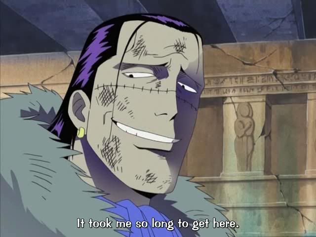
I looked through and couldn't find this one… (Then again, I'm not that vigilant o.O) But I thought Lucci and Blueno's faces were kinda... messed up. (Especially given they're not actually that far away)

…i dun't see anything in the 2nd one, buuhan Prays it's not something obvious
Oh, it's obvious. Sooo very obvious.
… I don't see it. I must be blind...
Seriously, what is it?
….Kokoro's face.
….Kokoro's face.
She always looks like that when I see her in the manga AND anime… Shes smiling? I still don't see whats so poorly drawn about her face.
It's not just her smiling….oh for the love of god, forget it. Move on.
Kokoro looks like someone who just found a quarter on the ground.
! http://i9.tinypic.com/4lfusqv.jpg
This was on the screen for like 5 whole seconds…
! http://i14.tinypic.com/6d1fdz5.jpg
I nearly LOL'd when I caught this.
! http://i9.tinypic.com/4raavx0.jpg
What makes this even more amusing, is this is them upon finding out that their friends just got killed.
AD 1:Whats wrong with that?After whad shes been through,youd look much worse.
AD 2:Okay,Kokoro is drawn stupidly,but Robin seems normal in this scene so that makes it acceptable
AD 3:Hmmm?What DID you find in here?
Holy crap he's ugly!
to the pic of http://i4.photobucket.com/albums/y131/Lorenor/Namivivi.jpg
Okay,Nami does look alot off,but Vivi's face actualy looks both hilarious and , well I dont think its lame.
i think you guys are just overreacting about stuff beeing poorly drawn…
the fact that people acctually keep an eye out for stuff like this rather then just ignoreing it and enjoying the story pussles me.
Yes,especialy if the pic they post takes ,what 2 seconds,like most people can actualy GET all the details in that short amount of time and ,come on people,the small things,you wouldnt even KNOW there there if you didnt stop it,for me,ive never noticed any of that posted here.
What you're saying is true. But in some cases the images are up their for quite a while. Plus, Oda drew these scenes and his always looked okay.
I can see that some of them are a bit stretched to find anything wrong, but when the characters are, what, five feet away from the screen? Come on!
There's no excuse for that kind of sloppiness, it's just lazy…
I'll stop ranting now... :ninja: 
What you're saying is true. But in some cases the images are up their for quite a while. Plus, Oda drew these scenes and his always looked okay.
I can see that some of them are a bit stretched to find anything wrong, but when the characters are, what, five feet away from the screen? Come on!
There's no excuse for that kind of sloppiness, it's just lazy…
I'll stop ranting now... :ninja:
Well, poor budget could be a reason, maybe….
Yes,especialy if the pic they post takes ,what 2 seconds,like most people can actualy GET all the details in that short amount of time and ,come on people,the small things,you wouldnt even KNOW there there if you didnt stop it,for me,ive never noticed any of that posted here.
I agree with this

I can't get a screenshot, but check out the first close-up of Sanji in episode 320. He looks weird, and he's apparently switched from cigarettes to french fries.


Found these on PhotoBucket and had to post them in my album and here…XD
If I ever made a lego man Zoro, that's the face that would be on it.
What's the 2nd one from? It looks like one of the movies.
@Crocodile15:
What's the 2nd one from? It looks like one of the movies.
Looks like Movie 7.
Seems like Toei have been focusing too much on fanservice and not enough time on making Zoro look less Lego-like.
Zoro looks like a Lego Man in the 2nd pic. XD
I want to point out that Zoro looks like a lego man in that second pic… =P
I dont know if this has been posted or not, but Zoro looks like a lego man in the second pic.
Wait, what?
3 people after each other pointed out the same thing.And they say Im the only one who doesnt read the threads he contributes to.
3 people after each other pointed out the same thing.And they say Im the only one who doesnt read the threads he contributes to.
Are you even serious here.