I don't really think you should've inner shadowed those jolly rogers
One Piece Wallpaper Thread
-
-
I think the shading of them is a little awkward and could use adjusting, but if you just fix it up it could look good.
-
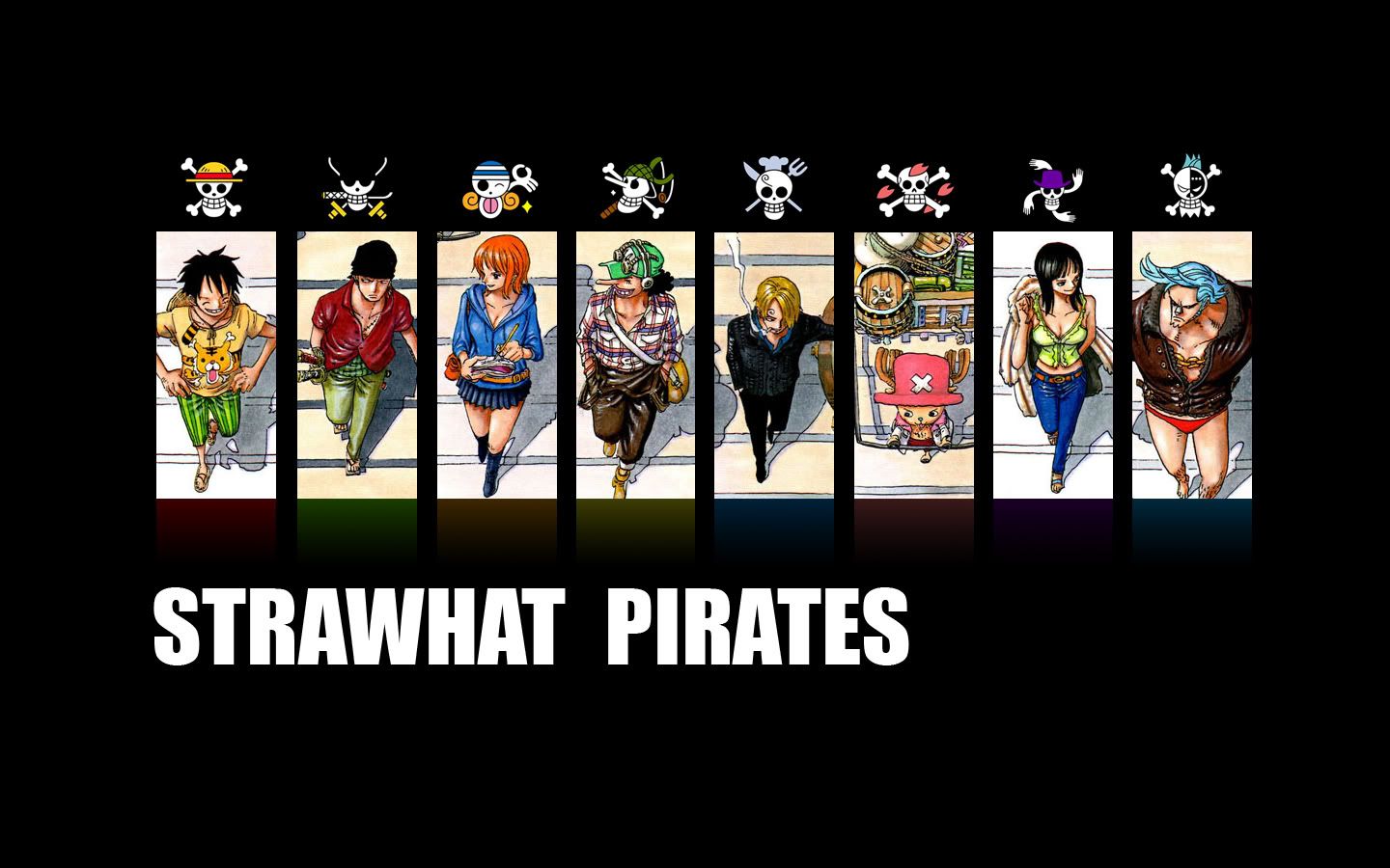
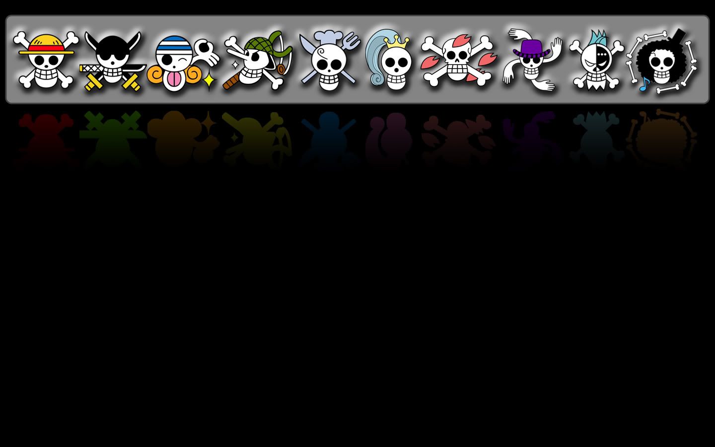
alright. Yea, the shading that is because i just took the layer from my older wallpaper.
However. Should i make the background a dark grey and give the skulls a drop shadow?
hrm we'll see. I will add Strawhat Pirates though.
J

Check out larger(huge) pictures of One Piece flags in my deviant art gallery: http://zerocustom1989.deviantart.com/gallery/
Official Gol D Roger. Just added.
-
No, keep it black. That seems to work better, you know, because of the usual pirate flag backdrop.
-
just don't do anything to them, if you think that it's a MUST, then maybe just add a glow over them (color glow by character)
you don't HAVE to, but just what I would do.
-
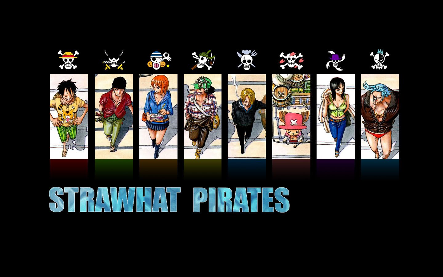
Well i added the text(but my experience w/ text being involved in a piece is not very high, so yea, not quite sure how to compose such a thing properly yet.)
I went with this font because it kept the vertical effect of the boxes.
(Im also including 3 diff. wallpapers)No Shadow, No Title
[hide]
[/hide]No Shadow, White Title
[hide]
[/hide]No shadow, Ripply title(lil experimentation)
[hide]
[/hide]J
Check out larger(huge) pictures of One Piece flags in my deviant art gallery: http://zerocustom1989.deviantart.com/gallery/
Official Gol D Roger. Just added.
-
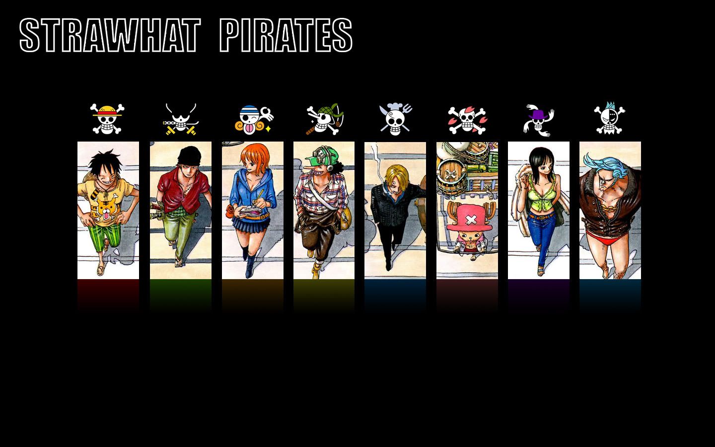
Eh, I'd say the last one was the best title-wise, but the way the title looks…I dunno, it just doesn't feel right. I mean, it was good and all, but it felt like more could be done.
-
@Impel:
Eh, I'd say the last one was the best title-wise, but the way the title looks…I dunno, it just doesn't feel right. I mean, it was good and all, but it felt like more could be done.
yea, the rest of the wallpaper is too simple to have the ripply title like that.
Yea, im not used to including text in my wallpapers(reason i included the one w/ it absent) Perhaps making the text smaller and empty on the inside….(brb, lol)
Edit!: There, done xD.
[hide]
[/hide]J
Check out larger(huge) pictures of One Piece flags in my deviant art gallery: http://zerocustom1989.deviantart.com/gallery/
Official Gol D Roger. Just added.
-
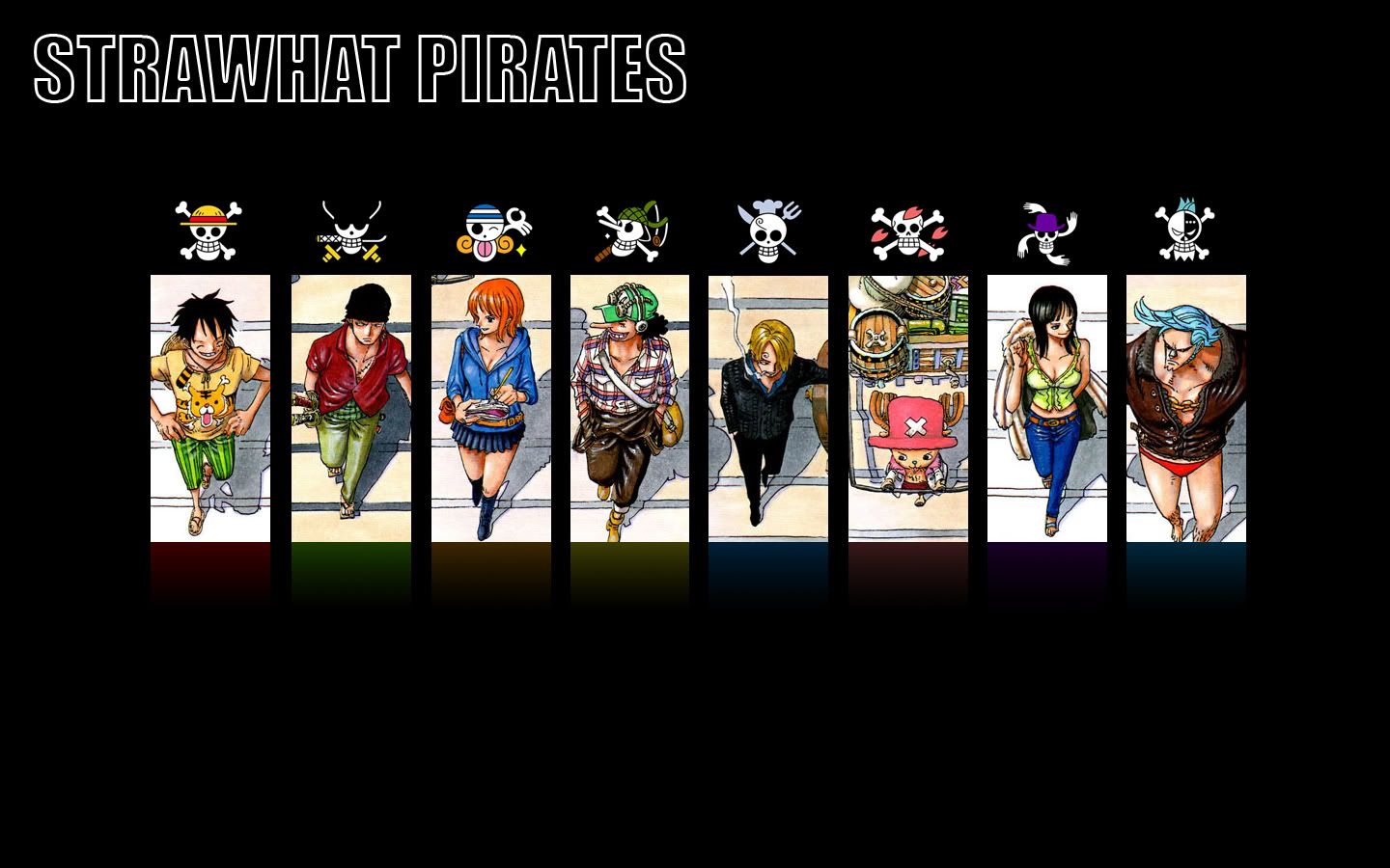
^ Yeah, that's great! Nice job!
-
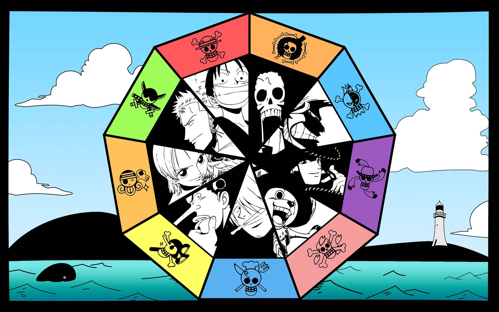
Here is something simple that I did. It is th 1024x768 version of my Thriller Bark wallpaper:
!

I have a 800x600 one as well:
-
nice, i would have gone w/ Pink letters though, to keep that theme fluid.
Other than that it's too busy for my tastes, but good job.
J
Check out larger(huge) pictures of One Piece flags in my deviant art gallery: http://zerocustom1989.deviantart.com/gallery/
Official Gol D Roger. Just added.
-
I used red letters because I wanted to fit it in the horror theme.
Too busy? What do you mean?
-
It has alot of things going on in it. If you go to deviantart.com and search for minimalistic you'll see the contrast.
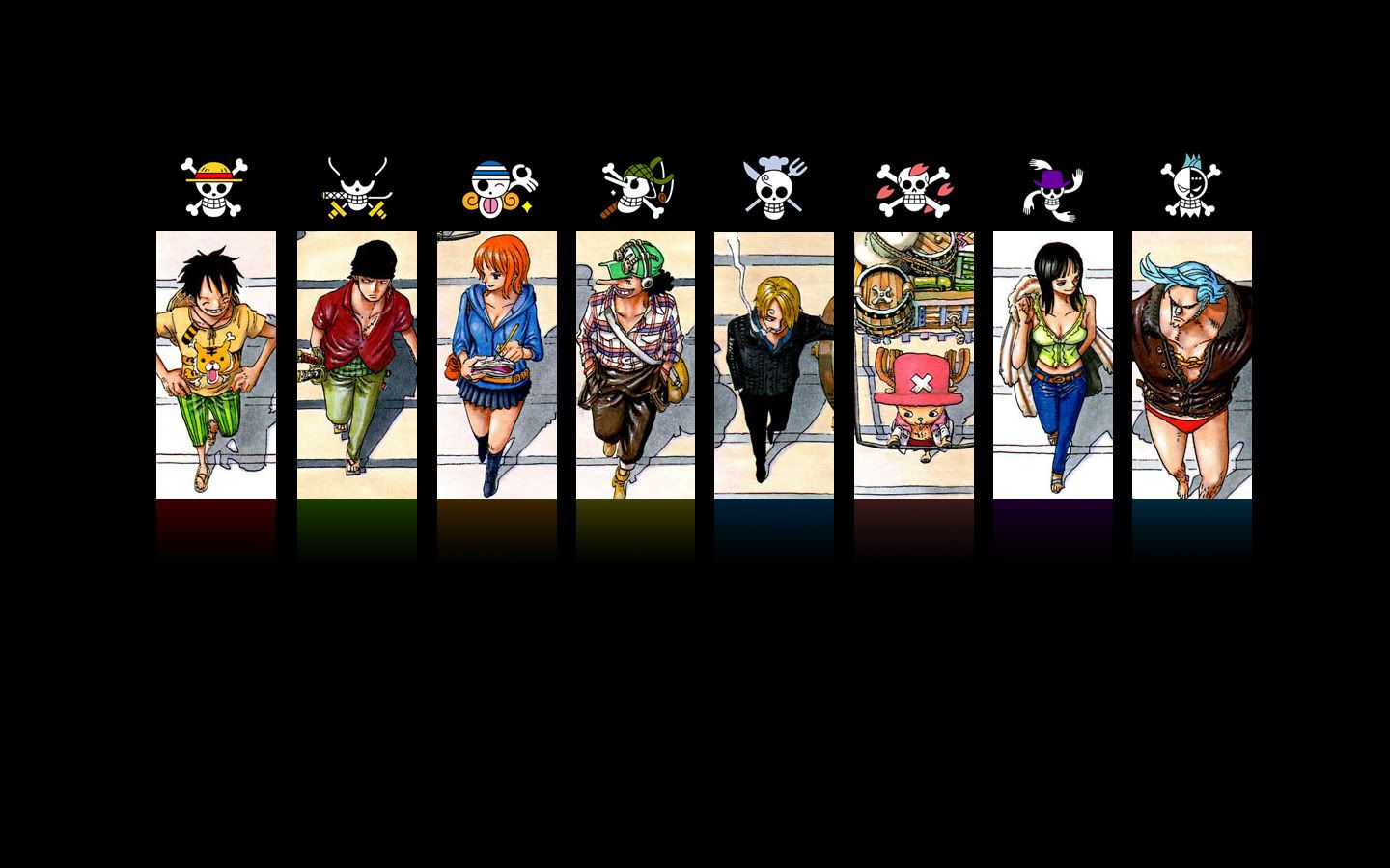
My wallpapers tend to have one or 2 symbols on them and i try to keep things very sublte. My most recent wallpaper is a collage made up of congruent recatangles in a straight row. I did that to give it a minimalistic feel.(as well as give it some more organization)
If i had placed the full image (still intact, not cut up) right in the middle, i would consider it too busy. (not to mention too bright for my tastes aswell)
This is how im gonna approach colorspread wallpapers from now on(that i make). Chop em up and organize em. Whenever oda releases another spread that has good character distribution you'll see what i mean.
EDIT: Revised walk more slowly wallpaper(letters no longer jagged)
[hide]
[/hide]J
Check out larger(huge) pictures of One Piece flags in my deviant art gallery: http://zerocustom1989.deviantart.com/gallery/
Official Gol D Roger. Just added.
-
Zwahahahaa! Here we go!
Alabasta Movie wallpaper(i dislike this one and desire artistic advice on how to make a decent Collage wallpaper out of those pics. Also, this one is so big Photobucket scaled it down[1.8megs] so im working on that…...) DL the big one here: http://www.megaupload.com/?d=LWKSAOYA
[hide]
http://i18.photobucket.com/albums/b114/zerocustom1989/alabastawallpaper-1.jpg
[/hide][/hide]
Do you mind uploading that to bigupload.com cos i cant dl from megaupload… thanks alot i really like that wallpaper!
-
J
Check out larger(huge) pictures of One Piece flags in my deviant art gallery: http://zerocustom1989.deviantart.com/gallery/
Official Gol D Roger. Just added.
-
http://fc04.deviantart.com/fs19/f/2007/238/8/d/Luffy_by_beansdooma.jpg
http://fc01.deviantart.com/fs19/f/2007/238/9/2/Defy_the_Gods_by_beansdooma.jpgMade these yesterday and today. Go ahead and use them if you like, they're widescreen though.
Wow, that one was yours?
been using the defy the gods one for a while.
Good stuff
-
Yeah, I caught the defy the gods one on anime paper. Nice work.
And thanks to whoever posted the One Piece spread link. You pushed my wallpaper/fan art collection over 1100. :D
-
This is my first try at making an OP wallpaper, and while I don't like to pat myself on the back, I think it came out good:
!

-
My last one.
It's spoiler about chapter 488.!

-
My last one.
It's spoiler about chapter 488.! http://www.rolonoazoro.com/albums/album01/the8th_by_Smoker.thumb.jpg
I am soooooo taking that
-
I love "The 8th" part, really original.
-
Would anyone be able to make a widescreen wallpaper out of this picture? Something like 1600x1200
http://i46.photobucket.com/albums/f121/skylineking/jangodancecarnivalxe4.jpg
-
Would anyone be able to make a widescreen wallpaper out of this picture? Something like 1600x1200
http://i46.photobucket.com/albums/f121/skylineking/jangodancecarnivalxe4.jpg
like this?

-
like this?
http://img107.imagevenue.com/loc995/th_32182_Jangowall_122_995lo.jpgAmazing! Thank you so much :D
-
You know what time it is? Time for me to post the wallpaper version of my updated sig :D.
here ya go!
[hide]
[/hide]Edit: Taken down for major re-editing. I dont want people using something as a wallpaper that i think is flawed.
Edit: reposted and better.J
Check out larger(huge) pictures of One Piece flags in my deviant art gallery: http://zerocustom1989.deviantart.com/gallery/
Official Gol D Roger. Just added.
-
It has alot of things going on in it. If you go to deviantart.com and search for minimalistic you'll see the contrast.
My wallpapers tend to have one or 2 symbols on them and i try to keep things very sublte. My most recent wallpaper is a collage made up of congruent recatangles in a straight row. I did that to give it a minimalistic feel.(as well as give it some more organization)
If i had placed the full image (still intact, not cut up) right in the middle, i would consider it too busy. (not to mention too bright for my tastes aswell)
This is how im gonna approach colorspread wallpapers from now on(that i make). Chop em up and organize em. Whenever oda releases another spread that has good character distribution you'll see what i mean.
EDIT: Revised walk more slowly wallpaper(letters no longer jagged)
[hide]
[qimg]http://i18.photobucket.com/albums/b114/zerocustom1989/WalkMoreSlowly5.jpg[/qimg]
[/hide]Thanks, I'm using that one now. Look forward to one with Brook in it.
-
You know what time it is? Time for me to post the wallpaper version of my updated sig :D.
here ya go!
[hide]
http://i18.photobucket.com/albums/b114/zerocustom1989/OPsg3.jpg
[/hide]Man, that one is freakin sweet, great job on that.
-
uh oh. i think… YUP IT IS!
I've done alot of experimenting with this piece.
I'd say it's version 0.9 . a Few things will change before I post the final version on my deviantart.
(in fact i really hate the ocean colors on this)WHADDYA THINK?!
[hide]
[/hide]J
Check out larger(huge) pictures of One Piece flags in my deviant art gallery: http://zerocustom1989.deviantart.com/gallery/
Official Gol D Roger. Just added.
-
Good work Zerocustom1989!! I really like the way Franky and Robin look in this one!!
-
Zerocustom, mind if I use the Jolly Wall wallpaper if its ok with you?
-
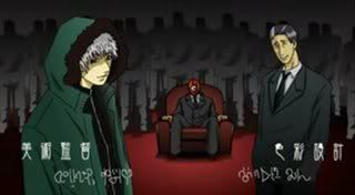
Oh. My. Eneru. This thread exsists? xD
I have a wallpaper. But I want to give people a warning because you could possibly throw up rainbows(or blue lazers) laughing at it.
SHOOP DA KIRIIIIIIN~
!
-
Zerocustom, mind if I use the Jolly Wall wallpaper if its ok with you?
nah, go for it.
16goforits
EDIT:
here's the version that ended up on my deviantart.
enjoy.
J
Check out larger(huge) pictures of One Piece flags in my deviant art gallery: http://zerocustom1989.deviantart.com/gallery/
Official Gol D Roger. Just added.
-
The top one is my current wallpaper. The bottom one was made for the lulz.
!
-
nah, go for it.
16goforits
EDIT:
here's the version that ended up on my deviantart.
enjoy.
for some reason the sunny wallpaper ended up a small size ,but,I tried using the strawhat pirates wallpaper and that came up full sized
question:
do i just right click and use as Desktop or do i have to save it to PB and then use? -
for some reason the sunny wallpaper ended up a small size ,but,I tried using the strawhat pirates wallpaper and that came up full sized
question:
do i just right click and use as Desktop or do i have to save it to PB and then use?Hey, gimme a day and i'll make a really big version. I'll post a photobucket link here when it's done.
J
Check out larger(huge) pictures of One Piece flags in my deviant art gallery: http://zerocustom1989.deviantart.com/gallery/
Official Gol D Roger. Just added.
-
Hey, gimme a day and i'll make a really big version. I'll post a photobucket link here when it's done.
ok then.

16 letters
-
This post is deleted!
-
wow… I didn't visit this thread for some time, and what do we have?? beautifull wallpapers everywhere XD saving all wallpapers XD Awesome jobs guys!!
btw, I must say this KqK, that Kaku is sooooooooooooo cuteeeee <3Hmm.... can I request a Robin, or preferably Zoro/Robin wallpaper?? I'm not that good with Photoshop -_-
-
@KqK:
! http://img265.imageshack.us/img265/7514/blindmewhileyoureatitdefi9.png
Kitty is pleased. <3 (Though I already saw it on dA.)
Mah. I should probly make a new wallpaper sometime for the lulz, and to test my skills. Like I have any skillz.
 I think someone needs to eat a happle. <3Mah dA.Bombing for peace is like having sex for virginity.
 -
hey how do you make these cause I have good ideas for some.
-
I didn't see this one here, but I may have just missed it by accident.
It's my current background, though it saddens me that it lacks Brook. :(

-
That's a real good one DNaraku. Do you happen to have it in a higher resolution?
-
DNaraku, use spoiler tags or hide tags.
@Lok:
That's a real good one DNaraku. Do you happen to have it in a higher resolution?
Seriously o-o, it's one of them best OP pics ever.
http://arnistotle.deviantart.com/art/One-Piece-Fanart-Colored-35310488
J
Check out larger(huge) pictures of One Piece flags in my deviant art gallery: http://zerocustom1989.deviantart.com/gallery/
Official Gol D Roger. Just added.
-
My last one!

-
Thanks Smoker!
Finally Oda put out a good ensemble picture with Brook in it.
-
-
Of course it's okay, he wouldn't have posted it if he didn't want others to use it. Lovely Wallpaper, Smoker! I'm highly considering using it even tho I'm accustomed to having a black screen due to it not being distracting and not slowing my computer down.
-
I didn't see this one here, but I may have just missed it by accident.
It's my current background, though it saddens me that it lacks Brook. :(
Only things I don't like are a) ya don't get franky's normal look
b) They only put dots for choppers eyes so he looks like a character from Whinnie the Pooh.
c) That is WAY too big of a grin for Robin. It's freaky.
and I would say Nami looks like even more of a slut than she really is…but i'd be wrong. she really is that big of a slut, lol.
Regardless it is now my background
-
How is Nami a slut in that image? Robin is dressed more like a slut.
The image was made back even before Franky joined. So of course there's no Brook.
Franky's look is cause of the drink being put into him.
Choppers eyes is a matter of artistic freedom, and Robin's grin is perfectly fine.
-
This thread has restocked "My Pictures" on my computer!
I don't think I'll ever need another wallpaper…
It's inspired me to make a wallpaper when I get to school...Maybe I will