No, I agree with him. Yeah, they tie eachother, but it still lacks variety.
If I really wanted to go the extra mile, I'd make another avatar of my Pirate-Akane that's in a different pose.


No, I agree with him. Yeah, they tie eachother, but it still lacks variety.
If I really wanted to go the extra mile, I'd make another avatar of my Pirate-Akane that's in a different pose.
 NewChapter 5
matrias: avi: quite nice, i like the part where the render is coming out of the background 9,5/10; sig: nice work, very good…can't think of anything more :( 9/10
avi: will not change it
sig: 
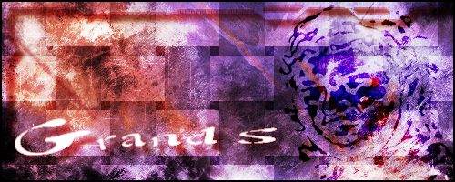
that's not grands@hot.ee …it's simply Grand S
hehe that guy is awsome although it does get kinda annoying after a while
8/10
now only some of you will get my sig, both series that is
@grands@hot.ee:
avi: will not change it
sig: [qimg]http://ic3.deviantart.com/fs11/i/2006/218/8/3/my_2_dn_sig____D_by_grands.jpg[/qimg]
Avatar: 4/10 Not really animated well and kinda big.
Sig: 6.5/10 Very dark, simple, and monotone. Nothing spectacular. Also, a word of advice, direct links to DA images don't work with bbcode.
Sig: 
Advent'
Ava: 10/10 Lol
Sig: 9/10 Looking good.
Meh new sig~
It's pretty cute, Daisuke.
Though I do know where you get those images from >:)
anyways avatar & sig this way come
Rate me, be honest.
Hey, I'm not that big of a GFX buff (I make sigs and avas for fun) but I was bored while playing with brushes while also having found a bunch of Jump Super Stars spritesheets and ended up making this.

Opinions welcome.
I like the top pick but the bottom one is way to crowded
Av: 6
Sig: 7
oh and just so you know its not possible for some to like both Coke and Pepsi
and just so everyone knows Blocks of Text are sigs aswell….
Zenko, I think you have to many things in your sig
Yeah, Zenko, your sig is too big.
Thanks for the input guys. :3
Zenko: Ava- 10/10 Who is that?
Sig- 10/10 I like the background in the first image.
Mine: Ava- 
Sig- 
Hmmm, it took me a second to figure who it was that was running in your avatar , now I see it's Kaku
7.5/10
Sig: Hilarious concept, maybe you need to have him lay down the law just a biiit more
8.5/10
@Kairouseki:
Zenko: Ava- 10/10 Who is that?
It's Sena from Eyeshield 21.
Avatar Pic could be wider 7/10
like the sig pic 8/10
decided it was time for an avatar change

note this is Soldat J from the Series GaoGaiGar and GaoGaiGar Final
Ava- 7/10 Looks like a green flower
Sig- .1/10 I don't know if quotes count as signatures, I don't find the quote funny. =/
avatar-0/10 no avatar
siggy-0/10 no signature:wassat:
Mine:
avatar: 
siggy: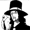
I am government man. I come from the government. The government has sent me.
Edit: Gaah! The avatar didn't work. Its luffy winking with skypeia wings from a volume cover.
I think your avatar didn't work because you can't link it from your computer.
Anyway: Ava- 10/10 Can't really find anything wrong with it.
Sig- 9/10 You might want to get a bigger picture of Lucci
Mine: Ava- 
Sig- 
I need to find something better to write on my sig.
love the avatar 9/10
not so much on the sig 7/10
Avatar:
![]()

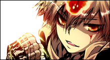
god Joker rocks hard
Who is that? The art style reminds me vaguely of Hellsing, but only because I've probably only seen about 10 series in my life.
Ava: Like the action in the pose. 8.5/10.
Sig: I can't tell if it's supposed to be Engrish or sensible. 7/10. I also like 'em short-and-wide instead of narrow-and-tall.
My new pair:
![]()
I've done this ava before, but I lost it a while ago. It's better than the creepy figure with odd lighting XD

Its Joker from Flame of Recca and the line in the sig is actually translated
B1B
Ava-10/10 Shahahahahaha!!
Sig-10/10 Kurobi and Arlong Park FTW ^^
And yeah, finally after quite a while changing my ava and sig. For those who dont know, the character in my set is Charlotte Camile Herlingum from a Mahou Bishoujo PC "H" game by Crossnet/Favorite known as Wiz Anniversary.
Avatar:

Signature:

Avatar: 2/10
Sig: 2/10
Next time do more than crop the image and add text.
Sig - 
Avatar: 7/10
Sig: 7/10
HT1191: Ava- 10/10 Can't see anything wrong with it
Sig 8/10 Kind of hard to read the text.
Mine: Ava-  I scanned it and I can't figure out how to get those diagonal lines off the picture. Help will be appreiciated.
Sig- Don't have one right now.
that is L right neway good pic a 9
EDIT: found it
Yep, it's L. I can't figure out how to get those damn lines off though.
Kairouseki-
Ava-I like how the darkness is being used. 9/10
Mr.Prince the Avatar is a great sogeking moment so 7/10
And the sig is really funny and simple so a 9/10
Ava:![]()
Sig: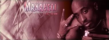
Sig: 9/10 really nice work there, the color scheme works well.
Avi: 7/10 not bad but is a little bit to simplistic.
What do you guys think of my sig:

Avatar not yet made.
Spastic
Spasticinformation
Your siggy gets a 10/10 but its 1700 KB bigger than the Rule's KB Limit in sigs, 100 KB.
Now for my new set..Haruhi Style!
Ava

Sig

like both images so a 7
haven't seen it yet sadly
Taleron: Ava- Nice coloring 10/10 It's from Jo Jo's Bizzare Adventure right?
Sig- Kind of squashed 8/10
Mine: Ava-  And again, help with getting rid of the diagonal lines will be appreiciated.
i'm bored.
kairouseki: i like your ava. (do you really need a rating? 10/10 then.)
i disabled sigs so i don't even know if you have one.
Well on my avatar is Knostantine a major character from uks Nikolai dante comic strip from the anthology title 2000ad.
On my signiture is David Daark who if I can ever draw right could well be my own manga. Unfortunatly until I can draw well that is a pipe dream.

my newest one
Nice sig. I like the background. 10/10
igalsfy, no I don't have a sig.
My ava- 
Kairouseki, you avatar is interesting but bland. I am not familar with the series that you used so that is why. Still the picture has a nice shadow effect to it. So I will rate it a four out of ten.
Here is a few signatures that I have made in photoshop in the last month. Yes some of them have been used on Arlong Park recently.


As everyone can tell, I'm in a Legend of Zelda mood.
GSR, my avatar is L from Death Note. It's a really good series, you should try it some time. It's only out in manga form right now though.
Kairouseki, you avatar is interesting but bland. I am not familar with the series that you used so that is why. Still the picture has a nice shadow effect to it. So I will rate it a four out of ten.
Here is a few signatures that I have made in photoshop in the last month. Yes some of them have been used on Arlong Park recently.
[qimg]http://i50.photobucket.com/albums/f331/SamuraiStar/The Legend of Zelda Gallery/0b6cd92c.jpg[/qimg]
[qimg]http://i50.photobucket.com/albums/f331/SamuraiStar/The Legend of Zelda Gallery/26748854.jpg[/qimg]
[qimg]http://i50.photobucket.com/albums/f331/SamuraiStar/The Legend of Zelda Gallery/25fe012b.png[/qimg]As everyone can tell, I'm in a Legend of Zelda mood.
I wont rate these by numbers, instead I'll give you some advice.
Firstly, it's best not to use beveled text, really there is no need to use the blending options on text at all. Second, the backgrounds are very very plain with nothing going on and the renders are not even blended intro the background in any way. Lastly, the sigs are very very cluttered, on average only 1 render is really ever needed.
I suggest checking out some tutorials and just messing around in photoshop. Also, I highly suggest you only use downloadable brushes for practice.
Avatar: not made by me.
Sig: 
Something to keep in mind when rating my sig, I completely colored the render.
i wanna say that i LOVE MR.Prince sig XD.
igalsfy-
avatar- 9/10 I've always liked your avatar.
siggy- 6/10 ookaay… I don't really get it, but I guess I'm not supposed to
avatar:
Luffy from this volume cover
siggy:

I am govenment man. I come from the government. The government has sent me.
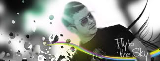
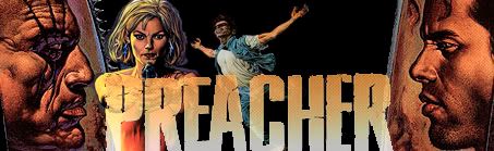
well i don't really want it rated yet since i'm not finished. but it's a preacher sig! wOot One of the best comic books ever created, so i suggest you all read it if you're into american comics, and if you are you prob have already.
strawhatteralice, the pic you used as your ava is probably my favorite drawing of luffy from skypeia arc. i rate it a 8/10! quality and size are great!
as for you sig, id LOVE to see some animation in it and i don't really get the line under it. 7/10 for it being such a cool pic tho.
@Advent`:
I wont rate these by numbers, instead I'll give you some advice.
Firstly, it's best not to use beveled text, really there is no need to use the blending options on text at all. Second, the backgrounds are very very plain with nothing going on and the renders are not even blended intro the background in any way. Lastly, the sigs are very very cluttered, on average only 1 render is really ever needed.
I suggest checking out some tutorials and just messing around in photoshop. Also, I highly suggest you only use downloadable brushes for practice.
I'll be honest with you, when I first read you post. I was mad because I worked on these signatures and put my heart into them. Now of course also by saying that my cup of tea isn't everyone's favorite flavor is also a true statment. Still I liked the blended text, one thing I will keep on future signatures.
Then I got to thinking, you are right, I could do a lot better with my photoshop skills, I have a gift but I'm not expanding on it.
I been looking at tutorials to see what ideas I can brainstorm.
So anyways thanks for the comments.
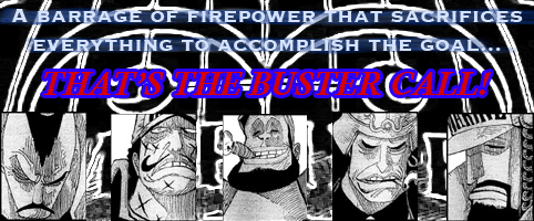
Hi everyone, back again with my Buster Call signature. I've been playing with it. How's this?
Plus, here's a poorly-coloured avatar I'm considering:

I'll be honest with you, when I first read you post. I was mad because I worked on these signatures and put my heart into them. Now of course also by saying that my cup of tea isn't everyone's favorite flavor is also a true statment. Still I liked the blended text, one thing I will keep on future signatures.
Then I got to thinking, you are right, I could do a lot better with my photoshop skills, I have a gift but I'm not expanding on it.
I been looking at tutorials to see what ideas I can brainstorm.
So anyways thanks for the comments.
I wasn't trying to be rude or anything like that. Sometimes my advice can come off that way though.
updated since the recent chapter kicked much assm, and I liked the old sig better Lion
IT'S A LION!: Ava- 10/10 for un-colored 7/10 for colored
Sig- Much better than your old one. 10/10
Mine: Ava-