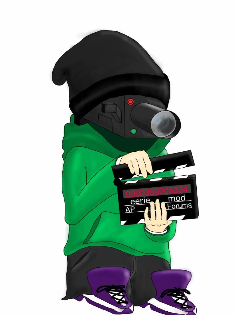
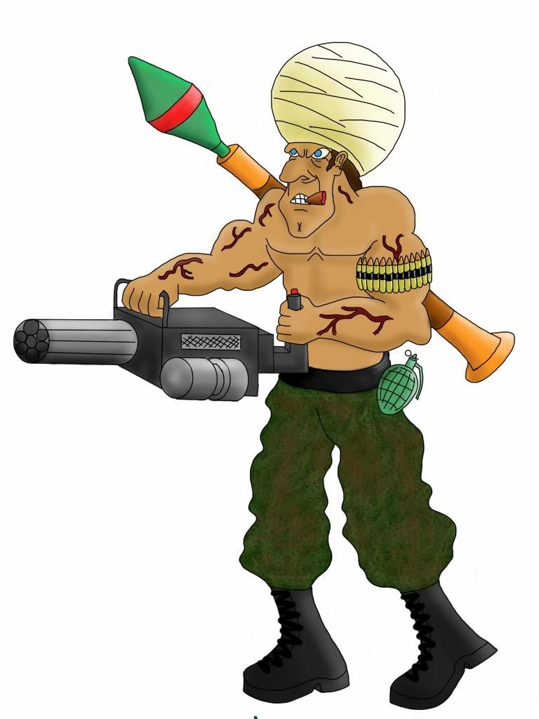
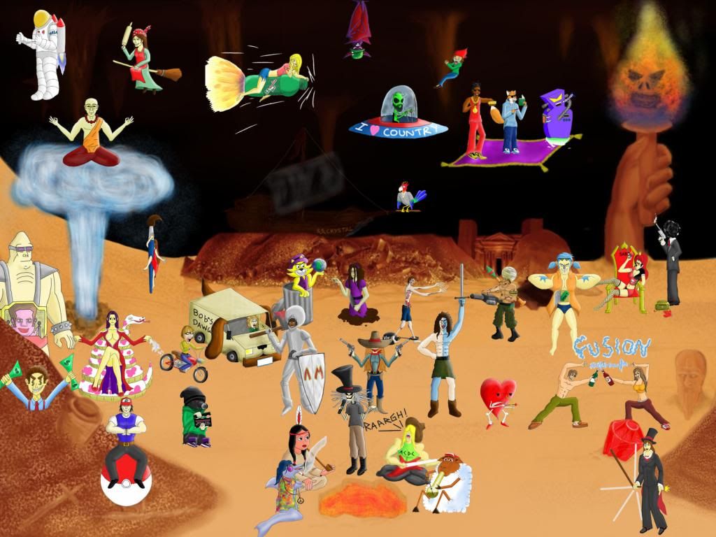
Ok, as promised, comes here my long rant and critique for you. Please bear in mind that I'm not trying to offend you but that I might sound harsh at some parts. I hope you don't take it personally, I'm really just here to help.
I made two different coloration tuturials for you and I hope they will help you improve. But please keep in mind that I'm surely no expert when it's about coloring and I'm also out of practise.
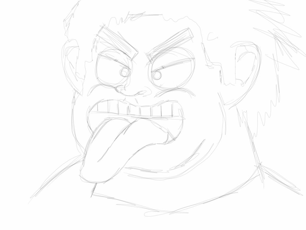
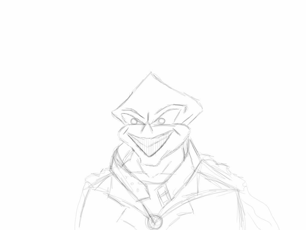
Ok, first off, I always enjoy your sketches a lot because they're full of live, but when you outline them, they lose a lot of this life. Your lines are wacky and look loveless. Like fast fast, just get it ready. I think the lines are the most important part and I take the most patience with them. If a line doesn't work out, strg+z and again until it does look good. Also, your lines have no variation in size, it's the same size all over. I suggest you change the size of lines, make them thicker and thinner at some parts. That way you can breath some live in them, just like in your sketches.
Ok, coloring now…
First tutorial is how I usually color. I might make a tutorial for coloring hair as well if you're interested. Still, my tutorials are only suggestions, you don't NEED to do it this way but you might want to try it out and see for yourself what's best for you and suits you the most.
Of course, my tutorials are messy as I'm a lazy cat. You have to put a bit more effort into the actualy drawing to not make it look so messy :P
Also, I don't know how SB Pro names the tools I use but I'm sure they must be in there somewhere as they're all basic tools. You might have to look around a bit and try out your tools :P
Ok, let's start, shall we?
! 
i sketched a simple shirt. I put my layer (it's an extra layer, not the one where I have my outlines) on MULTIPLY, took the Marker tool, choose a green color and went all over it with a big brush. My Marker tool works like a copic or crayon. If you touch the screen (in my case: graphic tablet) lightly, the color will only be lightly and the more you press, the darker it gets. For the start, I pressed lightly.
Now comes the first shadows.

I'm still on the same layer, only using a smaller brush and more pressure. As you can see, the light comes from the right. It might actually help you to draw a light source on your paper to have a constant reminder.
Now that looks rly messy, doesn't it?
An easy solution to fix that is the water brush.

I'm smoothing the edges with it.
! Now you might think you're done, but you still have loads ahead of you. Cuz let's be honest here, that doesn't rly look good, does it? You can always improve.
Make a new layer, MULTIPLY, pick marker, pick a darker green color and repeat what you did with the first color. First lightly going over the whole place and then with a smaller brush the shadows.


the shadows have to be smaller now.
! and then you repeat the smoothing with the water brush. but you don't want to smooth everything anymore. just here and there, you get a feeling for it.

! So now, that looks finished. But me is not satisfied yet. Time for experiences!
Let's make it more realistic with simply putting a DIFFERENT color into the mess.
Let's pick… PURPLE!

basically it's rinse and repeat what you did with the other colors.
Lightly going over it all,
then the dark shadows (less and less with every layer of shadows you make.)
and smoothening it

! hah, finally done!
! hm, nope!
I still think something's missing.
If you highlight the shadows, then why not highlighting the places where your light source hits?
Next layer, leave it on normal, get your marker tool and put it oooon… white! (you could also just use a brighter shade of green)

wow, that's shiny isn't it? Too shiny for my taste, let's blur it!

better. but still shiny. Let's do one last step. Take the eraser, turn down the density and go over the places that you find too shiny.

! aaand finally REALLY done this time! Big promise :3
Here I tried a more cell shading kind of tool.
! make a new layer, multiply it, pick a color you like, pick the pencil tool and fill the place with your color.

Now make a new layer, multiply, and KEEP THE SAME COLOR YOU HAD BEFORE!
And again with the pencil you draw the shadows in it. (lightsource again on the right)

there.
! Now create another layer, multiplay and KEEP THE SAME BASIC COLOR and paint some more, darker shadows

! New layer and NO multiply! AND you change the basic color this time to something lighter than your basic color.
Yep, it's time for the bright highlights.

! Well, finished.
… but of course I'm not satisfied and have the desperate urge to blur everything and so I do.

! and that's it :)
Also, I think looking at youtube and watch other people draw with the program you have might help you a lot because you'll see how much your program can actually do. It's important to know the program to get the best out of yourself.
Here for example (yes, it's german, but he's not talking during the drawing, so it doesn't rly matter. it's just useless blabla at the end and beginning.)
And this site might be useful too:
http://www.lynda.com/Sketchbook-Pro-2010-tutorials/essential-training/62087-2.html
Hope it helped you a bit. 
next time I might help you with proportions and stuff.


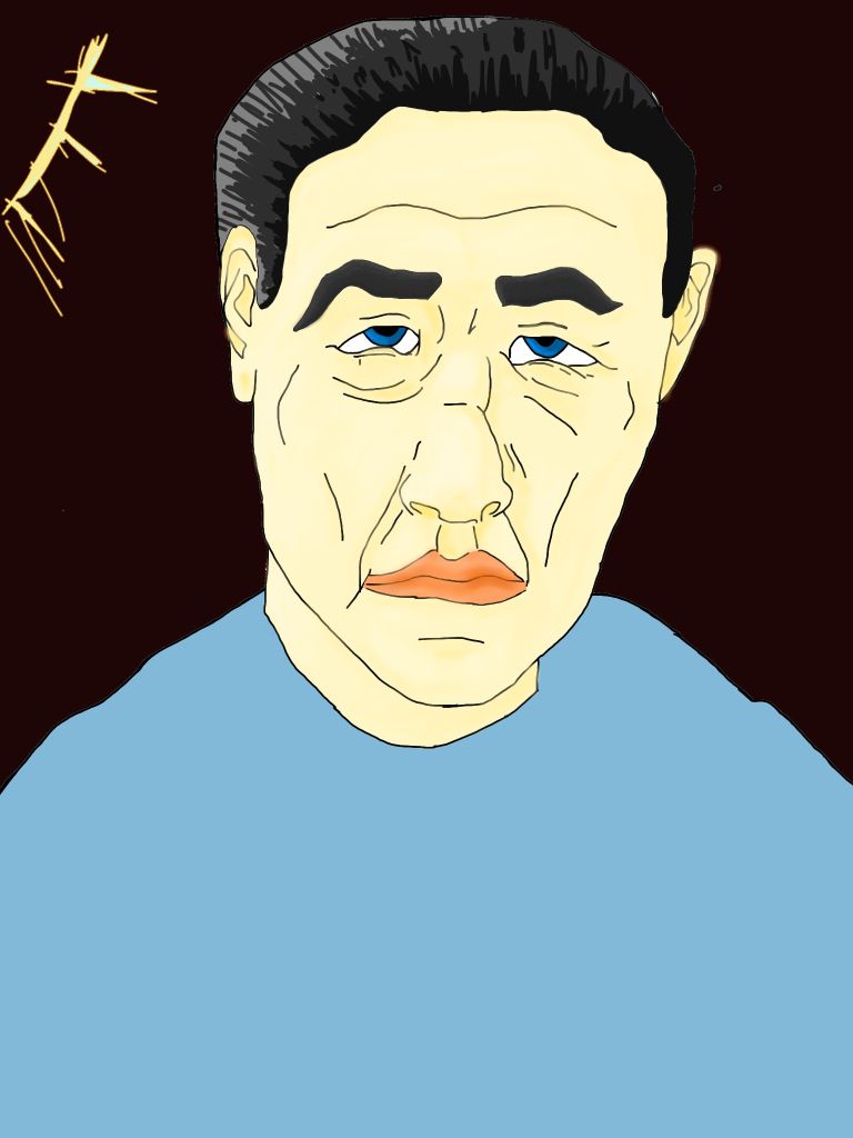
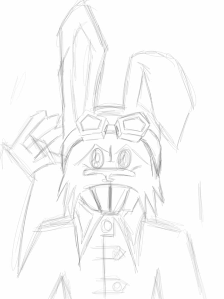
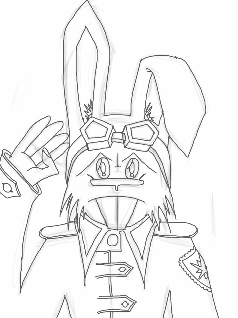

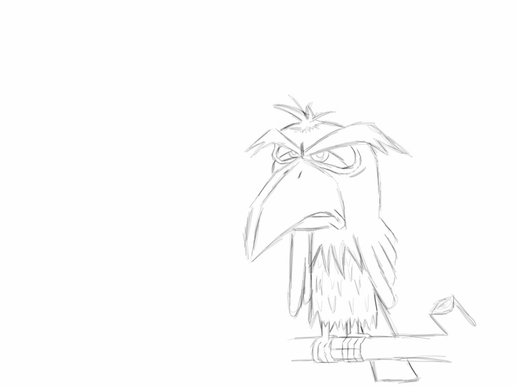
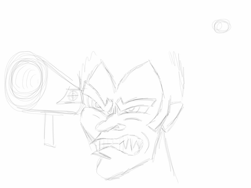
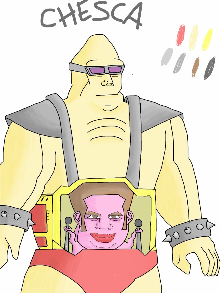

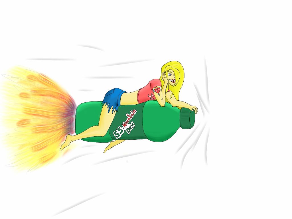



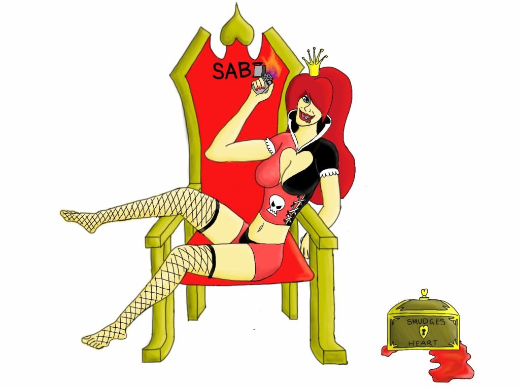

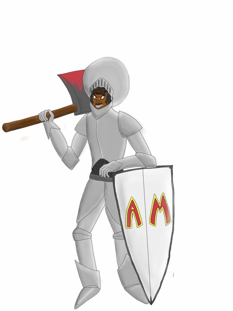
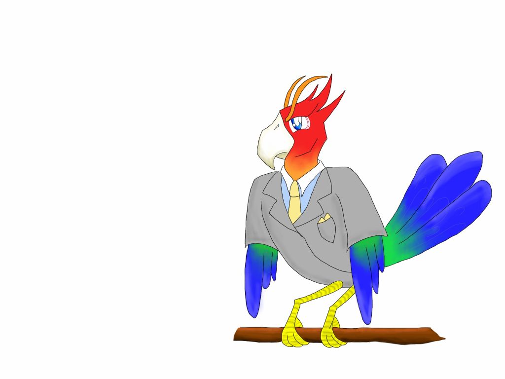



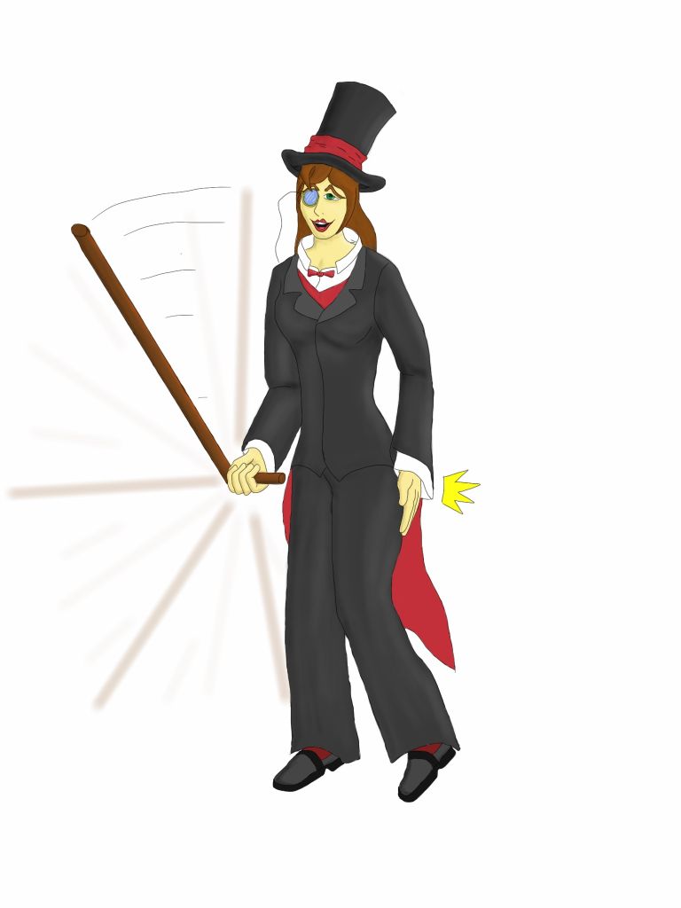


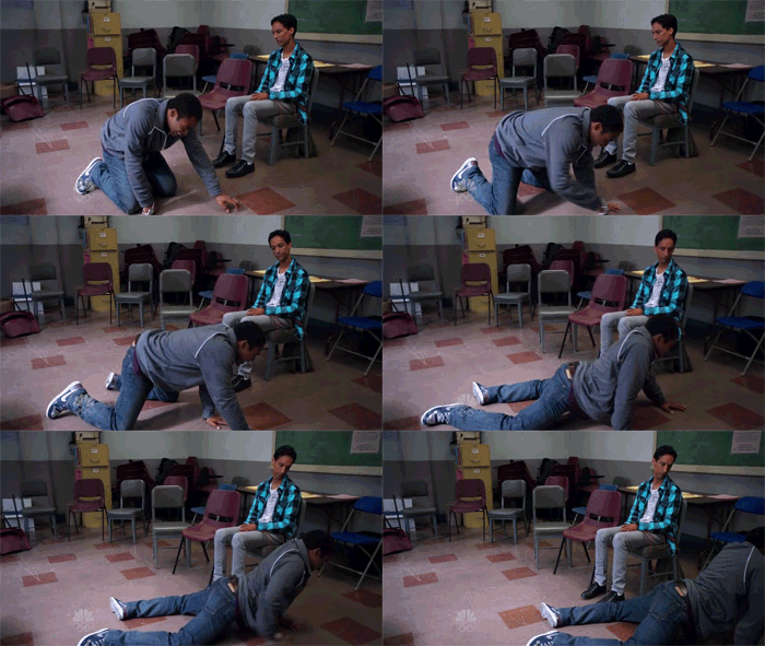
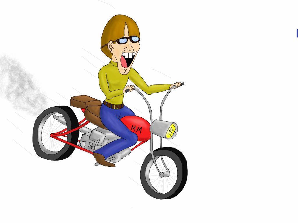



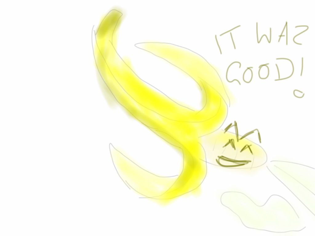

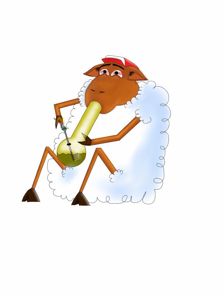
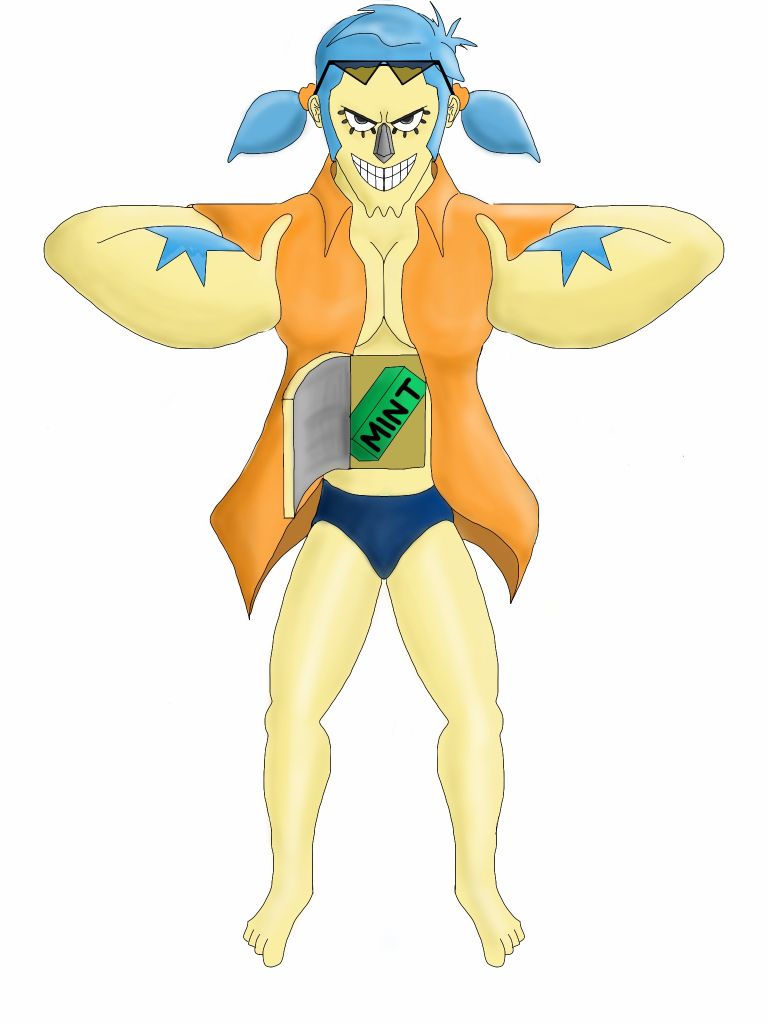
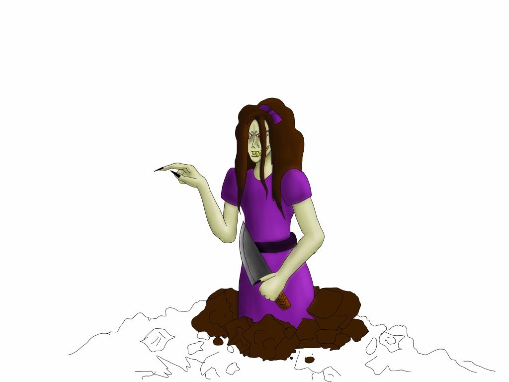

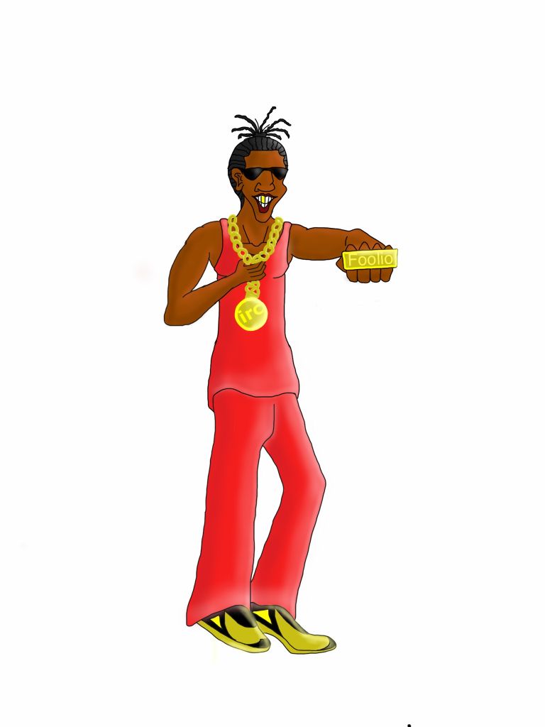
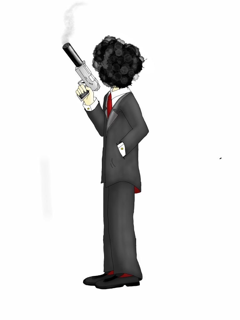
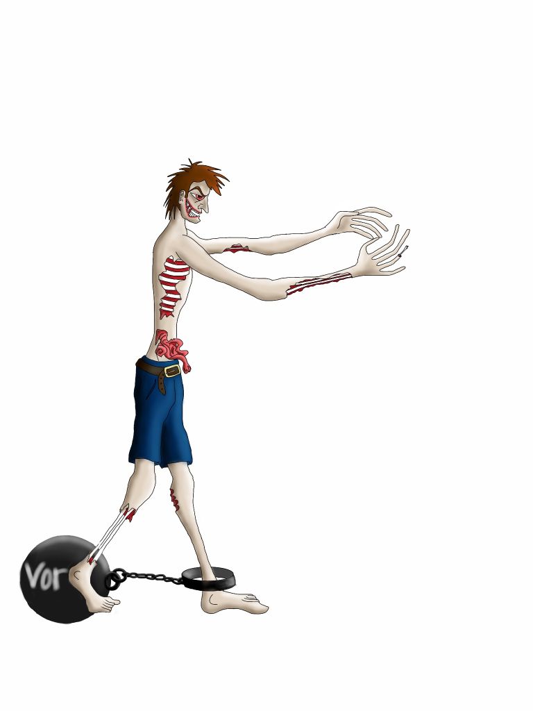 so I got around to drawing a few people. See if you can figure who's who.