Holy crap this is badass. Great work.
+++To Days Of Inspiration+++
-
-
…...... I'd go gay for that.
Very impressive. You've succeded in making Zoro look much older. I love the attention you gave to detail. The hand in the pocket is especially good.
Though the thumb on the left hand looks a little too short, but maybe it's just distance. And I do not like the scribbled lines at the bottom. Why are they there?
What's this about Zoro getting a beer belly? The guy constantly works out. How the heck would he get a beer belly?
-
Ahh! Nice! Well done!
He looks early-thirties now (32-33), but I have no problem with that, as it's closer to my age!
 And again, we're talking about someone who fights a lot and worries a lot, so if the average guy looks like that at 33, Zoro would look like that at 29.
The wall that he's leaning against is a good idea too, because that adds solidity and interest (as if Zoro wasn't interesting enough, eh?), but I almost want to see the wall covering more of his arm, so that the wall looks more dimensional, and so that the picture feels like we've turned a corner and stumbled across him suddenly.
To get an idea of what I'm talking about, take a ruler or book and hold it up vertically against the inside bend of his right arm – if you're doing it correctly, then the book will touch the inside bend of his arm and the tip of Yubashiri's hilt. Imagine that line as the wall, then imagine a diagonal line on the floor (similar to the one you already have, but maybe not quite as "steep") and a bit of shadow beneath it (just a tiny bit, to show that the wall has volume and weight).
EDIT: I'm wondering if maybe instead of a wall that goes from the floor to the top of the paper, you'd want to put a fence that only goes a little more than half way up instead? Zoro could be standing in a (door-less) "gateway" of that fence, leaning against a brick or marble pillar, with his elbow touching the top of the pillar. On top of the pillar could be a lamp or a small statue or an orb or something, that his hand could either be leaning against or hovering above. I think with a fence there, the picture would feel more open and yet more "solid" than it would with a full-scale wall. Do you think so too?
Something like this:

(my apologies to the website I borrowed this from!)Then make the fence in the background a little bit lower – about as high as his neck, but with each fence post slightly lower than the last as they go from left to right, so that it looks a bit more dimensional and "deep".
voila!
that should situate him nicely in his surroundings.(but as always, feel free to ignore any of these suggestions -- I'm just rambling, and ultimately, you will know best how to situate your man!)

Excellent work! Perhaps you should put this one in your portfolio, too!
-
@ Captain Usopp - Hehe yeah he does look older than I intended, but I kinda agree with what dinty said, now that I look at it again. Thanks a lot~!
@ Bobthedarkone - Thank you~!!
@ AWB - Hahaha thanks! I'm… glad ya like it ^^
@ dinty - I really appreciate your insightful critiques! I will have to try fixing the background like that... could you maybe show me what you mean just to get a clear picture? You can draw over mine, I don't mind!
And thanks, but unfortunately, my teacher wouldn't allow it probably... since I'm majoring in Graphic Design, not Illustration (which is what I'd rather do since GD is just not my thing anymore >_>)

*** PlasticStar5 Instagram***
-
@ dinty - I really appreciate your insightful critiques! I will have to try fixing the background like that… could you maybe show me what you mean just to get a clear picture? You can draw over mine, I don't mind!
And thanks, but unfortunately, my teacher wouldn't allow it probably... since I'm majoring in Graphic Design, not Illustration (which is what I'd rather do since GD is just not my thing anymore >_>)
I'd be glad to, altough I'll probably have to do it "old school" style (making a hard-copy print of your drawing and then drawing on that, then scanning it and sending it back to you). I have Illustrator, but I'm just not good enough with it yet – I'd have to mess with it for hours to get the same effects I can get offline in about twenty minutes with a Letraset pen.
Tomorrow is a fairly busy day for me, so I might not be able to get it to you until Monday. Is that ok?
Hmm, well, at the rate we are going, we should have it finished in time for Zoro's 30th birthday!
Ah, Graphic design -- yes, this picture wouldn't be appropriate for that, unless of course you were incorporating Zoro into a logo or something! It's an interesting frield though, and it has all sorts of practical applications (two graphic designer friends of mine got married recently and they made their own wedding invitations, place markers, guest book, etc. It was very cool! And their co-workers paid for the printing as a wedding gift to them).
-
Oh hehehe, you don't have to go to that extent to show me that lol! And I'm slow at finishing things anyways partially because I'm in school and partially because I procrastinate like nobody's business.
But if you still want to, by all means, go ahead! I'm not in any hurry to finish this anyway XD
*** PlasticStar5 Instagram***
-
Ok, so I took your pic to my most basic paint program and zapped out the background and went crazy with the geometry/shapes tools, and got a fairly good version of what I was trying to explain to you. With the fence instead of the wall, the picture looks much more "open" and dynamic, and now he has a "reason" for holding his arm so high and his hand at that neat angle that you've put it at (that really shows off your skill in drawing hands, by the way).
I'm still not totally satisfied with the perspective shift that I made (I think the fence in the background needs to be much lower and of course all the shading needs to be refined), but at least you have the basic groundwork and can take it from there. :) I'd recommend raising and lowering that fence in the background until you find a spot for it that feels most "natural" perspective-wise. It's kind of unnatural now.
As always, these are just suggestions, so feel free to keep what suits the drawing and pitch what doesn't.
EDIT: Oh, and I recommend cropping the drawing so that the post he's leaning on is a bit more close to the edge – unless of course you want to do something more interesting to the fence, like giving it texture or sticking a few bounty posters on it.


-
Ahhh I see, that actually helps a lot! Thank you very much for your help!
Yeah, that does make the background look better. I suck at coming up with backgrounds lol! Which is why I usually don't draw them XDBut seriously, you've been a big help, thank you so very much!! <333
*** PlasticStar5 Instagram***
-
You're welcome! Glad to be of help.
If you're ever at a loss for how to do a background, just look at any chapter of "One Piece". Don't try to copy the exact scenery, but instead look at the way Oda composes things : where he draws the horizon line and where he places the figures, etc. Use those things as guidelines, then invent your own buildings, props, etc.
As you've said, it's not easy. It takes practice – you'll have to burn through reams of paper -- but it's very satisfying when you finally get to the point where your figures and backgrounds come together naturally.
Here's one version of the crop job that I suggested. It loses a lot of the fence, but tightens things up and makes them more dynamic:

EDIT: Whoops! I just noticed something – the sword that I was calling Yubashiri is actually Wado! No wonder you were confused! I didn't realize that the blue spot that seems to be on the hilt of the sword is actually not part of the sword at all, but a button on the jacket beneath the sword!
It must be bedtime, I'm getting silly. Goodnight/morning!

-
Yeah, he does look like hes in his 40s or 50s. You age characters really well and naturally.
-
@pirateneko:
@ Captain Usopp - Hehe yeah he does look older than I intended, but I kinda agree with what dinty said, now that I look at it again. Thanks a lot~!
And thanks, but unfortunately, my teacher wouldn't allow it probably… since I'm majoring in Graphic Design, not Illustration (which is what I'd rather do since GD is just not my thing anymore >_>)
actually, i think zoro doesn't stress that easily. I'd expect more worry wrinkles on usopp, and nami. lol but that's just my prespective. (ha ha, prespective….drawing) :P
hey, I'll take that GD course for ya. I love GD. it's so graphic ^_^
-
actually, i think zoro doesn't stress that easily. I'd expect more worry wrinkles on usopp, and nami. lol but that's just my prespective. (ha ha, prespective….drawing) :P
They certainly show it more openly than Zoro does! We always know when either of them are worried about something!
… But I also think that Nami, Usopp, Choppy, Sanji and Luffy have an important recovery mechanism that Zoro lacks : the ability to laugh their worries off immediatley after the danger has passed -- to live in the moment and not dwell on what just happend or on what might happen in the future.
We almost never see Zoro let his guard down. While the others are eating and dancing and "getting girls" and shoving chopsticks in their noses and so on, Zoro's usually just sitting in the background slurping a beer and looking content, but also preoccupied. Either that or he's being hostile to someone (usually Sanji) because they haven't filled his plate or mug fast enough.
That was why I laughed so hard when a person on the doujinshi thread said: "Zoro just needs a big tickle" -- because it's true! He needs some intervention : he's needs something or someone to pull him out of his shell every now and again.
The big hint was in either Oda's "Red" or "Blue" book -- I forget now which one it was. Oda ranked Zoro's courage a bit lower than some of his shipmates. I thought "What the heck?!?" but then I realized that it's true. Zoro may jump into fights without blinking an eye, but he has a very sensitive "danger" radar, and when he thinks it's too early to celebrate, he'll get very defensive until he's certain that the danger has passed.
But I don't disagree with your point -- I expect we'll see a lot of wrinkles over time on the others, too.
Ah, Neko, I'm sorry -- seems I've hijacked your thread this weekend!!

-
Ahaha I don't mind! Discussions about Zoro are definitly ok with me XD Especially when they're so thought-provoking
I do love the points that you brought up too
That was why I laughed so hard when a person on the doujinshi thread said: "Zoro just needs a big tickle" – because it's true! He needs some intervention : he's needs something or someone to pull him out of his shell every now and again.
Which is why I say that ZoroxRobin is OTP…
*** PlasticStar5 Instagram***
-
Well, the beer belly idea Zoro kinda brought on himself. All that rum…
-
Oh god, if he ever stopped working out so much, then yeah…. All that rum will take its toll on him... Haha, alternate universe Zoro is even lazier and still an alcoholic XDDD Not good....
*** PlasticStar5 Instagram***
-
Neko, I've just realized something "off" about the way I modified your picture – the bottom of the fence post needs to be as low as his left heel. As it is now, it looks as though he is standing in front of the post, yet his arm is behind the orb on the top of the post. Whoops! To correct that optical illusion, we need to either lower the post so that it looks like he is standing beside or behind it, or move his arm in front of the orb.
I think lowering the post would be the easier of the two. The other thing that needs to be fixed is that all the lines on the post should be on that same slight angle that the bottom line is. That will help to fix the "optical illusion" aspect too.
Hopefully these things makes sense to you, but if not just let me know.
Discussions about Zoro are definitly ok with me XD Especially when they're so thought-provoking … I do love the points that you brought up too
Awww. You flatter me!
blushes
Thanks for reading. I'm relieved that you enjoy my mutterings. I sometimes wonder if I'm saying a bit too much in my posts. I mean, this is supposed to be a social forum, not a graduate thesis, forgoshsakes! ;) -
Ahhh, I see what you mean, dinty ^^ I'll fix it whenever I get to it again lol
Anyways… randomly made some icons and sigs....


some icons to go with this one: one at 150px and the other at 100px for LJ


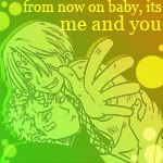
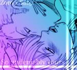
I know its hard to read that text, maybe I'll fix it… maybe. But its a song by The Calling that is called "Things Don't Always Go That Way"... thought it was fitting for ZoroxRobin...
some other icons... again, at different sizes...


*** PlasticStar5 Instagram***
-
the one with the white background; I'm not favorable of how zoro looks. The sig and avas are aranged nicely though.
That one with the heart; what program are you using? Does it not have a custom shape tool? Either that or Draw it freehand. You were probably just messing around and having fun, but that one looks soo good with the colors and arangement not to menchion the nice shot of the 2. I'd like to see it touched up a bit. :)
The OTP one is the best IMO. what does the OTP stand for though?
-
@pirateneko:
Hmm why does zoro look like he has an overly long neck? I like his face, but his neck is way too long.
@pirateneko:
Now this is what I call an icon/avatar :wub:
Great job neko. I wonder if you are going to do some SanjixZoro Yaoi stuff in the near future? (sorry had to ask XD)

*** For General (Non-Background) OP music, check this post.
- For BGMs (Background) OP music, check Audity's post.
If whatever you're looking for isnt there, THEN ask in the Music thread.**
-
Neko
I love the one with the heart. It looks so romantic. Great Job! -
the one with the white background; I'm not favorable of how zoro looks. The sig and avas are aranged nicely though.
That one with the heart; what program are you using? Does it not have a custom shape tool? Either that or Draw it freehand. You were probably just messing around and having fun, but that one looks soo good with the colors and arangement not to menchion the nice shot of the 2. I'd like to see it touched up a bit. :)
The OTP one is the best IMO. what does the OTP stand for though?
Well, I like the pic as a whole, but Zoro does look a bit femme for my tastes…
The heart I made like this: <3 ... That was the intent, I probably could've hand drawn it... but I was being lazy XD And it was a cute idea at the time... I don't know what else to do with that one right now ^^ I'll think of something, and I'm always open to suggestions to make it look better!
Made everything in Photoshop btwThanks, the OTP one is my fave as well ^^ and OTP=One True Pairing
Hmm why does zoro look like he has an overly long neck? I like his face, but his neck is way too long.
Now this is what I call an icon/avatar :wub:
Great job neko. I wonder if you are going to do some SanjixZoro Yaoi stuff in the near future? (sorry had to ask XD)
You know, he does have a long neck in that pic ^^ I guess that's just the artist's style. I noticed some doujinshi artists draw characters like that… kinda small heads and thick necks... its really strange isn't it. But I do like the pic as a whole, like I said... even though Zoro's long neck is a bit strange lol
oh and thank you hyakamaru~! I actually did make some ZoroxSanji icons a while back, here they are~
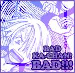

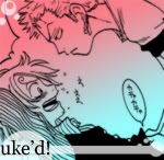
Nobody seemed to care at the time when I posted them, or there just weren't a lot of ZoroxSanji fans on here ^^ Though, also I was new to making icons and such, so that's why some of the sizes are a bit off…. And yeah, design wise, they're ok. That first one that says "Bad Ka-chan" was made for my 'Sanji' Crimsondreamer XD Since she loves Sanji as much as I love Zoro <3Also made a Nami icon:
*** PlasticStar5 Instagram***
-
ya, I know you made the heart by going <3. That's why it looks off. Other that that it's perfect. I wouldn't change anything.
I love how that first sanji ava looks. the art is great, and i'm into the colors. Though, I'm not big on bondage (I think that's what is being referenced in that one) The nami one is great too. just not my style.
one more question: what is uke? (i feel like a noob) lol
-
Ahhh, I see what you mean, dinty ^^ I'll fix it whenever I get to it again lol …
Ill look forward to it! But hey, no pressure, take as much time as you want – Zoro's next birthday isn't for another, what, 352 days? hahahah!

New avatars and sigs? Oh, you've made more than just the two that I saw on your posts this morning? ... Sweet!
This is excellent timing -- I was coming to your thread just now to compliment you on your new ZxR sig -- very clever editing job! You've really made them seem as as if they are playing a two person game. :) Oh, that heart avatar is nice too!
the ZxS ones are also fun, but a little bit "muddy" in terms of focal points -- your style's evolved a lot since then! :) You ought to try re-doing some of them in your current style. Or just making a few new ones. (There's no shortage of source material out there for new ZxS avatars, after all) ;)
"Over-thinking,
over-analyzing …"
......-- Tool (from Lateralus)
-
ya, I know you made the heart by going <3. That's why it looks off. Other that that it's perfect. I wouldn't change anything.
I love how that first sanji ava looks. the art is great, and i'm into the colors. Though, I'm not big on bondage (I think that's what is being referenced in that one) The nami one is great too. just not my style.
one more question: what is uke? (i feel like a noob) lol
Hehe, yeah I really wasn't sure what I was doing with the Nami avatar, so I don't even use it myself lol
uke=bottom, or 'the bitch', while seme=top or 'the dominant one'

Ill look forward to it! But hey, no pressure, take as much time as you want – Zoro's next birthday isn't for another, what, 352 days? hahahah!
New avatars and sigs? Oh, you've made more than just the two that I saw on your posts this morning? ... Sweet!
This is excellent timing -- I was coming to your thread just now to compliment you on your new ZxR sig -- very clever editing job! You've really made them seem as as if they are playing a two person game. :) Oh, that heart avatar is nice too!
the ZxS ones are also fun, but a little bit "muddy" in terms of focal points -- your style's evolved a lot since then! :) You ought to try re-doing some of them in your current style. Or just making a few new ones. (There's no shortage of source material out there for new ZxS avatars, after all) ;)
Hahahaha, I won't take THAT long on it XDDDD very funny though, I liked that…
Oh and thank you~ I just kept looking at that spread, thinking.. I should edit it to where it looks like he's holding her... it was tougher than I thought, but it worked out in the end ^^
And I really appreciate your honesty, I wish people would've told me that when I first posted them ^^
I may take another stab at those one day.... I have PLENTY of ZxS pics :ninja:
*** PlasticStar5 Instagram***
-
Sweet sigs and avatars. I wish mine were that good. :3
-
@pirateneko:
This av is UBERsexy!!! I totally didn't notice the heart was <3 at first… I'm ashamed at my lack of attention to detail... I blame it on the massive amount of turkey I just consumed. But, the fact that it's <3 instead of some vector actually makes it neato IMO.
Also, I love your new sig... the gradient reeks of smex! XD (I tend to shy away from gradients... maybe I should incorporate them into some of my designs... hmm... now I'm rambling in my inner-monologue)
-
@ Paulie - D'aww thanks ^^ But I love your avis and sigs (I miss the Paulie avatar, that was so hot XD)
@ mr_bushido - Hahaha thank you~ Yeah, its easier than making a vector heart, and I was just using Photoshop anyway… I kinda tried blending it together, I should've gone and scaled each part but I'm lazy XD
Aw and yes, I'm pleased with how that sig came out! Not so much the other one, I was experimenting with something that I may try again someday...And as far as gradients go... sometimes they do lend themselves well to designing stuff, but I'd be careful about using the default ones, especially as backgrounds. Its cool to go in there and mess with the colors and stuff
........ I got bored at my dad's, they were watching Red Dragon... that movie confuses me. So I drew some ZoroxKaku.... Sorry I had watched ep 286 again... <333

s'not much… just a messy sketch in my notebook that I carry around....*** PlasticStar5 Instagram***
-
@pirateneko:
oh and thank you hyakamaru~! I actually did make some ZoroxSanji icons a while back, here they are~
http://i3.photobucket.com/albums/y68/pirateneko/BAD150.jpg http://i3.photobucket.com/albums/y68/pirateneko/cuteness150.jpg http://i3.photobucket.com/albums/y68/pirateneko/ukesanji150.jpg
http://i3.photobucket.com/albums/y68/pirateneko/woohoobondage150.jpg http://i3.photobucket.com/albums/y68/pirateneko/yaysex150-1.jpg
Nobody seemed to care at the time when I posted them, or there just weren't a lot of ZoroxSanji fans on here ^^ Though, also I was new to making icons and such, so that's why some of the sizes are a bit off…. And yeah, design wise, they're ok. That first one that says "Bad Ka-chan" was made for my 'Sanji' Crimsondreamer XD Since she loves Sanji as much as I love Zoro <3Oh sweetness, if you dont mind, ill be using one of em
Do you have full sized ones too? I guess I need to appease my perverted mind.. XD
EDIT: The ZoroxKaku pic just loaded for me, not bad not bad. That nose looks like its hurting Zoro's eyes. lol..
*** For General (Non-Background) OP music, check this post.
- For BGMs (Background) OP music, check Audity's post.
If whatever you're looking for isnt there, THEN ask in the Music thread.**
-
Neko
I really like the Nami one. Is there anyway I could use it?
-
Oh sweetness, if you dont mind, ill be using one of em
Do you have full sized ones too? I guess I need to appease my perverted mind.. XD
EDIT: The ZoroxKaku pic just loaded for me, not bad not bad. That nose looks like its hurting Zoro's eyes. lol..
If you mean just normal ZoSan smut… I have... alot. LOL. I'll upload some good ones for ya if you want
oh and thank you~! I totally don't mind if you use em
yeah, I kinda tried making Zoro's head to the side to prevent that, but I guess I failed lol!@Ms:
Neko
I really like the Nami one. Is there anyway I could use it?Sure, go ahead! ^_^
*** PlasticStar5 Instagram***
-
@pirateneko:
http://i3.photobucket.com/albums/y68/pirateneko/other crap/ZoKaLuv.jpg[/qimg].
lol neko, you silly girl. I wonder what your dad thought of your picture? (my dad wouldn't get it. He never got playing videogames, watching anime, or things like wearing those stuffed animal book bags…and he's not big on gays)
-
Ahaha, my dad is not big on gays either… but he didn't see it, thankfully, heh XD I showed my sister though, she was like "Oh god -_-;"
*** PlasticStar5 Instagram***
-
Great ZoKa art, though their backs looks so stiff. For that, you get half of my deep fried gerbil skins.
-
Hehe, that's what I get for not using reference XD
*** PlasticStar5 Instagram***
-
Uuugh.. soo much yaoi…Buu....Buu is melting...;_; tries to crawl towards some boobs but passes out in the process
-
Brings Boobs to Buu Go nuts.
Great Work. My Girlfriend would flip if she saw this, Mind me sharing it with her? I'm not a fan of Yaoi, But it's still damn cool.
-
Haha, I don't mind at all, DFG ^^ and thank you~!!
Aww poor Buu-chan~ <3 no boobies for you XDDD randomly gropes Crimsondreamer's boobs ;p
*** PlasticStar5 Instagram***
-
–----
Post deleted cause it upsetted Local and I was threatened with sexual harassment.My apologies, neko. I wont consider grabbing your boobers again.
-
Apology accepted ^^ Hehe, I wasn't here most of the day yesterday since i had to work, and stuff happens in my thread XD I think I kinda asked for it though ^^
*** PlasticStar5 Instagram***
-
Personally, I was joking around and I think Local way overreacted. Well, I'm shutting up now before he gets me banned.
-
Moving on then….
DA really sucks lately...
Here's some old crap from me... hurrah for gradients :getlost:
Ehh.... I kinda miss having long hair... but then again, I hate when my hair grows out during that awkward phase, so MARIMO HAIR FOREVER!!!
one of my original characters, loosely based off of my friend Tessa, she let me use the name Vert =3…. um yeah... Yellow ninjas are so impractical, then again so is 90% of the Naruto cast, so piss off.

…. another thing I did... this was gonna be for my portfolio, as part of a post card series... but there was nothing really conceptual about it, so its just a pretty scenery....

*** PlasticStar5 Instagram***
-
I like the coloring on the first two pics. It's very creative, like 3D in a way.
I love that last pic.
-
@pirateneko:
Moving on then….
DA really sucks lately...
Here's some old crap from me... hurrah for gradients :getlost:
Ehh.... I kinda miss having long hair... but then again, I hate when my hair grows out during that awkward phase, so MARIMO HAIR FOREVER!!MARIMOES OF THE WORLD UNITE.
-
ahhhhh so cute. I love that style of yours. feel free to draw something like that for me in that style ^_^
-
All this yaoi (the previous page) is scaring me, but goddess-like art.
-
Heh. The Second pic kinda reminds me of that Game "Sly Cooper" No I dea why.
Just does, And I like it alot. -
It does look like a she-Sly Cooper now that you mention it.

-
@Pass:
I like the coloring on the first two pics. It's very creative, like 3D in a way.
I love that last pic.
Thaank you~ Hehe, yeah, I honestly didn't see them that way, I was just adding more color to them, but hey, that works too!
Oh and thank you, I put quite a bit of work into that XDMARIMOES OF THE WORLD UNITE.
RAAAR!! <3
ahhhhh so cute. I love that style of yours. feel free to draw something like that for me in that style ^_^
Hehehe thanks! And I'd love to draw something like that for ya~ Just let me know someday, and I'll see what I can do… I do need to start inking for real again anyway XD
All this yaoi (the previous page) is scaring me, but goddess-like art.
Geez too many homophobes on this boardXDD I'm kidding, I'm kidding
But thank you, I appreciate that ^^Heh. The Second pic kinda reminds me of that Game "Sly Cooper" No I dea why.
Just does, And I like it alot.…I think I know what you're talking about, but I've never played that game, so its just a coincidence that they are both raccoons... Only major difference aside from gender is that my character is a Ramcoon, she is a raccoon with ram horns, but her horns are cut off... long story XD
@Pass:
It does look like a she-Sly Cooper now that you mention it.
[qimg]http://content.answers.com/main/content/wp/en/thumb/4/4a/180px-SlyCoopertheThief.jpg[/qimg]yeah, that thing… but I assure you, it was unintentional XD
*** PlasticStar5 Instagram***
-
Neko, I really love the style of the first pic! I like how you used two contrasting gradients to accentuate the stroke/drop shadow effect… oh man, it's making want to fool around with gradients.
[opens Photoshop]
-
Sankyuu mr bushido~ <333
btw your sig is LOVE~ I think I recognize that guy… he looks like the guy who plays House, but I'm not really sure since I'm like half awake lol
*** PlasticStar5 Instagram***