Boredom haunts me
!

Can you say Kakashi Parody?


Boredom haunts me
!
Can you say Kakashi Parody?
Double Posting because I'm awesome.
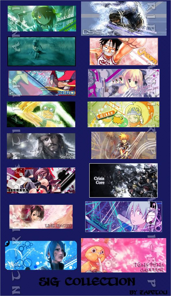
A collection of, what I think, are my top sigs.
Can also be found on my deviant page for a full view.
If anyone wants to use this, ask and I'll send ya the file.
Really awesome. I didn't have seen the Jack Sparrow one yet :)
I like the Haruhi sig, can I get it?
wow, great sigs! especially capt. jack sig… :wub:
btw, do you accept requests?
^Sure, I just need a stock (a picture of the person basically) or an alreayd cut-out render of the person. Tell me the style you would like it as (maybe choose one of the sigs above or someone else's sig). You can PM me or just post here.
^Sure, I just need a stock (a picture of the person basically) or an alreayd cut-out render of the person. Tell me the style you would like it as (maybe choose one of the sigs above or someone else's sig). You can PM me or just post here.
thanks a lot. i'll just look for a good pic then.
Inspired by Crazy Crazy Rainbow Star!
!
Very nice, I love it. <3
Makes a great background after dimming the colors a bit.
Indeed, that is really cool!
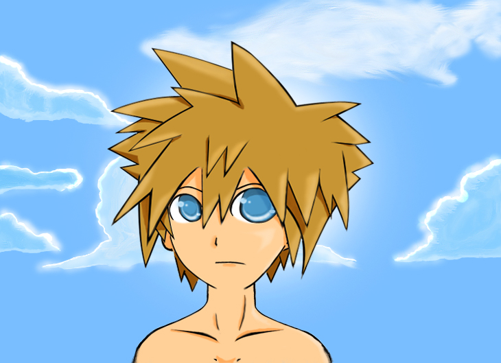
Sora:
!
Clouds:
!
SORA CLOUDS!!!
!
Did this becasue Sora in Japanese, I think, means sky.
Anyways, my drawings not very good as you can see. I should've added more colors to him. I thought the eyes turned out alright though. But the head and body….....they don't match right? Well I gotta practice; don't worry, they'll get better. As for the clouds, not how I wanted to come out, but I guess they're close enough. One of the clouds looks defected...It also may be my choice of colors again. Gotta get me reading those tutorials. XD
More in the future! WHO THE HELL DO YOU THINK I AM!?
Good drawings Cr4zy :)

Kamen Rider OOOs
Wow, I'm pretty impressed. Did you draw these on a tablet?
Wow… that Sora would be awesome as a star of his own comic strip, methinks.
Very good drawings.
Wow, I'm pretty impressed. Did you draw these on a tablet?
No, I drew it by hand and inked it with the pen tool. But I'm gonna get a tablet soon for my b-day this coming weekend. So like i said, things will be much easier.
And thanks for the positive comments.
I'm gonna get a tablet soon for my b-day this coming weekend.
You'll love it. I got my tablet last year, and I can't live without it. I look forward to seeing some of your work that you do on it.
Dooooooo dooooooo….
!
Dooooooo dooooooo….
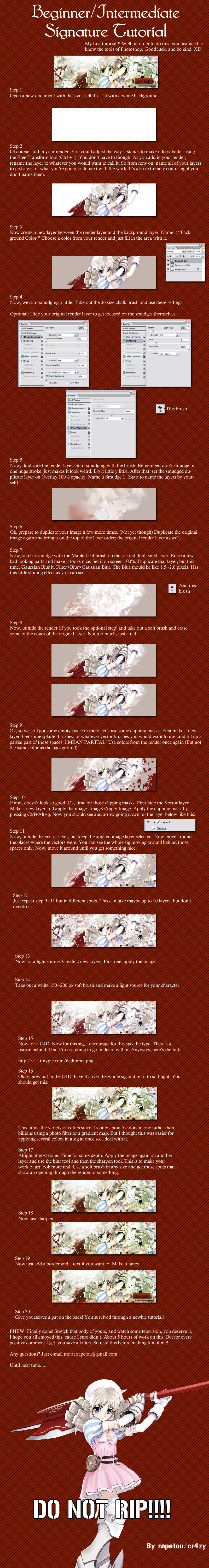
! http://fc01.deviantart.com/fs21/f/2007/236/6/2/Beginner_Intermediate_Tutorial_by_zapetou.jpg
<3
Still enjoying the tablet? Done anything really cool with it?
Haha, it was about time you made a sig tutorial. :D
And a splendid one it is.
Thanks; I'll be using it. <3
Ah, no problem. Never knew you liked my sigs. :P
In other news:
!
Due to boredom again. But the color choices suck. Meh, whatever.
I am also in the works of a request (which is driving me absolutley crazy) and on a character from Tengen Toppa Gurren Lagann.
Konata and Haruhi togather,Good job Cr4zy
Does this look banner-worthy?

Entered this in a little contest. Wanted to see your opinions. BE BRUTALLY HONEST!!! Even I wasn't all too happy about the outcome.
Well, the background is great and Luffy's pose is great too. But I feel there is something lacking… I don't know what is. Maybe something different you know, since there are plenty of Luffy banners like this.
Yeah, I'm thinking it might be the right side. Luffy just seems too plain to me.
You could add other character with him, like Chopper or Robin.
Oh I see. Sorry man.
What I would do is drop the opacity on the Luffy layer, to soften his look a little. Right now, he looks way too bright & colorfull, and it clashes with the background.
When doing a sig, how do you get the character render? Whenever i have one, theres always this white background? Have you cut it out or something? Cause it looks very "clean-cut" then..
What I would do is drop the opacity on the Luffy layer, to soften his look a little. Right now, he looks way too bright & colorfull, and it clashes with the background.
Yeah, it's the light. I fixed it a little, but I had to have him solid; to have him stick out. I used a little Variation on the sig as a whole to match the mood. I went for a warmer feeling.
Here's the edited version:

@El:
When doing a sig, how do you get the character render? Whenever i have one, theres always this white background? Have you cut it out or something? Cause it looks very "clean-cut" then..
Well, I usually am really lazy with cutting a character ut of a piece of work, so I usually go here:
www.planetrenders.net
and type in what I'm looking for and find it. It's usually clean cut, but not always. I cut it out with the pen tool in Photoshop(most people do). But this Luffy render, I saw a lot of little white marks around the render that just pissed me off. So I sometimes rely on others to do it for me, but it isn't always great.
@Cr4zy: That looks a lot better. I like how you added the orange offset stroke on top of the red… it brings Luffy out more.
@Pinguino: Use the Polygonal Lasso tool.
Planet renders looks pretty cool.
Thanks

My…recent love for Korean R&B
It's not great, but a couple of months without Photoshop makes a person rusty. :P
Looks very good Cr4zy :) i haven't photoshop anything since my old hard drive broke