The japanese volumes have alternate covers under the cover flap.
Volume 66 prediction thread
-
-
Was there another version of the Vol. 63 cover?
I definitely liked this one better.
!
-
@Barbe:
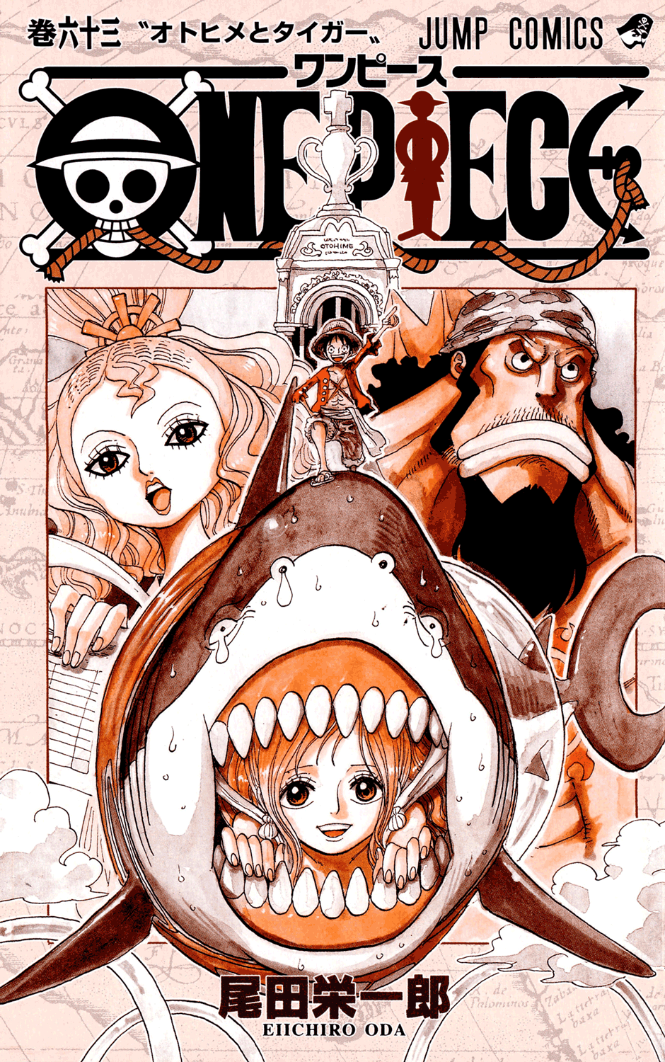
Cover :
http://i42.tinypic.com/2ajxkbk.jpgI hope Oda is gonna give Big Mom's crew more colors than pink. lol
-
I really like this cover, even though Shirahoshi looks a little squished as some people have pointed out. And is it just me or does Baron Tamago remind you of Hercule Poirot? I also like how relaxed Luffy looks as they sit down back to back. I'm looking forward to seeing a picture with higher quality.
-
Nice cover, but reminds me too much of 63, and some of the colors are too similar. Kind of like in 59 where there was Ace wih fire, Shanks with red hair, Whitebears with a lot of blood and red stripes on staff, and Bb with red shirt.
-
Pretty big stepdown from 65, but then again 65 was one of the best covers Oda ever made imo.
Drawing is fun
-
what is that little square above pekoms and under baron tamago?
i just can't tell WTH that is :ninja: -
That's probably the background for Shirahoshi.
-
Not the most inspired cover (too many characters).
However, Smoker and Tashigi look great and can hype up volume readers.
-
the little box above shirahoshi is the pinky promise, if you look closely you she the hands. I like the cover.
-
Meh, This cover isn't as awesome as I'd hoped… 65 was much better
-
Not the most inspired cover (too many characters).
Less characters than on the last volume cover…
-
Convoluted isn't a trouble if it's done well. The previous one, as well as the Supernova one, was very good. But on another look what really bothers me is Tashigi. She's in that square. And that Lion guy too. The square ruins the whole picture. It's as if you were putting images on the back-cover of a film.
-
Not the best cover. Like many people have said, the boxes kinda ruin it.
-
Yeah, this isn't my favorite cover either. It looks like six images kind of shoddily layered on top of each other. And it looks like Shirahoshi's tail starts behind Pekom's picture and then wraps around to the front. Kind of like the 4 pictures(Smoker, Tomago, Pekoms, Tashigi) are 2 dimensional pictures within Shirahoshi, Luffy, and Jinbe's 3 dimensional world. It looks kind of odd. I almost thought it was fanmade the first time I saw it. Maybe I need a closer look at a HQ pic.
-
Convoluted isn't a trouble if it's done well. The previous one, as well as the Supernova one, was very good. But on another look what really bothers me is Tashigi. She's in that square. And that Lion guy too. The square ruins the whole picture. It's as if you were putting images on the back-cover of a film.
Not just the squares, but Shirahoshi's lower body looks… Warped. How would her midsection lead into her tail this way? The waist and hips are facing downward and the tail is facing upward, way over there, and the top of the tail is SUPPOSED to be thicker than the bottom, and... UGH. It's almost as if they said "we'll just cover it up with Luffy, and nobody will notice". PLUS, Shirahoshi's tail is going OVER the square that cuts off Tamago's body for absolutely no reason, but it's going UNDER the Pekoms square. WHY?
-
The boxes were awkward on the cover of Vol. 56, and they continue to be so here.
~Stargazer~, ~Distance~ original stories.
3DS Friend Code: 2234-8294-8917
-
so CH 647 to ?? 655? or 656?
-
The boxes were awkward on the cover of Vol. 56, and they continue to be so here.
That was the one with Mr. 1 and Inazuma right?
At least they put Ivankov's gigantic, freaky face there to distract us from them.
-
The boxes were awkward on the cover of Vol. 56, and they continue to be so here.
Oooh, I never noticed there were boxes in 56 until now. Beh :( Now I see them.
-


Twitter: https://twitter.com/Mugiwara_23
-
http://books.shueisha.co.jp/search/book_image_b/978-4-08-870416-6.jpg
I like it,especially Jinbei and Luffy bit, the only awkard bit for me its the rectangle with coral in front of Tamago the rest its fine.
-
There is too much going on, but I love the mood this cover sets.
-
Thanks Redon!! Even though there's a lot of stuff going on, it is a nice cover when you see the better image. One note, is this first time the straw hat on the One Piece logo has ever been colored like Luffy's hat?

-
Thanks Redon!! Even though there's a lot of stuff going on, it is a nice cover when you see the better image. One note, is this first time the straw hat on the One Piece logo has ever been colored like Luffy's hat?
I noticed that, too. I looked throught the other covers and it does seems like it's the first time.
-
Actually, the rectangle with the corals go all the way to the other side if you look closely.
We have 3 layers of characters with three rectanges between them and a rainbow background.
1st layer is composed of Luffy and Jinbe. Behind it is a rectangle with Tashigi and Pekoms.
2nd layer is Shirahoshi. Behind it is a rectangle with corals.
3rd layer is Smoker and Tamago. Behind it is a rectangle with a blue sky and clouds.Notice however that Shirahoshi is in the same "image" as Luffy and Jinbe, even though not in the same layer, while Smoker and Tamago compose an "image" apart.
-
WUT!!! The green part at the bottom is Jimbei's clothes! I thought it was Tashigis somehow ridiculously large arm and shoulder. Although still not my favorite cover, I'm better now. The square isn't as big as I thought.
-
i just realised that not only tamagos clothes but also pekoms clothes are coloured pink. I guess this means that the whole big mom pirate crew will get a pink theme.
-
Chapter? 647- 65x??????
Visita il [ROLONOAZORO FORUM
Il Canale Youtube dell' RZ e Verba Team](http://www.youtube.com/channel/UCwsqwXKjpsvXVuUDG8_TUSA)

-
-
I like it better now that I see it in hi-def, but I still think the coral rectangle is unnecessary.
At least it's Bubble Coral, instead of some random coral that has no plot relevance.
I also like the lati/longi tude lines in the background. They forebode the NW. -
i can see the fingers now around shirahoshi's finger. It's an alright cover
-
-
Isn't there any pattern with the previous volumes?
It's usually anywhere from 9 to 12 chapters. If this volume has 10 chapters, like the last two, it'll stop at Chapter 656.
-
@redon: Thanks for the higher quality image…
Great cover. Jinbe and Luffy are still the best part...
-
i just realised that not only tamagos clothes but also pekoms clothes are coloured pink. I guess this means that the whole big mom pirate crew will get a pink theme.
I just noticed it too. Im now starting to fill in the other crew members Ive seen but with pink clothes. Just think if her allies had to wear pink in her presence as well. Jinbe and Sun Pirates forced to wear pink all the time
-
Cover is growing on me. Still not as good as the last couple but better than 63.
-
I do actually like this cover a fair bit. The triple-rectangle thing can be a weird and unappealing aesthetic if it's not used well but I always thought Oda had a knack for it. Seeing the continuity of all of them in the higher-quality image helps a lot.
v.65 cover is still my favourite of the last dozen or so.
-
Wowwee, that's pretty nice. The focus of events in the volume are Luffy, Jinbe and Shirahoshi, so while they gotta show off the new players a little bit, I for one am glad they're sectioned off somewhat from the main point of the cover. Not the most ideal set-up, but I don't mind it.
(Don't keep us waiting too long, Jinbe. ;D)
 Like the Avatar? / Like the Miis?
Dragalia Lost ID: 97617932505
-
I do actually like this cover a fair bit. The triple-rectangle thing can be a weird and unappealing aesthetic if it's not used well but I always thought Oda had a knack for it. Seeing the continuity of all of them in the higher-quality image helps a lot.
v.65 cover is still my favourite of the last dozen or so.
65 is amazing sure but I still think 58 tops it.

read.
-
58 and 64 are the best current covers imo
-
game time - lets rank the last 12.
58
65
61
60
64
62
55
57
59
66
56
63Save for the bottom 3 I actually love them all…and even those 3 have parts that I really like.
-
^
61 > 64 > 58 > 63 > 60 > 59 > 66 > 62 > 57 > 55 > 56 > 65
Some of 'em seem like they're trying too hard to be cool/badass looking, or too much is thrown in just for the sake of being there.
-
Surprised that 65 is at the bottom for you, but after reading what you wrote it makes sense. Still I can't fathom how anyone can think 56 > 65 or for that matter how 63 is in fourth place. Each his own and all that.
-
62
61
58
64
60
59
66
65
56
57
55
63for me. 62 was just so colorful and full of life. One of my favorite covers in the series, if not favorite.
-
http://books.shueisha.co.jp/search/book_image_b/978-4-08-870416-6.jpg
….........Tamago is wearing pink ?
Okay.
-
@No:
….........Tamago is wearing pink ?
Okay.
Probably because of the whole candy-thing going on with Big Mam and such.
-
-
@No:
Yeah but in the manga his clothes was clearly "colored" black. I don't care what you say but no amount of "greyscaling" can make that shade of pink look piano black :P
Yeah, I know it's kind of strange. Very strange to be honest. Well, we'll see.
-
@No:
Yeah but in the manga his clothes was clearly "colored" black. I don't care what you say but no amount of "greyscaling" can make that shade of pink look piano black :P
Chopper's pink hat has always been colored black. Usopp's YELLOW post-skip pants as well as Luffy's Impel Down shirt are, too. They are closer to white than basically any other piece of clothing among the Straw Hats.
And I remember when Luffy wore a light blue shirt with his usual dark blue shorts, and the shirt was colored black, while the shorts was left white.
I don't think you can really make any sense of it. Some things are just colored black to not make to manga look pure white. Or for Oda to give his assistants some more work. :P