Arlong Park Forums

    • Register
    • Login
    • Categories
    • Recent
    • Tags
    • Popular
    • Users
    • Groups

    Throughout this month, we will be testing new features (like search) so you may experience some hiccups from time to time. We'll try to not be too disruptive...

    Psychology and art.

    Help Forums
    7
    14
    3572
    Loading More Posts
    • Oldest to Newest
    • Newest to Oldest
    • Most Votes
    Reply
    • Reply as topic
    Log in to reply
    This topic has been deleted. Only users with topic management privileges can see it.
    • T
      THE SEA
      last edited by
      T
      spiral
      THE SEA
      spiral

      I soft of wonder why people's eyes are often more appealed by detailed pieces. (often, not always)
      The same thing apply to stories/plot too.
      Is this because of something related to mental stability? Something in the sub-consciousness?

      I think the respectful feeling for the artist's effort/talent or impression are just answers on the surface. They are the explanation you come up with after feeling.

      1 Reply Last reply Reply Quote 0
      • T
        THE SEA
        last edited by
        T
        spiral
        THE SEA
        spiral

        I figured most superhero comics I read these days are too black and white in inked forms, and with colours they still look annoyingly over-dramatic. Even with many details they still don't look as appealing as the pencil sketches.
        This must have something to do with mental stability.
        Manga are black and white, but aren't exactly black and white. In fact it's more diversifying.

        1 Reply Last reply Reply Quote 0
        • tigerlilly
          tigerlilly
          last edited by
          tigerlilly
          spiral
          tigerlilly
          spiral

          Honestly, I'm having problems to follow the direction your thread is meant to have. Do you want to talk about the feelings conveyed by Comics/Manga or the aesthetics of Art in general?

          For example I disagree that art is only appealing when detailed. Of course great detailed art, so realistic that it appears as if the drawing or painting itself has it's own life and soul, are respected, if alone for the craftsmanship behind it.
          But even minimalistic art can provoke a strong emotional response with the right means.

          To come back to the part about coloured comic books, I also prefer black and white, but I don't think this has to do with mental stability. Preference and what we are used to plays into it a lot. However I agree that Black and White seems to distract less, whereas coloured versions makes everything appear a bit overcrowded, hectic.
          HOWEVER there are exceptions.
          A nice soothing french comic "Le Goût du chlore", far away from being over dramatic, but in the contrary with a clean completely visual language, expecting the reader to read inbetween.
          [hide]

          [/hide]
          The blue colour plays into this. It really depends on HOW you use colour. It also lacks detail, characters are kept as silhouettes most of the time, dialogues are rare, too. But still, it's pretty appealing to me because of the parts under the surface.

          Hmm hope we didn't talk past each other too much haha

          T 1 Reply Last reply Reply Quote 0
          • T
            THE SEA @tigerlilly
            @tigerlilly last edited by
            T
            spiral
            THE SEA
            spiral

            @tigerlilly:

            Honestly, I'm having problems to follow the direction your thread is meant to have. Do you want to talk about the feelings conveyed by Comics/Manga or the aesthetics of Art in general?

            Basically the latter.

            For example I disagree that art is only appealing when detailed.

            I didn't say so.

            Of course great detailed art, so realistic that it appears as if the drawing or painting itself has it's own life and soul, are respected, if alone for the craftsmanship behind it.
            But even minimalistic art can provoke a strong emotional response with the right means.

            I know. Look at an ancient Chinese painting, they are simplistic, but the lines are so free as if they are flying.
            However I wasn't talking about artistic value. But the eye-catching effect of a detailed piece.

            To come back to the part about coloured comic books, I also prefer black and white, but I don't think this has to do with mental stability. Preference and what we are used to plays into it a lot. However I agree that Black and White seems to distract less, whereas coloured versions makes everything appear a bit overcrowded, hectic.
            HOWEVER there are exceptions.
            A nice soothing french comic "Le Goût du chlore", far away from being over dramatic, but in the contrary with a clean completely visual language, expecting the reader to read inbetween.
            [hide]
            [qimg]http://www.francomics.de/img/content/titelCOMIC02.jpg[/qimg]
            [/hide]
            The blue colour plays into this. It really depends on HOW you use colour. It also lacks detail, characters are kept as silhouettes most of the time, dialogues are rare, too. But still, it's pretty appealing to me because of the parts under the surface.

            Hmm hope we didn't talk past each other too much haha

            Thank for your insight, Tigerlilly.

            1 Reply Last reply Reply Quote 0
            • Badass SnoCone
              Badass SnoCone
              last edited by
              Badass SnoCone
              spiral
              Badass SnoCone
              spiral

              @THE:

              I soft of wonder why people's eyes are often more appealed by detailed pieces.
              The same thing apply to stories/plot too.
              Is this because of something related to mental stability? Something in the sub-consciousness?

              It could have something to do with how some people may feel the more detailed a piece is, the more realistic it is. And, then the more realistic it is, the more relate-able it is. I think that if a person can somehow relate to a piece (whether the piece be a depiction of everyday life or a depiction of something that a person is familiar with, such as a religion) they would find it more appealing. But, a more detailed piece isn't always a more relate-able piece. I guess it all depends on how deeply one considers the piece that they're looking at.

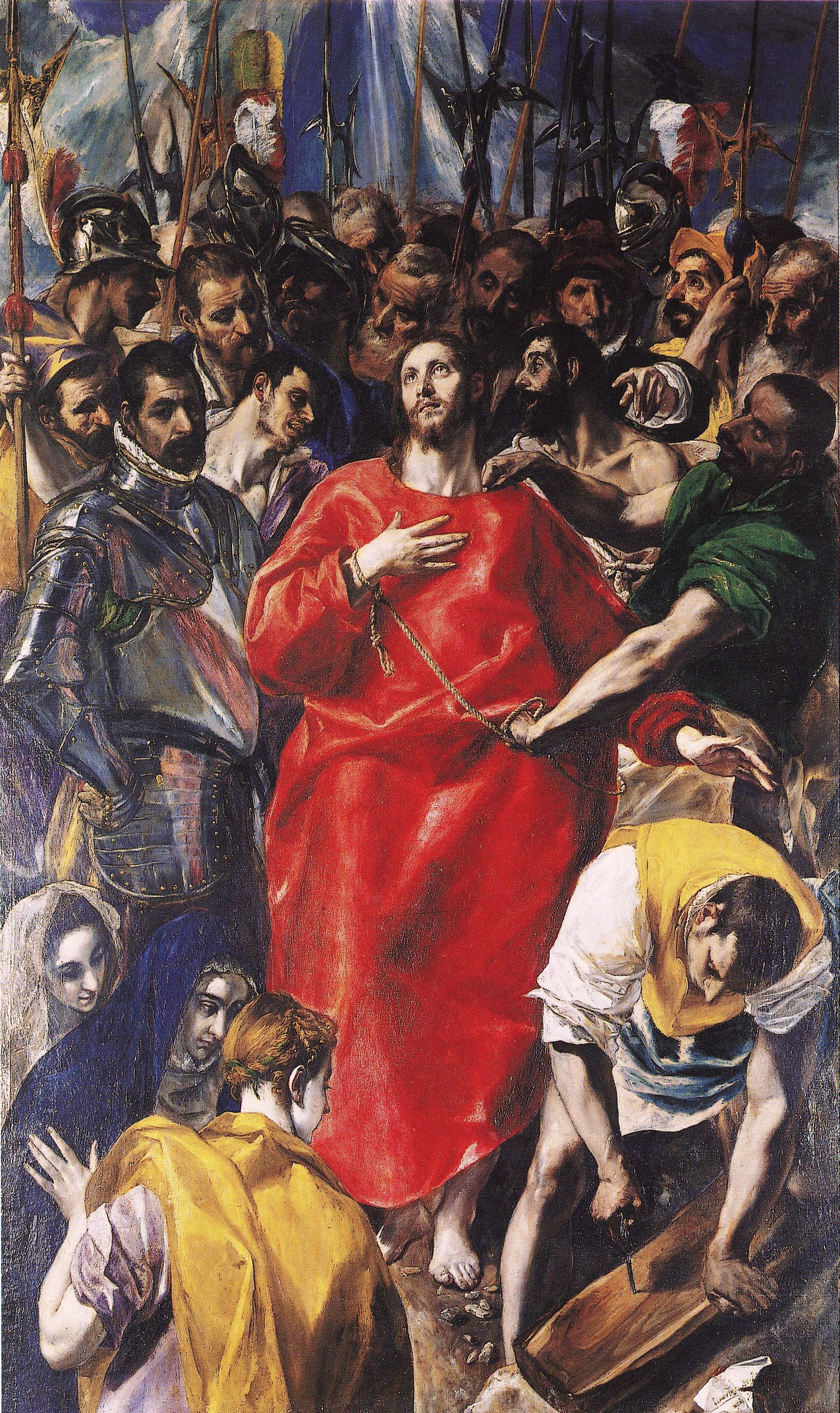
              For example, this piece by El Greco:

              [hide]

              [/hide]
              It's pretty detailed. And it's something that some people may find more appealing because it's something they know. A familiarity with something may cause somebody to find a piece more appealing.

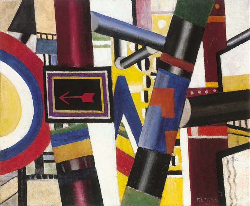
              Now, you have some less detailed art- Abstract Art. I'd say that that kind of art is partly to invoke some kind of feeling in the person who sees it.

              Something like this:
              [hide]

              [/hide]
              Could give off a certain feeling to somebody which they may find appealing.

              All in all, I guess I'm trying to say that a person's appeal for an art can come from different things, such as subject matter or an emotion invoked by the piece, or anything else along those lines really. I don't think it's as black and white as "this piece is more detailed, I find it more appealing".

              ChesCa 1 Reply Last reply Reply Quote 0
              • ChesCa
                ChesCa @Badass SnoCone
                @Badass SnoCone last edited by
                ChesCa
                spiral
                ChesCa
                spiral

                I can only give you my limited experience with comics, and that's the fact that more than art, life is the most important part.
                Now, you always need to draw well enough to get the story across, but a highly detailed artistic setting means nothing if the characters look like emotionless statues or they're just standing around talking. My art style hasn't improved that much, but the quality of my work jumped immensely when I had my characters move around instead of standing still panel-to-panel.
                Now, as far as appeal goes, the more realistic the art, the better it can be…but only if you can get it to appeal to the audience. It's why One Piece is so good: It's art style is wacky but the emotions and mood it gets across are very clear.
                I'm almost willing to bet my right hand that if you want your art to have a higher rate of connection with people (not all who read it, but a higher rate), you have to fool the reader's subconcious into thinking that the little doodle on the page is somehow alive.
                I can't say much on color vs black and white.
                On a personal level, everything serious I do is full color (like your typical American comic), while my doodle stuff is Manga black-and-white with some color added in for key components (photos from the past, fire, the color red, etc.) to make things easier to identify.
                That's more abstract than anything, though.

                1 Reply Last reply Reply Quote 0
                • T
                  THE SEA
                  last edited by
                  T
                  spiral
                  THE SEA
                  spiral

                  In my experience there are many things almost unattractive as a photo but very appealing as a drawing, even though the drawing is just copying.

                  1 Reply Last reply Reply Quote 0
                  • Kylor
                    Kylor
                    last edited by
                    Kylor
                    spiral
                    Kylor
                    spiral

                    It's the details we remember. In the long run, even in life, the little details we remember help us form an image of the bigger picture. This carries over to art, too. The details help shape our understanding of the artwork. Details are everywhere in life, and when they're present in art, it likewise makes us more likely to relate to the message the artist is trying to say.

                    I'm not an artist, by any means, but that's how I feel about the subject.

                    1 Reply Last reply Reply Quote 0
                    • T
                      THE SEA
                      last edited by
                      T
                      spiral
                      THE SEA
                      spiral

                      Googling for some example.
                      [hide]Photo:

                      !
                      Drawing:

                      !

                      A less detailed piece:
                      [hide][/hide]
                      Some random pieces of architecture:
                      Photos:

                      !

                      !

                      !
                      Drawings:

                      !

                      !

                      !
                      [/hide]
                      A photo sure is more realistic and relate-able. But there are effects that make a drawing more eye-catching.
                      It depend how handle the contrast of light, and how it differs(exceeds) from other pieces of art that you usually see or able to do. Mental stability-related, I think.

                      1 Reply Last reply Reply Quote 0
                      • Zack
                        Zack
                        last edited by
                        Zack
                        spiral
                        Zack
                        spiral

                        It may also have something to do with the more detailed something is, the more it seems like you can appreciate how much work must've gone into the drawing/painting/whatever.

                        T 1 Reply Last reply Reply Quote 0
                        • T
                          THE SEA @Zack
                          @Zack last edited by
                          T
                          spiral
                          THE SEA
                          spiral

                          @HiroVoid:

                          It may also have something to do with the more detailed something is, the more it seems like you can appreciate how much work must've gone into the drawing/painting/whatever.

                          Well.

                          I think the respectful feeling for the artist's effort/talent or impression are just answers on the surface.

                          Zack 1 Reply Last reply Reply Quote 0
                          • Zack
                            Zack @THE SEA
                            @THE SEA last edited by
                            Zack
                            spiral
                            Zack
                            spiral

                            -.- And that's why I need to learn to pay more attention…

                            1 Reply Last reply Reply Quote 0
                            • Nami
                              Nami
                              last edited by
                              Nami
                              spiral
                              Nami
                              spiral

                              What is detail?
                              Or better asked, what do you see as detailed and what not?

                              For example.

                              !
                              This is detailed, right?

                              what about this?

                              !
                              I guess most people wouldn't say it's very detailed. I would.

                              !
                              There is not much to see. Just a girl with some flowers in her hand standing in the water. And looking to the sky. Still, I'd say it's detailed because the coloring makes it so. Lots of shades.

                              !

                              Jasper Goodall, google him, he's awesome.
                              No shades. Very abstract. Still detailed.

                              !
                              Black and white. Still detailed in the way it's done.

                              And I don't even talk about the deepness most of these pictures give you. The feeling.

                              What I hate: When people use details wrong. Or only try to fill the space with something. I can often see that in the Shojo mangas. Fuckin flowers everywhere.

                              "Unicorns can't see into your heart. All our dumb horns can do is glow, point towards the nearest rainbow and play rave music!"

                              Visit my Etsy Shop: Heart'n'Skull or Tumblr

                              1 Reply Last reply Reply Quote 0
                              • T
                                THE SEA
                                last edited by
                                T
                                spiral
                                THE SEA
                                spiral

                                I think you just inspired me the answer.
                                A detailed drawing, aside from giving off realistic feeling, doesn't leave many space for imagination to fill in the paper. Perhaps people's mind are often too lazy or hasty (or various other reason) to look at an abstract picture and imagine things and look into the distance and indulge in mediation, anyway, they prefer to stare and admire the already established details all over the paper, directly have their eyes overwhelmed with details upon details, lines crossing lines in a neat form. Which additionally have a clearness due to emphasizing technique- the properly strong contrast between black/dark gray and white, unlike what they often see in real life-the weak contrast between various colors. Due to how mental stability work, appropriate unfamiliarity is appealing. Detailedness of this kind could give secure feeling too.
                                As I thought, this has many things to do with mental stability.

                                Now I know why I don't like coloring often seen in many superhero comic books. They blurred (not really, just less distinct) many details of the same area of the same color together, and give a more vague feeling, and distracting. They are the products of mass industry after all.
                                Of course not all coloring technique result in the same thing, like the picture Tigerlilly posted. It has the clearness needed. Or the clearness in Oda's color-spreads. They are kind of grim and not shiny, and the contrasts between color and colors and colors are chosen wisely. That helps the distinction.

                                I feel so incredible now. Thanks, Nami.

                                1 Reply Last reply Reply Quote 0

                                • 1 / 1
                                • First post
                                  Last post
                                Powered by NodeBB | Contributors