Arlong Park Forums

    • Register
    • Login
    • Search
    • Categories
    • Recent
    • Tags
    • Popular
    • Users
    • Groups

    Throughout this month, we will be testing new features (like search) so you may experience some hiccups from time to time. We'll try to not be too disruptive...

    Hi can you help me review these posters for my graphics coursework for research ^_^

    Help Forums
    7
    11
    3348
    Loading More Posts
    • Oldest to Newest
    • Newest to Oldest
    • Most Votes
    Reply
    • Reply as topic
    Log in to reply
    This topic has been deleted. Only users with topic management privileges can see it.
    • S
      shadowrep
      last edited by
      S
      spiral
      shadowrep
      spiral

      ok basically i need a few people for my secoundary research to review these 3 posters,

      I need your view about the poster for example:
      1. what you like about the poster
      2. what would you improve about this poster
      3. what is the bad things about the poster

      thanks ALOT!!! ^_^ if you can help me by just reviewing the 3 posters here are the pictures of the poster.


      1 Reply Last reply Reply Quote 0
      • King Kobra
        King Kobra
        last edited by
        King Kobra
        spiral
        King Kobra
        spiral

        didn't they got into problems for plastering Jesus on that poster?….

        1 Reply Last reply Reply Quote 0
        • Buuhan1
          Buuhan1
          last edited by
          Buuhan1
          spiral
          Buuhan1
          spiral

          Oh, what? Were retarded Christians saying the image of Jesus was in the Batlogo-mouth?

          The Dark Knight:
          1. It's a very original idea.
          2. I'd make the text, or at least the "Why So Serious?" graffiti on the wall.
          3. All in all, being a great poster, it just doesn't speak for the movie. Tho I haven't seen it.

          Die Hard 4:
          1. It has nice lighting.
          2. Make it an actual… poster?
          3. I think there's a lot wrong with it, beyond just not being a poster. One, it doesn't have the actual title "Live Free or Die Hard", and it should focus on a bit more.

          King Kobra 1 Reply Last reply Reply Quote 0
          • S
            shadowrep
            last edited by
            S
            spiral
            shadowrep
            spiral

            thanks alot! Buuhan1 ^^ ummm can someone write a review of the poster of **X-Men Origins: Wolverine, thanks alot if you do ^^ oh btw the Die Hard 4.0 "poster" had to fill up the whole A3 sheet and had a small empty area, when i typed in Die Hard 4.0 poster that came up and it was small xD so it was pretty much perfect loool**

            1 Reply Last reply Reply Quote 0
            • King Kobra
              King Kobra @Buuhan1
              @Buuhan1 last edited by
              King Kobra
              spiral
              King Kobra
              spiral

              @Buuhan1:

              Oh, what? Were retarded Christians saying the image of Jesus was in the Batlogo-mouth?

              uh, nope, but it kinda looks like that

              I'm not a christian so I find it kinda amusing….

              1 Reply Last reply Reply Quote 0
              • Mokenda_mint
                Mokenda_mint
                last edited by
                Mokenda_mint
                spiral
                Mokenda_mint
                spiral

                Dark Knight
                Looks amazing. The 'eyes' seem a little high up in comparison to the 'mouth' but that's not important. I love the idea of using a bloody red Batman logo for the mouth.
                And like Buuhan said, the "Why so Serious" in graffitti form would add to its awesome factor. I could totally see Joker as having scrawled that on the wall
                I think it'd make a great poster for the movie.

                Die Hard 4.0
                It's okay, but it's also small and somewhat bland. Maybe if you were to put in some text in that blank area to the left of it. That'll definately add to the overall effect 🙂

                X-men Origins: Wolverine
                While totally awesome with his claws ripping through steel, it doesn't tell you what it is. While some people (like me) can look at it and say "Oh! That's X-men!" But they won't know that it's about Wolverine as such. And others will look at it and not have any clue as to what it is. So I think a title would make it better 🙂

                Hope this was helpful ^^;

                Originally Posted by Drake_Cloud

                He didn't come back because he thought he could win, he came back because he's a goddamn hero and that's what heroes do.

                ![](http://i9.photobucket.com/albums/a58/Mokenda/website pics/OPsleep.jpg)

                1 Reply Last reply Reply Quote 0
                • 1
                  123
                  last edited by
                  1
                  spiral
                  123
                  spiral

                  Dark Knight
                  It kind of sends the message of who joker is with the poster those 'crayon-drawed' 'eyes and mouth.' Its simple and nice. However after spending more then 5 seconds looking at the poster, i realise that even though its simple its like too simple with those drawings(of the eyes and the bat logo mouth.) as if a 2-year old kid coloured them.

                  Die Hard 4.0
                  I really like this one. It gives the feeling of a hero being bathed in light and glory after a battle, it was like as if he was invincible. The look itself makes me wanna watch the movie if i looked at it for the first time.

                  Wolverine
                  Dont really like this one. Its as if the claws are ripping through the metal as it its like aluminium,cause even if its at poster size its hard to see the jagged edges, they should put a title or something like that. Im sure that many people wont even know what it is about.

                  Tick tick tick

                  1 Reply Last reply Reply Quote 0
                  • Buuhan1
                    Buuhan1
                    last edited by
                    Buuhan1
                    spiral
                    Buuhan1
                    spiral

                    Wolverine:
                    1. I think it just looks really cool.
                    2. Make it more apparent it's not an X-Men: 3 poster, as that's what I thought it was.
                    3. Needs a title.

                    A 1 Reply Last reply Reply Quote 0
                    • A
                      AnonymousStrawberri @Buuhan1
                      @Buuhan1 last edited by
                      A
                      spiral
                      AnonymousStrawberri
                      spiral

                      Good.
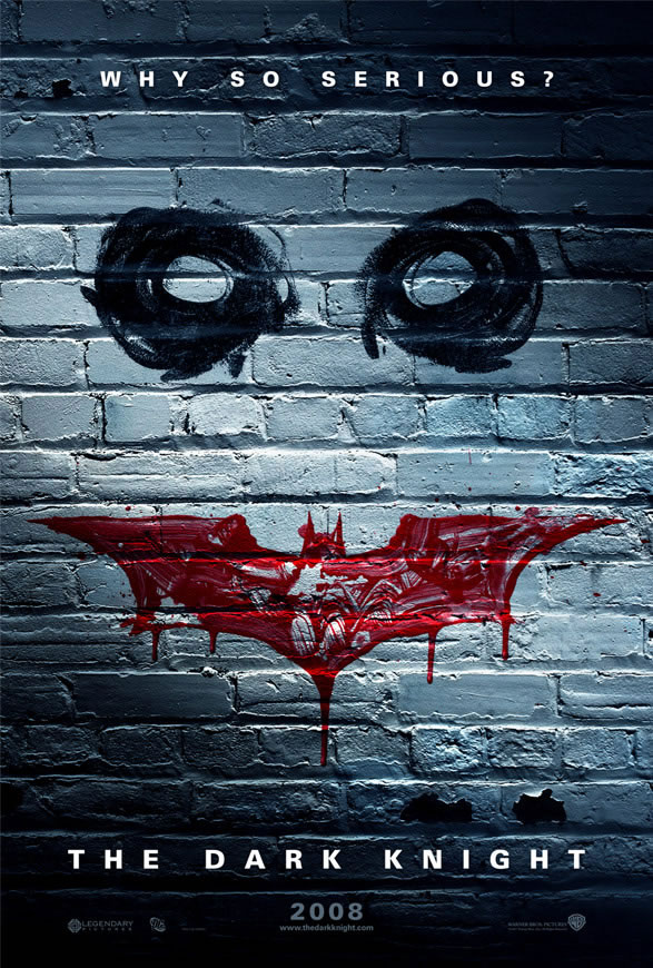
                      Batman - It's simple and to the point. Whether you knew Joker was in it or not it would build hype for the final product. They kept the dark overtone with dark colors relevant to the movies dark overtone. And the crayon drawn face was a nice touch. It shows the mental wreck that is the chaotic joker and strikes the viewer with a sense of bedazzlement.

                      Die Hard - Everyone knows who Bruce Willis is and to see him in this glorious light makes die hard fans..of…Die..hard thirst to see it. it's a shot back t just showing a character and a title...nothing big. The words come mostly from the light of glory. 123 put it best.

                      Wolverine - the only thing I like about this is that it keep speople guessing. There no title which will cause the brain to ponder, whcih will cause the eyes to wander and analyze. At first glance you mgith think it's horror but as soon as you see marvel...the equation is quickly summed to soemthin related to X-men. It catches the aggression of wolverine and comes towards you foreshawdoing the hype of the actual movie.

                      The Bad
                      Batman..from a graphic design point of view...nothing. It says everythign it needs to say..Batman, Joker, Psychotic chaos...watch now!!!

                      Die HArd.. the only bad thign I have is..if bo ones seen it....the reminiscence of old movies approach here may cause peopel to say..oh..one of those movies...seen it before. But what it does have is subtly. It doenst have to prove that its a grea movie .. New poters have o show a billion graphics to rpove that its different. Die Hard is already known.... but still

                      WOlverine
                      Needs a title XD I would think it's liek X-men 3v.2? or a new X-men. THen if I were an X-men fan...it mgith cause me to be angry that WOlverine is posterboy again. Than again that would cause hype...but still it doenst tell anything..

                      Hope I helped 🙂

                      1 Reply Last reply Reply Quote 0
                      • S
                        shadowrep
                        last edited by
                        S
                        spiral
                        shadowrep
                        spiral

                        thanks guys ^_^ this is all i need now thanks for taking time out of your lives to help me lool

                        1 Reply Last reply Reply Quote 0
                        • Gorlom
                          Gorlom
                          last edited by
                          Gorlom
                          spiral
                          Gorlom
                          spiral

                          about the x-men poster. I just can't stop being annoyed at one little detail: The blades are fixxed paralell to each other but there is still somehow a slight v pattern in the ripping? (i'm sayin the angle of the cuts are tilted away from each other in a way that imo shouldnt be possible.. buggs the helll out of me)

                          Mokedemia: I'm guessing the eyes seems high because the face is lacking a nose. And at least my brain want's to place the nose at the head of the batmanlogo because of that.

                          I have no idea how anyone can see jesus in that mouth… =S

                          Originally Posted by Ivotas

                          What the…? Holy smurf am I slow! Until this statement of yours I never even realized that an octopus is actually serving octopusballs. Talk about not seeing the forest because of too many trees. facepalm

                          1 Reply Last reply Reply Quote 0

                          • 1 / 1
                          • First post
                            Last post
                          Powered by NodeBB | Contributors