

want some feedback, and please, no flaming.
!
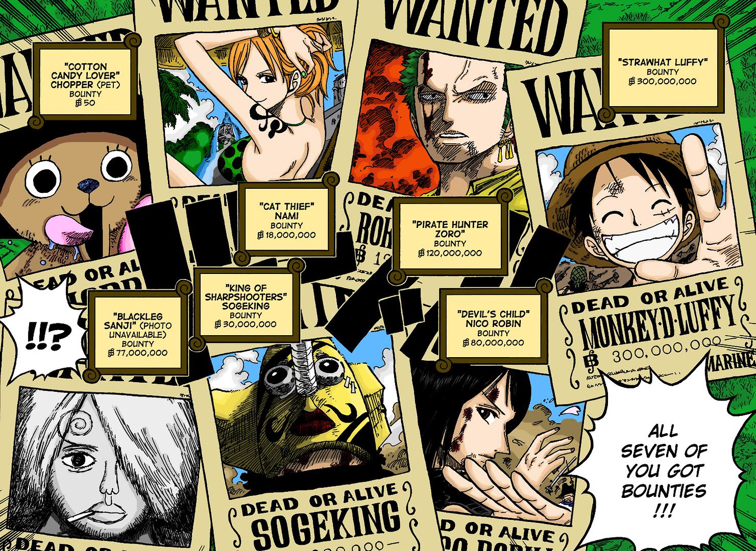
i've been working on this for a long time, on and off. i actually got the idea for the basic style from the 'colored manga' thread. i've done quite a few colorings before but nothing this major, and never with the cell-shading style, usually some form of soft shading.
i'm actually really pleased with the way everything turns out. my best friend thinks that sanji looks horrible, that he really ruins what would be an awesome picture because he stands out too much, that i 'gave up' when i got to sanji. i just didn't know how to go about coloring him. i saw it as a black and white composite sketch (like the infamous unibomber sketch), he said it should either be colored like sanji (no) or a shade closer to the color of the poster itself.
what i really want is feedback from you, the AP community, on how the overall pic looks, especially sanji. anything else i should fix?
thanks in advance!
jeff

 . green is my favorite color, and nami is the sexiest ever so when i'm coloring, she's getting colored the way i'd want her :devil: lol