i was bord so i deside to show my colored op manga to everyone XP
here my galery:http://s44.photobucket.com/albums/f11/DODO1234/ONE%20PIECE/COLORED%20MANGA/
and here's my newest one:
!

THERE WILL BE MORE SO ENJOY


i was bord so i deside to show my colored op manga to everyone XP
here my galery:http://s44.photobucket.com/albums/f11/DODO1234/ONE%20PIECE/COLORED%20MANGA/
and here's my newest one:
!
THERE WILL BE MORE SO ENJOY
wow, thats really good! I had a look at your other work and its awesome!
Keep it up!
I uh color manga too, as a project, in case you hadn't heard. Very nice, but the highlights should be a little more skin colored, they are too light. The highlight on the cheek is a nice touch though. Also I like to erase the shading lines once I shad below them, it gives it a bit more of a realistic feel.
AWESOME! You are a GENIUS!!
I agree with GearSecond on the shading under the chin. It seems kind of unnatural with coloring.
Yeah I just go to my Outlines layer and use the eraser tool. It usuallt works just fine, and gives a better feel to it. Since the printing only works in black or white mode usually, there is no real shading like in Chapter 1, Oda doesn't have the time. Just looks awkward in color, since blakc stands out more againt a rainbow than against white. Well techinclaly not, but it fits in more when there is no color.
i've made another 2:
!
!
You're really good at this. Do you take requests?
i've made another 2:
Kudos! Very nice indeed!
I think it looks better with the shading lines ^^
keeps the manga feeling. really good work, keep it up!
and Robins hair looks great!
You're really good at this. Do you take requests?
sure,why not meby i'll open a thread in the op general furom:happy:
Good job!! Like a couple of the others said, the shading lines should be kept. There'll be an empty feeling if they're not there.
Some lines, you guy sneed to learn, there's 3 kinds of lines.
Shading Lines
Shading + Motion liens like in the last chopepr image, where chopper is screaming. These should be left in but shaded.
"fur" lines, like chopper's fur, should be left it, and not shaded unless there is a good reason.
Also you need more shading and highlights. Each image has only a few bits shaded, you need to have a lightsource.
Some lines, you guy sneed to learn, there's 3 kinds of lines.
Shading Lines
Shading + Motion liens like in the last chopepr image, where chopper is screaming. These should be left in but shaded.
"fur" lines, like chopper's fur, should be left it, and not shaded unless there is a good reason.Also you need more shading and highlights. Each image has only a few bits shaded, you need to have a lightsource.
intresting,do you know where there is guids to coloring manga? or cuold you at lest show me pics with shading lines so i can more untestand whats you saying? :blink:
You're awesome, keep it up. I'd love to see some Franky, Sogeking, and Mr. Prince.
That Chopper one cracks me up every time. You don't mind if I go post it in the Face Fault thread, do you?
I'll credit.
Some lines, you guy sneed to learn, there's 3 kinds of lines.
Shading Lines
Shading + Motion liens like in the last chopepr image, where chopper is screaming. These should be left in but shaded.
"fur" lines, like chopper's fur, should be left it, and not shaded unless there is a good reason.Also you need more shading and highlights. Each image has only a few bits shaded, you need to have a lightsource.
I know perfectly well what you mean. It isn't that hard to understand :getlost:
It's best as it is IMO 
I don't have any guides to knowing the lines.
It's just kinda like….well it's hard to explain.
Like in Zulen's signature it's just to create a shadow effect, the more lines the darker, usually.
THen there's lines that are on people, and you shade them but don't erase those because they are there for effect, these are mostly used when someone gets a close up of them in a panic, and in the Anime it's like those times when the camera moves up from it's start position and returns and repeats like 3 times.
Then there's design ones, which are textures that you occasionally shade around, like Chopper's Fur coming out you'd shade below to show it sticking out, and on Luffy's straw hat, the straw weaving, but the straw hat has it's own rules to it, any showing behind luffy's head wher ethere's a ton of weaving showing are shaded, as well as some marks(see my sig) but not all the weaving lines should have shading. It's kinda like hair, but different. It's a texture.
got it,arigato for the explaintion
That Chopper one cracks me up every time. You don't mind if I go post it in the Face Fault thread, do you?
I'll credit.
no prablomo
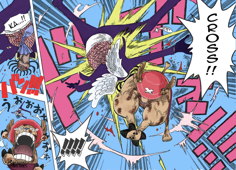
heres another 2:
!
!
i hope this time i did the shading lines right this time…
Those are really cool. Keep the good work.
About shading lined, I'm sure you'll understand when you compare exact scenes from the manga and anime. They know what they're doing. You'll see what lines they keep, shade, or throw away.
You messed them with Sanji's last color again. His lips, chin, and wounds are all wrong. Dont shade the wounds, and for the lips and chin you should just shade and delete lines. The neck and shirt too.
I just wanted to note something about the colors you chose for Robin/Merry.
Check covers 24 and 32 (Can't direct link them): http://www.eastblue.net/pages/manga/couvertures/couverture.php?id=Japon
Noticed something? Yeah Oda's colors are different from TOEI's colors. IMO Oda's colors are better but in your own choice. And keep up the good work ;)
Don't erase any lines whatsoever if they aren't just dirt lines from a dirty scan. Modifying the actual Artwork is an insult.
I just wanted to note something about the colors you chose for Robin/Merry.
Check covers 24 and 32 (Can't direct link them): http://www.eastblue.net/pages/manga/couvertures/couverture.php?id=Japon
Noticed something? Yeah Oda's colors are different from TOEI's colors. IMO Oda's colors are better but in your own choice. And keep up the good work ;)
Um.. Oda colors with pens/markers/whatever you can color with, so the color is more realistic, can be shaded better, and more stuff that can't be done on the pc, so of course it's gonna be better than Toei.. I'm sure you know that.
He can't color like that no matter what, and the color has a different touch in every pixel.
EDIT:
Buuhan, its just my personal opinion, but isn't reading illegally without paying Oda an even greater insult? I don't think there are different reasons among computer scanlating and editing.
He was talking about the actual color schemes, not how it was colored.
Like Robin hair being black, but blue in the anime. And her eyes being brown but also blue in the anime. Also how Merry is like wooden in the manga but white in the anime.
He was talking about the actual color schemes, not how it was colored.
Like Robin hair being black, but blue in the anime. And her eyes being brown but also blue in the anime. Also how Merry is like wooden in the manga but white in the anime.
I know that, I just wanted to say it because I just learned it =P
Anyways I also added a note that every pixel has different color touch, so he can't really use it too much.
True, Oda wants to get paid for his artwork but I think it makes him feel good that his story is being enjoyed all over the world, illegally or not.
Editing the artwork is by far more insulting.
You try coloring Manga. You have to change a little bit.
Besides a few notable mistakes the liens in the Sanji pick are fine. THe cliff shading liens are excusable becase it could be argues as rock texture if you want.
I have to complete lines occasionally, since clouds have a habit of randomly dissapearing.
I'd like to go back one day and recolor all of the Manga by hand(or rathe rlet my friend) and make a sort of tribute to Oda. It'll all be color walk style, so the Sky would be white, the clouds white and bluish grey on the bottom.
But thats a super hard project that noone probably wants.
When you color the Manga, you have to make a few changes. So get used to minor things, also you occasionally need to "clean" earlier chapters. Like Sanji's fac ein the 1st pi of the last post, when theya re falling and their eyes pop out, and on Usopp too, you can see the bad scan pattern, you need to erase that before you start, so it's just black and white, no grey.
It's just alot easier to close up holes in clouds and stuff before doing that sky, rather than going back and using the eraser tool.
I'm sorry for this but I have to do it.
that is my shading, my coloring, ect. I spent a large amount of time. The whole page was finished awhile ago, and the page after it finished last night. I have to take time when I get it, so it takes overall a few hours to color + the special touches. It makes it a whole lot better if you add special touches and shading on your own.

This was my first Colored Manga, pretty sucky, and the translation is I dunno, someone's. But I like it, I am happy with it. But to me, it sucks. I like to add special touches, like the wood in the first panel, or all the nice shading lines on the boat. You need to reflect the style of the artist, the colors, respect the artist's work, and give it your own flare.
You are doing a great job. I'm not perfect either, I do Cel Shading, everyone else I know does major events in One Piece and they Soft Shade, I tihnk I'm the first Cel Shader, and I certainly haven't seen any Soft Cel Shading.
Since One Piece is cartoony at first I picked Cel Shading. Can't really tell what yours are. I've decided to Soft Shade 3d events and the rest is all Cel Shaded 2d. People complain about the brighter colors and "flat" coloring. It's the style. Need to get used to it.
That said, you are doing a fine job, but nobody's perfect. I'm practicing and am new at it too.
You've colore dmore pages than I have. I take my time and am rather short on time. Keep up the good work, and jsut remember it can always be better.
You try coloring Manga. You have to change a little bit.
I have, and this may sound rude but I'm quite better than you. The art doesn't need modified at all. Maybe your problem resides in your knowledge of Photoshop.
http://img.photobucket.com/albums/v461/codymccourtstratics/sneakpreveiw.png
that is my shading, my coloring, ect. I spent a large amount of time. The whole page was finished awhile ago, and the page after it finished last night. I have to take time when I get it, so it takes overall a few hours to color + the special touches. It makes it a whole lot better if you add special touches and shading on your own.
That doesn't mean that you have to remove the shading lines. It's ok when you replace some lines which where lost because of scanning, printing etc. but like Buuhan said: Never change the picture of another artist.
It's the same with quotes. When you quote you have to use the exact same phrase.
Btw, I think you used too bright colors for your pic. You should use different types of green and blue for the grass, bushes and water because it seems lifeless without it and use also more shading. I have six years of Photoshop experience so you can trust me on that
EDIT: here is a pretty good example from the master himself: klick
And don't even try to say "he uses no shading lines either!" cause, he is the original artist and can do what he wants with his pics 
So, because he is the original artist, he can do it with HIS colored pics, but as soon as someone else doe sthe same thing that have to leave inabsolutely everything.
Ok now first off, I'm just starting out compared to some of the work I could do. I am trying to do afull series, which means I do not have a couple weeks to polish a page and change every little thing I want to be more perfect.
Secondly, my skin colors were taken from Oda's art himself.
Third, the beginning of the series is bright and colorful, I'm just reflecitng that it's very brighjt and happy in the begginning, by Lougetown the colors will be tones down a bit.
Also, this isn'y my thread, and everoyne has their own opinions on how things should look.
So, because he is the original artist, he can do it with HIS colored pics, but as soon as someone else doe sthe same thing that have to leave inabsolutely everything.
Yes, cause it's HIS art, not yours.
So, because he is the original artist, he can do it with HIS colored pics, but as soon as someone else doe sthe same thing that have to leave inabsolutely everything.
Ok now first off, I'm just starting out compared to some of the work I could do. I am trying to do afull series, which means I do not have a couple weeks to polish a page and change every little thing I want to be more perfect.
Secondly, my skin colors were taken from Oda's art himself.
Third, the beginning of the series is bright and colorful, I'm just reflecitng that it's very brighjt and happy in the begginning, by Lougetown the colors will be tones down a bit.
Also, this isn'y my thread, and everoyne has their own opinions on how things should look.
1. When you really want to do a full series, do your best. It may be time consuming, but we already know what happens so you don't have to rush it. Ask someone to help you with the coloring when you don't want to spend so much time.
2. And he still uses different shades. Without it, it seems lifeless and dull
3. It still hurts the eyes. In every part of the series are happy moments and because it is a manga which tells a story that in Odaverse really happens, you don't have to choose colors which only express a feeling. Use realistic ones instead.
you should learn to take some criticism. I don't think my comments were unconstructive or anything :getlost:
I know very well that this isn't your thread but all replies are about coloring mangas so I guess it will help Chopper and the others too.
Like I said we all have our opinions. And Buuhan, you just awnsered a retorhical question! :D
I am also in the process of making a pallette and gathering a full group. All I have so far is me as a cel shader, one soft shader, a spell checker(they begged for the job so I made it) and a translator.
Compared to earlier work I'd say both I and Kaizoku Chopper have improved alot.
heres my new one:
!
i had a lot of truble with luffy's vest plus i delete all the gray part and i think it's got prety good
I like the way you make chopper's hat it looks cool
^ I'm the opposite, actually.
Chopper's hat really needs an outline. The quickest way to do this is to select it with the magic wand, then contract it by 1 or 2 pixels.
yes, almost all black objects you want to color should be contracted by 1 or 2 pixels. Depends on the object, some look better with a slightly thicker outline.
kaizoku Chopper, nice job! Colors are distinct and accurate! However (provided you want achieve a semi-realistic effect), you should also explore and emphasize more colors. (Actually, I'm guilty of this too sometimes  ) But anyway, since I wish for you to succeed, I will give you some suggestions that have helped me improve (in my opinion anyway). Some are just observations, some are from critiques. As for examples, I'll use your current coloring.
On highlights:
-Depending on the light source, highlights appear on parts of the face that jut out more. (Nose, top/bottom lip, cheek bones, chin, and parts of the forehead.) Don't be afraid to emphasize those more too. Same deal for clothes. For the bottom Luffy panel in particular, you should lighten more areas on his abs, limbs, jeans, and shirt.
On shadows:
-While I did see some highlights, I can't say the same for the shadows. After looking vveeeeeeeeeeeeryyy closely I saw some. With minimum shadows, the subject turns out rather flat looking. Take a look at Robin's arm for example. An arm's shape is very similar to a bunch of cylinders. By giving her arm a larger shadow, it'll look more like a cylinder/arm. The hair behind Nami's neck should also have shadows. Shadows will give us a better sense of where objects are located with respect to a light source.
-Make darks darker! (Yes, again with the color emphasis) Just as highlights will turn somewhat whitish when directly hit with light, shadows will turn near blackish, when there's no exposure to light.
On color:
-Don't be afraid to use a variety of color! Throw some purple on Luffy's vest for a shadow! How about some blue midlights for black hair? Or some orange for life in the skin! Skin doesn't have to be all brown or all peach. Of course, some characters will be tanner than others but you can still play with color.
GO FOR IT!!!!
(By the way, I'm slightly medicated right now, so sorry if some things do not make sense:) But I truly hope this helps, even a little.
Ganbatte-kudasai!
3 new colored:
!
!
!
i'm going to bet (it's midnight in israel)
See Chopper's hat in your sig? Yeah.
Your coloring isn't half bad! I love the last Nami one. Good color choices.
Though, you hardly use any shading at all, and that's really a shame. Also, I agree on Chopper's hat - it would look much, much better with a lineart around it.
Hey, you're from Israel? Me too! ^_^ What's your name?
my name is dor,i'm from rishon le zion
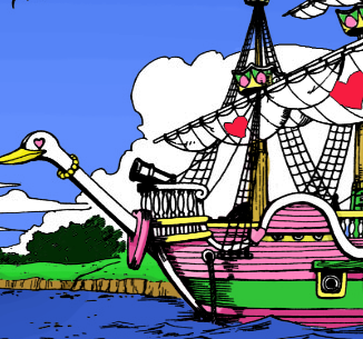
and here another coloring:
!
Might I recommend a gradient and lighter shade of blue for the sky. (look at the "sky" in your sig for EXACTLY what I'm talking about)
Some stuff looks a little wonky, but it's mostly cus your'e coloring in solid blacks at times. Other than that, there's some major good work in here. And while Buuhan is right about altering the original work, he is being a bit rude about it.
The sky color is similar if not almost identical to what I use. For special scenes(where I do extra shading for thoe landscape views and such) I add darker colors the higher in the sky, but I usually do it like he does.
Might I recommend a gradient and lighter shade of blue for the sky. (look at the "sky" in your sig for EXACTLY what I'm talking about)
Some stuff looks a little wonky, but it's mostly cus your'e coloring in solid blacks at times. Other than that, there's some major good work in here. And while Buuhan is right about altering the original work, he is being a bit rude about it.
I was not being rude. If I was being rude trust me, you'd know. I'm always told on here that my messages seem to be assholish or rude, whinning or bitchy, when they aren't. Bringing words from inside our head into text format is the biggest "lost in translation" of our century.
I know this is sortof off topic but where can I get photoshop?
bitorrent is the best and easiest way.
EDIT: Or you can go to google and look for an alterante one. Or a trial at download.com is avaible. BUt end the trial beforehand if you want to keep it, or you can't downoad it off of bitorrent the next day. It doesn't allow you to cause of the trial.
how do i use bittorrent and where do i download bt and photoshop from?