Avatar/Signature Rating: The Next Generation
-
Whoa….. Do it.
-
Yeah Mr. Prince, this sig is really good. I'll give a 9/10.
So guys, what do you think about my avatar and sig? I'm thinking in change the sig soon.
-
I like the avatar, (wonder what hapened to him), the sig is, funny and icky.
Ava-9/10
Sig-7/10 -
Your signature is great, and avatar looks fine too. :happy:
Ava, 8/10
Sig, 9/10 -
Gin''Ava 9/10 Nice colors
Sig-10/10 Love the Luffy pic in it.Anyhow, my new ava from Negima?!

-
I like your new avatar Daisuke CP9 and i like Sig of Yakumo in a Bunny suit and i found my new Sig but for some reason i can't edit
-
I love the Asuna blushing avatar, has anybody else notice that her eye's aren't suppose to be the same color.
-
I don't see the draw from most Chibi's so a 6 for both
updated both sig and avatar
-
ava: 7/10 was it you who had that previously in your sig?
sig: 9/10 funny
okay… here's mine
Just look for avatar, I can never get them to show up...
siggy:

Patience is a Virtue, but Ham is a Meat.
~Me

-
10/10 for avatar Guu is so cute
10/10 for Sig mmmmmmm ham -
I don't see the draw from most Chibi's so a 6 for both
updated both sig and avatar
What's wrong with chibis?
-
I really like chibi Plum, so I'll give both your ava and signature an 8/10. Here's mine…
Avatar:

Signature


"Let's go to Burger Doodle and eat in the car."
The Kingdom of Loathing: An Adventurer is You!Oh how I love Makar.
-
ava: 7/10 was it you who had that previously in your sig?
sig: 9/10 funny
okay… here's mine
Just look for avatar, I can never get them to show up...
siggy:
http://www.theallineed.com/holiday/05030103.jpgPatience is a Virtue, but Ham is a Meat.
~Methe sig isn't supposed to be funny

-
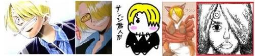
Mr.Prince
Ava 10/10 Sanji FTW
Sig: 10/10 More Sanji ^^New sig

Who says we cant get to the Holiday Spirit early ^^? -
10/10
10/10 well edited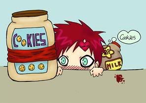
-
Apparently, my old sig was too big, so I made a new one…

Plum, your sig gets a 9 for Chibi Zoro
-
**Nice sig Daisuke CP9! 10/10
Oh and please don't rate my signature, it's way too lame!**
-
Av - 9/10 for hawtness :3 Bit small, though.
-
Av - 9/10 for hawtness :3 Bit small, though.
LOL She's mine. As for the signature, I'm only using it to promote my One Piece Commentary on Mangahelpers. I just removed some parts though. I'll try and make a bigger signature next time!
-
I like both an 8 or both
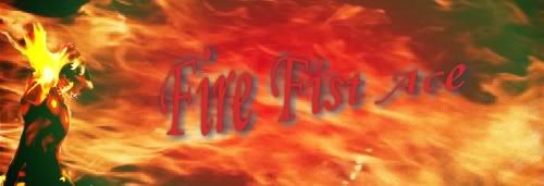
I decided to change my avatar because the person featured in it is IMO one of the most important people in the past 50 years. and the sig needed changing because the last one was kind offensive I guess
-
For Mr. Bushido:
Avatar: 9/10
Sig: 9/10They are really awesome.
For Taleran:
Avatar: 8/10 The pic is well done, though I don't know who is he.
Sig: 8/10 Really good -
Mr Bushido – your Grand Line Pimpin' sig was great fun, but it was pulled out before I had a chance to tell you that. I would have given it 10/10. If I'm remembering correctly, it was oversize, but had dimensions that could easily be resized without distortion, so you might try shrinking it in a paint program and bringing it back eventually.
Your new sig is fun too! I give it a 9/10 : the only reasons why I've docked a point are (1) because the clipboard in Zoro's left hand just sort of "disappears" -- so it distracts from the rest of the design -- and (2) because the fonts aren't quite compatible with each other. But it's excellent otherwise! Solid composition, nice colors and effective blending of the many seperate elements. Funny too. :)
As for your avatar -- 10/10 -- Love it! The "fuzzyness" of the picture suits the subject matter (dj/music) and because the text extends beyond the border in two places, the image has balance and interest. Nice!
Inspired by the creativity of all you AP folks, I've decided to "upgrade" my avatar and make a new sig for myself too. I've used the most basic paint program I have (still don't know my way around my Illustrator yet), so that's why there's some unintentional blurring and "jaggies" and so on. I hope you'll enjoy these in spite of that. As soon as I become more familiar with Illustrator, I'll tidy them up.
A friend pointed out that in my avatar, Zoro looks like he is "thinking Big Thoughts while typing on an (off-screen) keyboard" -- I loved that interpretation of the pic, so I'm keeping this avatar forever. I'll probably play with the backgrounds and colors every now and again though.
My new avatar:

And my new sig:

–
"Over-thinking,
over-analyzing …"
......-- Tool (from Lateralus)
-
6/10 for both, there kind of blurry.
-
there kind of blurry.
Yes, I wasn't intending for that to happen. My generic paint program added distortions when I resized the pictures, so I tried to go back and correct them, but that caused more distortions!
Eventually though, I decided just to let the distortions stay.
They're kind of interesting –-- well, to me at least.

-
Could I hurt you with 2/10? ;_;
For the avatar, it's 3/10… for what regards the signature, it's a two. Sorry, I don't like it.
-
Could I hurt you with 2/10? ;_;
Who – me?
(you didn't specify if you were rating mine or Plum's)If it was a rating for me : ah, well -- it takes a bit more than that to "hurt" me these days, but I assure you, it's ok if you don't like my sig and avatar. The world would be a boring place if we all liked the same things. :)
-
Isn't it obvious that I rated yours because you were right above me?
-
@CP9:
Isn't it obvious that I rated yours because you were right above me?
apparently not to him.
CP9 Encore:
Ava-Shading looks a little weird, so an 8/10
Sig-I like the electric flow through the golden keyblade. Nice art design as well. But I must cost you a 1/10 of a point for the word kicka**. 9.9/10 (WHY CANT THE QUALITY OF MY SIG BE LIKE YOURS!) -
Ah, I counldn't keep away from this one.
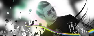
Mr. Prince, I think your Sig is Pretty Rad with the colors in the bkg. I like how the Avatar matches the theme.
Av: 7/10 Sig: 8/10Avatar and Sig:


Don't hesitate to be mean.
-
having second thought of which sig i should use..which one?
this one?
OR
-
I dont really understand the first one, so I go with the second sig you got there.
As for Fleur:
Ava- I dont really like pale girls, but still looks good. 8/10
Sig- The Zoro, Nami and Franky can be better, I guess. 8/10
Current Sig- I don't understand why you're on the ground XD. Cute picture of you and your dog. I hate MySpace, don't know why. Simple pics, they're good. 7/10 Yes I hate MySpace so much I take 3 points away. -
Mr Bushido – your Grand Line Pimpin' sig was great fun, but it was pulled out before I had a chance to tell you that. I would have given it 10/10. If I'm remembering correctly, it was oversize, but had dimensions that could easily be resized without distortion, so you might try shrinking it in a paint program and bringing it back eventually.
Your new sig is fun too! I give it a 9/10 : the only reasons why I've docked a point are (1) because the clipboard in Zoro's left hand just sort of "disappears" -- so it distracts from the rest of the design -- and (2) because the fonts aren't quite compatible with each other. But it's excellent otherwise! Solid composition, nice colors and effective blending of the many seperate elements. Funny too. :)
As for your avatar -- 10/10 -- Love it! The "fuzzyness" of the picture suits the subject matter (dj/music) and because the text extends beyond the border in two places, the image has balance and interest. Nice!
Wow, thanx… are you a design or art student, by chance?
and don't pay any attention to anything CP9Encore says... his av & sigs are just jpegs he found on the internet... your sigs are good for being made on Paint...
-
Wow, thanx… are you a design or art student, by chance?
Nope, but I'm surrounded by 'um, so I've learned to think like 'um! ;)
(Especially in terms of layout and of color. I'm a sap for good layout and good color).Oh!
Kuroneko – I'm so sorry! I've forgotten my manners and jumped right over your work to comment on Mr_Bushido's. Let me fix that oversight now:Kuroneko's Avatar: 9/10
It's beautiful, but the image is almost too detailed to be this small, which is why I'm docking a point. I do like the atmosphere : it feels like a little window into a world populated by Remedios Varo ... :)Kuroneko's Sig: 8/10 -- it made me laugh, and you did a good job of cropping it. Good choices for font and font color, too -- they really stand out. I was initially going to rate the sig lower, due to the excessive "fan serviceyness" of the image, but when I saw from the text that you were clearly making fun of that very aspect of it, I changed my mind and bumped it up to an 8 again! :)
Mr. Prince -- I've just got to say, I love your sig! Great colors, excellent layout and fun font. If you moved the words a tiny bit closer to the edge, it would be a bit more balanced, but as it is, I'll give it a 9/10.
… your sigs are good for being made on Paint...
Thanks!
I'm so glad that someone understands what I'm working with (or should I say "against"?). Paint can do some mighty peculiar things to one's art – changing lines, adding colors, blurring edges, etc. But in spite of that, I am having fun. It's such an unintimidating program compared to Illustrator! That's probably why I churned out so many sigs over the weekend. I've been switching them pretty frequently, so I'll post a few of my favorites here, and let the next person on this thread tell me which one (if any) they like best:


These represent Zoro's two habitual actions : sleeping and stressing! :)
"Over-thinking,
over-analyzing …"
......-- Tool (from Lateralus)
-
Rate this banner!

-
I dont really understand the first one, so I go with the second sig you got there.
As for Fleur:
Ava- I dont really like pale girls, but still looks good. 8/10
Sig- The Zoro, Nami and Franky can be better, I guess. 8/10
Current Sig- I don't understand why you're on the ground XD. Cute picture of you and your dog. I hate MySpace, don't know why. Simple pics, they're good. 7/10 Yes I hate MySpace so much I take 3 points away.Haha, I was suntanning. X]
Anyway, I got rid of the Myspace link anyway.Love your new avatar btw. 9/10.
And malintex terek, I think the sig is a 9/10, but your current one is better.

-
Can't see the ava = no score
Sig: Not bad. 9/10
-
Rate the avatar.
@Sanji. Seksi avatar you got there… <3. 9/10

*** For General (Non-Background) OP music, check this post.
- For BGMs (Background) OP music, check Audity's post.
If whatever you're looking for isnt there, THEN ask in the Music thread.**
-
Avatar: 6/10. Very nice.
Rate my new avatar and sig.
-
Rate my new avatar and sig.
Kuroneko – I'll do it properly this time. Sorry for skipping over you last time!
Avatar : please see post number 480 in this thread -- I rated it there. :)
Sig: the image is beautiful and the words are legible, but the cropping is just a little bit unbalanced. If the picture could have been moved over to the right just a bit, so that the tip of the girl's ribbon was touching the border of the sig, then it would have a bit more balance. Either that or tightening the font a bit so the words don't overlap as much on her as they do now. Otherwise, very good! 8/10 . Oh, where is the poem/song from? I don't recognize it, but it does seem familiar.
Note to the next person : please don't rate my current sig, but go back to post #480 in this thread, where I put a bunch of previous sigs, and choose one of those to rate instead. Thanks!
EDIT :
Looks like DaisukeCP9's rating was for my Zoro car sig, so I've added it here to avoid confusion, because it's gonna change very soon:

-
^
Ava: 8/10 Not much comment.
Sig: 10/10 Lol to Zoro from that manga color spread.
New ava from GouGou Sentai Boukenger, one of my favorite Tokatsu shows. DaiBouken FTW -
Av: Great, I like the funky robot head.
7/10
Sig: 9/10, very stylish.
-
Avatar : please see post number 480 in this thread – I rated it there. :)
Ah ok, I checked it :)
Remedios Varo? Interesting. If you wanna the image in its original size and with no cuts, I'll show to you; it's a poster of the movie Uzumaki.
Oh, where is the poem/song from? I don't recognize it, but it does seem familiar.
It's the ending theme of Vampire Princess Miyu, "Miyu Yachiyo".
-
8/10 the avy is weird
10/10 good poem for the sig -
I just got a new avatar!
-
To Plum, since chopper skipped him/her.
Avatar: 7/10 because its a neat ghost, cropping it was done poorly though. Low quality I suppose.
Sig: 10/10, as you said. Hooray for chibis. XD
-
A: Hooray for finger-guns. 7.5/10
S:Slick and stylish. 9/10
-
-
Avatar: 9/10
Aww Kaku is so cute here. Excellent.
Sig: 8/10
Great job. I like how you mixed the pics of Robin in the sig, and the background is creative.
-
To Plum, since chopper skipped him/her.
Avatar: 7/10 because its a neat ghost, cropping it was done poorly though. Low quality I suppose.
Sig: 10/10, as you said. Hooray for chibis. XD
The cropping wouldn't be noticable if the background was white or a lighter color for the forum. Besides if I cropped it better it would deactivate the chromokey.